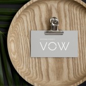
VOW Logo and Name by Kirill Semenovich |
Home > Winners > #76116 |
 |
|
||||
| DESIGN DETAILS | |||||
| DESIGN NAME: VOW PRIMARY FUNCTION: Logo and Name INSPIRATION: There is in the marriage an interesting moment of mystery and some kind of mysticism, where the two people are connected to each other for life. Therefore the logo tells the story of the intercrossing of two people. There is a connecting event between them, the wedding. Two become one. This moment is fixed in the name and in the logo also, as a central line, which is located between two letters and links them. UNIQUE PROPERTIES / PROJECT DESCRIPTION: Vow agency is the organizer of unique weddings in picturesque Georgia. The name has two aspects. First, weddings are with wow-effect, in tune with the name. Second, the word vow contains the meaning of connection. Logo concept: the wedding vow is the words, therefore the logo is typeface. Values: ritual, uniqueness and emotions. Style: luxury in its simplicity. OPERATION / FLOW / INTERACTION: The logo is used on the website, also on the Instagram and Facebook page, on special uniform, on business cards and other print products. PROJECT DURATION AND LOCATION: The project started in June 2018 in Moscow and finished in July 2018 in Moscow. FITS BEST INTO CATEGORY: Graphics, Illustration and Visual Communication Design |
PRODUCTION / REALIZATION TECHNOLOGY: All the work was divided into several main stages: brief preparation, research, concept creation, name creation and logo design. To search for the concept, xmind application was used, in which the mental map was built. Further, sketches were made on paper. Most of the work on the logo was in Adobe Illustrator and other applications from the Adobe package (Photoshop, After Effects). SPECIFICATIONS / TECHNICAL PROPERTIES: The original logo files were transferred to the customer in the formats: .ai, .pdf, .svg, .png TAGS: Logo, Name, Vow, Wedding RESEARCH ABSTRACT: Work on the project consisted of the following parts: market research and competitors, creation of a mental map, search and approval of the name of the agency, development of the logo concept, logo design, and logo guidelines. CHALLENGE: The most interesting and difficult moment was to tell a story about two people in the logo, to show their connection. At the same time it was necessary to keep the minimalistic style in such a way that it looked luxurious. ADDED DATE: 2019-02-11 19:57:21 TEAM MEMBERS (2) : Creative Director: Kirill and Designer: Valeria IMAGE CREDITS: Kirill Semenovich, 2018. |
||||
| Visit the following page to learn more: http://youtu.be/P7ENeMM3LPU | |||||
| AWARD DETAILS | |
 |
Vow Logo and Name by Kirill Semenovich is Winner in Graphics, Illustration and Visual Communication Design Category, 2018 - 2019.· Read the interview with designer Kirill Semenovich for design VOW here.· Press Members: Login or Register to request an exclusive interview with Kirill Semenovich. · Click here to register inorder to view the profile and other works by Kirill Semenovich. |
| SOCIAL |
| + Add to Likes / Favorites | Send to My Email | Comment | Testimonials | View Press-Release | Press Kit |
Did you like Kirill Semenovich's Graphic Design?
You will most likely enjoy other award winning graphic design as well.
Click here to view more Award Winning Graphic Design.


