|
|
|


|
|
| DESIGN DETAILS |
DESIGN NAME:
Recreation Bondi Beach
PRIMARY FUNCTION:
Natural Fragrances
INSPIRATION:
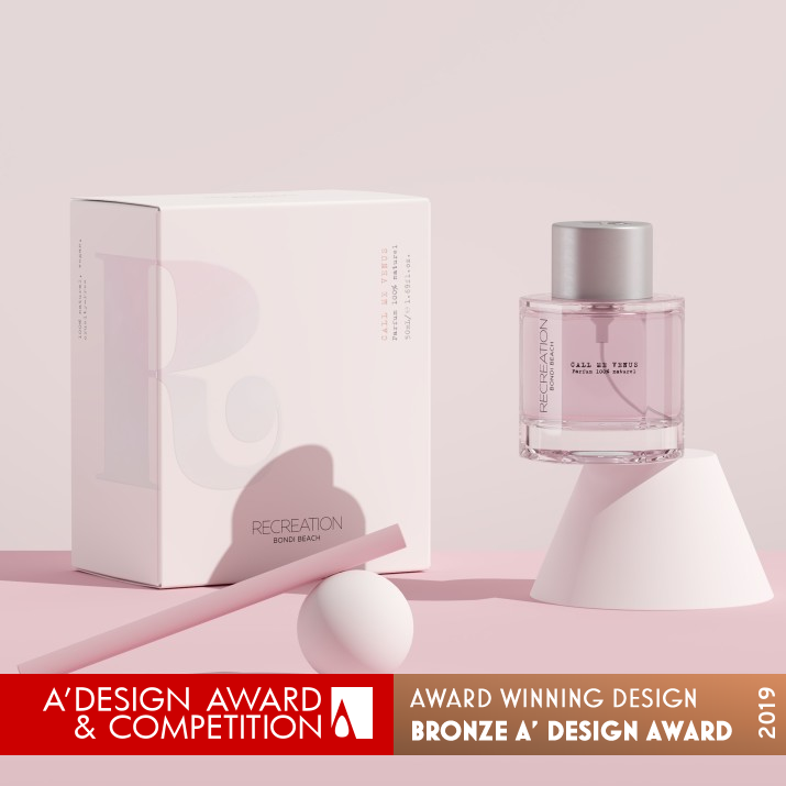
The brand mark embodies female empowerment. The stylised R is inspired by the iconic image of the woman sleeve rolled up, from the WWII We Can Do It campaign.
UNIQUE PROPERTIES / PROJECT DESCRIPTION:
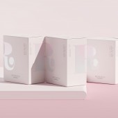
The R, the visual shorthand for Recreation dominates the packaging as the brands hallmark of confidence. The infill of the mark, a subtle pink, blue and yellow graduation, echoes the twilight beach skies of Bondi.
With the bottle design we explored the intrinsic beauty of basic geometry. Arriving at a bottle that is a softened hexagon. The solid clear pedestal gives it visual gravitas. The vertical chime lines give the bottle a soft rhythm and the illusion that it is a much rounder shape.
OPERATION / FLOW / INTERACTION:
The fragrances are activated via an atomizer. The smaller 10ml bottles are roll-on.
PROJECT DURATION AND LOCATION:
October 2017-December 2018
Sydney, Australia
FITS BEST INTO CATEGORY:
Packaging Design
|
PRODUCTION / REALIZATION TECHNOLOGY:
The debossed aluminium cap sits flush against the bottles’ shoulder, assisting with optimising the overall proportions. The base is also debossed with the R as a point of unexpected discovery for the consumer.
The boxes are printed CMYK on uncoated stock, with two spot colours, spot gloss UV and an all over satin aqueous varnish. The spot gloss afforded a subtle glint that appears and disappears according to the angle at which the box is seen. Again, a subtle nod to the unique beach light as it dances across various surfaces.
SPECIFICATIONS / TECHNICAL PROPERTIES:
Box dimensions: 125mm (H) x 102mm (W) x 62mm (D)
Bottle:73mm (H) x 52mm (W)
TAGS:
Fragrance packaging, Natural fragrance packaging, Bespoke bottle, Branding and Packaging Design, Packaging Design, Branding Design, Form Design, Australian Packaging Design,
RESEARCH ABSTRACT:
The word mark uses rigorously even fine line typography that uses geometric shapes and clear definition.
An asymmetric layout has been purposefully used to give the packaging sufficient tension for the three visual elements to work both together and in isolation within the space. The vertical type describing the fragrance is through its orientation and font style given a unique visible position without it overshadowing the brand mark elements.
CHALLENGE:
The manufacture of the bottle was the most challenging along with orbital printing on multiple surfaces that were not perfectly flat.
ADDED DATE:
2019-02-07 23:55:21
TEAM MEMBERS (3) :
Creative Director/Designer: Angela Spindler, Industrial Designer: Charlie Payne and Industrial Designer: Andrew Simpson
IMAGE CREDITS:
Vladimir Pospelov
|
| Visit the following page to learn more: http://recreationbeauty.com/ |
|
| CLIENT/STUDIO/BRAND DETAILS |
 |
NAME:
Depot Creative
PROFILE:
Depot Creative is an independent packaging design agency, based in Sydney Australia. Its specialised team uses their wealth of experience and industry knowledge to deliver cut through solutions and tell unique brand stories. The company works with brands that resonate with them as consumers in the categories of gourmet food, beverage, alcohol, skincare, fragrance, confectionery, and health and lifestyle products.
Depot is a dynamic team of free-range thinkers, problem solvers, craftsmen and perfectionists. As designers, they are part innovator, part psychologist and part marketeer. The agency believes that the most valuable packaging designer is the one, who is able to create solutions based on understanding the subtle alchemy of these disciplines. With the diverse range of projects that come through the studio, Depot hand-picks teams tailored to meet specific project needs. With that, they collaborate with the best talent around, whether it is structural engineers, 3D rendering artists, or even glassblowers. This diversity keeps the company ‘crisper’ fresh and enables it to deliver results driven solutions for its clients.
At the helm
Angela Spindler, the Principal Founder and Creative Director of Depot Creative. She has 30 years design business experience and has notched up over 50,000 hours of design across four countries. She has squeezed in a Master’s Degree in Design, and guest lectured at design school’s bot in Australia and Europe. She regularly contributes to publications such as Dieline, Packaging World, PKN Australia, and has had her work published in a number of prominent design books. She has scooped a number of industry awards including, Pentaward, Dieline Award, German Design Award and A’Design Awards.
|
|
|
| COMMENTS |
| Giulia Esposito |
Comment #8592 on December 26, 2022, 11:18 am |
|
I'm so impressed with this packaging design for natural fragrances. The attention to detail and the overall look and feel of the design is stunning. The colors are so vibrant, and the elements used to represent the beach are beautiful. The use of typography and illustrations to convey the theme of the product is thoughtful and inspiring. It's clear that a lot of time and effort went into creating this packaging, and it really pays off. It's a great example of how design can be used to create an emotional connection with the audience. I'm so proud of this work, and it's an honor to be able to celebrate the success of this design. Congratulations to Angela Spindler for winning the A' Design Award!
|
| Adam Harris |
Comment #59570 on January 3, 2023, 9:53 pm |
|
I am absolutely in awe of the exquisite packaging design for Recreation Bondi Beach. It is clear that the designer has put a lot of thought and consideration into the creation of this product. The brand mark is incredibly empowering, and the visuals of the twilight beach skies of Bondi provide a beautiful backdrop for the design. The use of basic geometry to create a softened hexagon bottle is both visually striking and original. The vertical chime lines give the bottle a lovely rhythm, while the clear pedestal adds to its visual impact. The word mark is elegant and sophisticated, and the asymmetric layout gives the packaging an impressive tension. Finally, the orbital printing on the multiple surfaces must have been a challenge to create, and the resulting product is stunning. It is no surprise that this design has won the A' Design Award.
|
| Chloe Turner |
Comment #68294 on January 4, 2023, 1:52 am |
|
We can all appreciate an award-winning design that epitomizes female empowerment. Angela Spindler's "Recreation Bondi Beach" packaging design is the perfect example of how design can be used to convey a powerful message. Through the use of the iconic "We Can Do It" symbol, the stylized R is a reminder of the power and strength of women. The colors and textures used on the packaging also evoke a feeling of natural beauty and serenity. This is truly a stunning work of design that deserves to be celebrated.
|
| Mark Allen |
Comment #69638 on January 4, 2023, 2:31 am |
|
This award-winning work is a truly inspiring example of packaging design. Its unique brand mark, the use of geometric shapes and the combination of colors and textures evoke the twilight beach skies of Bondi. The debossed aluminium cap, the spot gloss UV and the all-over satin aqueous varnish combine to create a subtle glint that really catches the eye. The research and manufacture of the bottle was no easy feat, but the result is a stunning design that captures the essence of the natural fragrances it contains.
|
| Elisabeth Clark |
Comment #71065 on January 4, 2023, 3:12 am |
|
It's an absolute pleasure to be able to celebrate Angela Spindler's success in winning the A' Design Award for their work titled "Recreation Bondi Beach". The way this design incorporates the brand elements with subtle visual cues to the beach skylines of Bondi is truly remarkable. The use of basic geometrical shapes to create a soft hexagonal bottle design gives it an interesting and eye-catching look, while the vertical lines provide it with a unique rhythm.
The brand mark is also very powerful, embodying female empowerment. The use of even fine line typography and geometric shapes gives it a unique position without overshadowing the other elements. Moreover, the asymmetric layout adds tension to the design, creating a visually pleasing piece that works together and in isolation.
It's amazing to see how Angela Spindler has creatively combined the various elements to create an award-winning work that stands out and captures the essence of the product. It's no wonder why this design was recognised and praised, and it's an absolute honour to be able to celebrate such a fantastic work.
|
|
|
Did you like Angela Spindler's Packaging Design?
You will most likely enjoy other award winning packaging design as well.
Click here to view more Award Winning Packaging Design.
Did you like Recreation Bondi Beach Natural Fragrances? Help us create a global awareness for good packaging design worldwide. Show your support for Angela Spindler, the creator of great packaging design by gifting them a nomination ticket so that we could promote more of their great packaging design works.
|
|

|
|
|
|


