O2.tv Logo for the National Television by Dragana Stojanovic |
Home > Winners > #75672 |
 |
|
||||
| DESIGN DETAILS | |||||
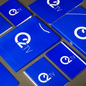
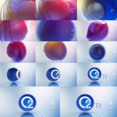
| DESIGN NAME: O2.tv PRIMARY FUNCTION: Logo for the National Television INSPIRATION: To find the right inspiration it is always better to look around us instead of going far to unknown places. The obvious connection with the O2 molecule and a sphere-like shape brought the idea for this logo, along with a modern visual standards and strong character that were of great importance for this project. The result was recognizable logo, adjusted to the demands of contemporary graphic compositions, balanced like nature is and light like the air we breathe. This logo was created as a symbiosis between the television visual identity and the organic world which led to perfect graphic harmony. UNIQUE PROPERTIES / PROJECT DESCRIPTION: This logo is the visual identity of the O2.TV national television. The television’s new and specific name was our focus during logo creation; on one hand – an inspiration, and on the other – a great challenge. A simple and modern name with a symbolic character demanded a very precise and clear solution. The final result, simplified and eye catchy, brings the whole new and fresh look to Serbian media market positioning O2.TV on the top of all visual identities among national televisions in the country. When launched O2.TV logo made great impact making audience remember and notice new TV brand instantly. OPERATION / FLOW / INTERACTION: Interaction with O2.TV logo happens only visually but it is designed in a way that makes it interesting for different kind of animations. Sphere shape is transformable easily so the audience can perceive it in a different way each time. Original logo is used constantly for new variations, visualizations and forms which makes it fresh for watching with every appearance. PROJECT DURATION AND LOCATION: The project started in April 2015 in Belgrade and finished in August 2017 in Belgrade, and was on air in September 2017. FITS BEST INTO CATEGORY: Graphics, Illustration and Visual Communication Design |
PRODUCTION / REALIZATION TECHNOLOGY: Logo is used both on-air and off air. It was initial point for making all graphic packages for television purposes. It is applied as on-air bug, programing graphics, promotional purposes; in print, on promo materials, trailers, TV Identity videos in 3D technique... Even for an inspiration of television's general headline / BREATHE IN - O2.tv SPECIFICATIONS / TECHNICAL PROPERTIES: The logo is applied in different sizes. Brand color is blue. The connection with organic world and focus on male audience gave the idea for color combination of this logotype. Blue and white are strong and clear throughout every possible use while keeping simplicity and elegance. On-air, Online: r:0 , g:0 , b:200 Print : c:100 , m:90 , y:0 , k:0 TAGS: Art direction, Graphic design, Branding, Broadcast logo, Logo, O2, National television RESEARCH ABSTRACT: Considering the brief behind the logo which was to attract younger, mostly male audience, research was based on that. The television program is mostly male-oriented, which led to this particular color choice. The sphere, taken from the variety of nature's perfectly created shapes, was chosen to meet different graphic demands of a program mostly associated with sports, movies and TV series. Having in mind all of these needs and all future requirements it was important to make the final design to be easily transformed in a recognizable way. CHALLENGE: Fusing the name into the design in a most efficient and creative way become a challenge with an inspiration. It was, on one side very hard to fulfill the desires and expectations of local market and on the other side to step forward and stand out from the competition. The decision was to follow our believes and go beyond standards that already existed on media market. ADDED DATE: 2019-02-07 12:00:45 TEAM MEMBERS (1) : Dragana Stojanovic, art direction, branding, graphic design / Zoran Djudurovic, creative director / Marko Stojanovic, sound identity / Aleksandar Rados, Marketing Director / Pr1mer studio, animation IMAGE CREDITS: Dragana Stojanovic, 2018. |
||||
| Visit the following page to learn more: https://www.behance.net/JUST-MACHINE | |||||
| AWARD DETAILS | |
 |
O2.tv Logo For The National Television by Dragana Stojanovic is Winner in Graphics, Illustration and Visual Communication Design Category, 2018 - 2019.· Read the interview with designer Dragana Stojanovic for design O2.tv here.· Press Members: Login or Register to request an exclusive interview with Dragana Stojanovic. · Click here to register inorder to view the profile and other works by Dragana Stojanovic. |
| SOCIAL |
| + Add to Likes / Favorites | Send to My Email | Comment | Testimonials | View Press-Release | Press Kit | Translations |
Did you like Dragana Stojanovic's Graphic Design?
You will most likely enjoy other award winning graphic design as well.
Click here to view more Award Winning Graphic Design.


