Vilar Corporate Identity by Pablo Prada Granada |
Home > Winners > #75202 |
 |
|
||||
| DESIGN DETAILS | |||||
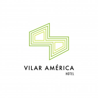
| DESIGN NAME: Vilar PRIMARY FUNCTION: Corporate Identity INSPIRATION: Hotel Vilar America is a traditional family owned business, located in Bogota, Colombia. Given that it is a brand design update, the challenge was to be able to communicate the Hotel's change and evolution, without hindering brand awareness and recognition. Concepts to keep and convey were: Union, family and service. Newly incorporated concepts were: cyclical, evolving, movement and infinity. Inspiration was also found on pre-colombian friezes to create a more versatile and modern brand. UNIQUE PROPERTIES / PROJECT DESCRIPTION: This design is a Brand update and redesign for Hotel Vilar America. The Hotel, is upgrading and updating its facilities and services, and with it, it's image. The submitted design is a modern take, on an established and traditional family business, heading into the next decade with a crisp, clean graphic language. OPERATION / FLOW / INTERACTION: Design was created to be used in all communication and marketing pieces created by or for the Hotel; wether it is an in-house production or a third-party designed product. PROJECT DURATION AND LOCATION: Project started on December 2018 and was completed and delivered on March 2019. FITS BEST INTO CATEGORY: Graphics, Illustration and Visual Communication Design |
PRODUCTION / REALIZATION TECHNOLOGY: Adobe Creative Suite Apple Macbook Pro - Retina Display - 2.7 GHz Intel Core i7 SPECIFICATIONS / TECHNICAL PROPERTIES: Logo and brand design was created using vector graphics which allow resizing for print and digital outputs without compromising image quality. TAGS: logo, brand update, hotel, colombia, vilar america, frieze, cyclical, movement, evolution, kinetic RESEARCH ABSTRACT: The original logo was designed based on the values and characteristics of the company (experience, quality, cleanliness and good service) based on a concept of tradition, service and support to the community. Logo construction is based on the image of a handshake; and its sinuous shape also makes reference to the initials of the name AV in a line without end in perspective and rotated 90 degrees to the right. The re-design of the brand denotes the evolution of the Hotel, it reflects the projected changes towards the future. It retains the values and characteristics of which the initial logo was developed; and incorporates concepts of an organization that finds its essence in cyclic, kinetic processes, a company that evolves, that is in constant movement; projecting towards infinity. The graphic elements and the new construction of their parts present a more clean, simple and versatile visual alternative. In the new logo, the serifs of the typographical families used previously disappear; and they are replaced by non-serif typographic families that connote a more modern graphic language. We sought out to find graphic references that reflected the new kinetic concepts we were introducing into the brand; we found inspiration in pre-Columbian friezes; from the objects we created an abstraction separating and at the same time integrating them, with the original symbol of the hands from the previous logo. CHALLENGE: The challenge was to be able to communicate the Hotel's change and evolution, without hindering brand awareness and recognition. ADDED DATE: 2019-02-01 16:06:01 TEAM MEMBERS (2) : Creative Director: Pablo Prada Granada and Designer: Pablo Prada Granada IMAGE CREDITS: Pablo Prada Granada, 2018. |
||||
| Visit the following page to learn more: https://olbap.co | |||||
| AWARD DETAILS | |
 |
Vilar Corporate Identity by Pablo Prada Granada is Winner in Graphics, Illustration and Visual Communication Design Category, 2018 - 2019.· Read the interview with designer Pablo Prada Granada for design Vilar here.· Press Members: Login or Register to request an exclusive interview with Pablo Prada Granada. · Click here to register inorder to view the profile and other works by Pablo Prada Granada. |
| SOCIAL |
| + Add to Likes / Favorites | Send to My Email | Comment | Testimonials | View Press-Release | Press Kit |
Did you like Pablo Prada Granada's Graphic Design?
You will most likely enjoy other award winning graphic design as well.
Click here to view more Award Winning Graphic Design.


