Souper Branding Project Branding by Ng Wai Ming Chris |
Home > Winners > #73991 |
 |
|
||||
| DESIGN DETAILS | |||||
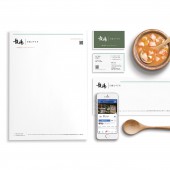
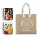
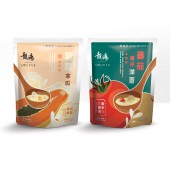
| DESIGN NAME: Souper Branding Project PRIMARY FUNCTION: Branding INSPIRATION: Inspired by the company vision, which simply want to satisfy their consumers physiological needs and psychological wants towards Chinese soup, we use traditional chinese typography to make the logo, implying some degree of culture and the the feeling of home. The name, Souper, sounds like super, represented that consumers will feel great about the delicious soup. The headline, Simply Satisfied, conveys the happy, convenience nature of the brand. UNIQUE PROPERTIES / PROJECT DESCRIPTION: Souper, the newly launched Hong Kong ready-to-eat Chinese soup bags brand, starting from naming, branding to online and offline marketing strategies, we dramatized their core idea of satisfaction : what makes Souper become a super soup brand by simply satisfied consumers needs and wants. To start the design process, we precisely defined colours, typefaces, images and templates form the foundation of the visual identity. The outcome is a brand with delicious, modern and sincer DNA. OPERATION / FLOW / INTERACTION: Urban Air Design applied the modern design language consistently across a wide range of items for the launch, from naming, visual design, packaging to online offline marketing materials. Bringing the brand to life and expertly applying it to make it accessible and engaging. We understand brand building is an ongoing process. Souper has many exciting opportunities to keep people engaged and updated about what’s ahead.proudly made in Hong Kong. PROJECT DURATION AND LOCATION: The project started in June 2018 in Hong Kong and finished in December 2018 in Hong Kong. FITS BEST INTO CATEGORY: Graphics, Illustration and Visual Communication Design |
PRODUCTION / REALIZATION TECHNOLOGY: As brand guardians, Urban Air Design ensure that the brand are accurately leveraging its applications across a range of products, from online to offline. To start the design process, we surveyed the market with a carefully crafted visual questionnaire. We continued its communications efforts by designing brand touchpoints, such as web site, social media campaigns and video advertisements. SPECIFICATIONS / TECHNICAL PROPERTIES: Naming, visual identities, brand guidelines, packaging design, responsive web and mobile application. TAGS: Branding, Graphic,Design, Video, Web, App, Corporate, Identity, Logo, Packaging RESEARCH ABSTRACT: The passion for soup is deeply rooted in Chinese culture, however, people are frustrated by the complicated process to make soup at home, especially Hong Kong is a fast paced city. Therefore, the founders of Souper set out to change how we purchase soup. Originating from the satisfying feeling, a series of ready-to-eat Chinese soup bags were launched, with exciting visual elements and communicative messages, we aim at making Souper the number one soup brand that proudly made in Hong Kong. CHALLENGE: With many ready-to-eat soup brands flooding the market, and most of their branding looks dated, the company decided to hit the marketing with a creative approach. It was important that eating soup be viewed as a critical element of Chineses culture, bringing joy to people of all ages. The brand promise that convenience soup with quality will satisfied people health and mind, promotes the liveliness soup eating experience on their life journeys and gives them something to look forward to compared to other options. ADDED DATE: 2019-01-08 04:53:42 TEAM MEMBERS (7) : Ng Wai Ming Chris, Sin King Man Kelly, Rao Amandeep, Tse Kin Wa Jeff, Or Chi Bun Stanley, Mok Cho Yi Joey and IMAGE CREDITS: Alex Jung PATENTS/COPYRIGHTS: Copyrights belong to Simply Satisfied, Year 2019. |
||||
| Visit the following page to learn more: http://bit.ly/2TAr0WW | |||||
| AWARD DETAILS | |
 |
Souper Branding Project Branding by Ng Wai Ming Chris is Winner in Graphics, Illustration and Visual Communication Design Category, 2018 - 2019.· Read the interview with designer Ng Wai Ming Chris for design Souper Branding Project here.· Press Members: Login or Register to request an exclusive interview with Ng Wai Ming Chris. · Click here to register inorder to view the profile and other works by Ng Wai Ming Chris. |
| SOCIAL |
| + Add to Likes / Favorites | Send to My Email | Comment | Testimonials | View Press-Release | Press Kit |
Did you like Ng Wai Ming Chris' Graphic Design?
You will most likely enjoy other award winning graphic design as well.
Click here to view more Award Winning Graphic Design.


