DESIGN NAME:
Sense Antique Glasses Gallery
PRIMARY FUNCTION:
Antique Glasses Museum
INSPIRATION:
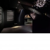
Within the spatial structures, there are two oblique walls designed with the techniques of reflective and twists used in optical glasses.
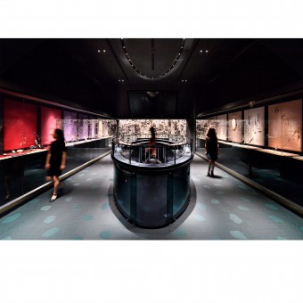
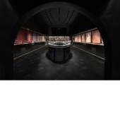
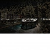
These two walls divide the main room into three distinctive zones (not include storage room). The oblique walls let viewers follow the narrow space through the trapezoid shaped environment. Create an wide space for a customize light which made by 498 pieces hand-made optical glass. Following through the narrow space, The ascending ceiling will guide the viewer into the main atrium. Next, with the arched entrance, viewers shift their focus to the lighted oval shaped transparent glass table which carries the main exhibits.
the aggregate to all the spaces is an underlying attention to detail. this oval table is all made by glass, including all the structure and the façade. The goal was to create an low-lighted environment that make everything disappear but the exhibits.
UNIQUE PROPERTIES / PROJECT DESCRIPTION:
The important element to create the atmosphere in our design is to create a space that make people came in and feel isolated from the world we used to live in. darkeness 、 the low reflection space allow exhibits not only to display the surface but also the micro details.In comparison to art galleries, the collection room is more artistic, opened yet secretive, luxurious yet ordinary, transparent yet clear.
OPERATION / FLOW / INTERACTION:
The oblique walls when viewers enter the room. ascending wall go through the low height wall and form a unique sense of space.
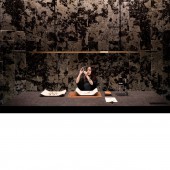
Time is a character. The architects developed construction materials based on this character, 20% grey artificial GLASS are used throughout the whole space, and are intended to organically record time as it passes. THE relection light of antique glasses is also a character, and this space was likewise built to incorporate this character, with all of its possibilities and elegant – whether in drawing the outline of materials, or forming interesting interaction with fixed installation. This light yet heavy space was purposely designed for its usage: exhibiting,antique restoring, and communicating.
PROJECT DURATION AND LOCATION:
The project started in April 2018 in TAIWAN and finished in OCT 2018 .and exhibited since
FITS BEST INTO CATEGORY:
Interior Space and Exhibition Design
|
PRODUCTION / REALIZATION TECHNOLOGY:
we use a lot of low-reflection materials to create a dark room . this area covers industrial production technology used in antique glasses , wood and metal processing, glass, as well as the paper industry. With almost one half of all the objects and a series of special historical collections, it characterises the profile of the museum to a large extent.
SPECIFICATIONS / TECHNICAL PROPERTIES:
Museum not only has the 4.5 meters clear height space of traditional art museum, but also has spaces of different sizes and dimensions: big box, black box(multi-function performance, convention, exhibition spaces).interior Width 788 cm x 2235 cm x Height 450 cm
TAGS:
museum, interior,
RESEARCH ABSTRACT:
The important element to create the atmosphere in our design is the shape of darkened space and the low reflection to allow exhibits not only to display the surface but also the micro details.
CHALLENGE:
the design team is trying to use space geometry to innovate a collection style. Upon entering the room, the viewer will feel the narrow space through the trapezoid shaped environment. Following through the space, the ascending ceiling will guide the viewer into the main atrium. Next, with the arched entrance, the viewer will shift their focus to the lighted oval shaped transparent glass table which carries the main exhibits. The oval shaped table seems as light as a feather by using extremely thin iron rods.
ADDED DATE:
2018-12-12 13:04:56
TEAM MEMBERS (3) :
chih-yuan,hung, kuan-yi,tai and lora lai
IMAGE CREDITS:
wang te fan
PATENTS/COPYRIGHTS:
Copyrights belong to NONETOTEN DESIGN LAB, 2018.
|


