Buoy Health Logo and Visual System by Pencil Worx, Sam Ayling |
Home > Winners > #73037 |
 |
|
||||
| DESIGN DETAILS | |||||
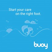
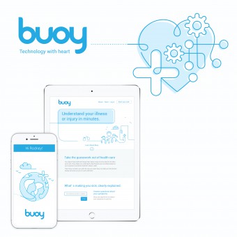
| DESIGN NAME: Buoy Health PRIMARY FUNCTION: Logo and Visual System INSPIRATION: Buoy Health needed a fresh, humanistic visual system. We pulled inspiration from various artists that used a continuous line technique to give the illustrations a clean and playful gestural quality. Each illustration in the system had its own special twist. UNIQUE PROPERTIES / PROJECT DESCRIPTION: The healthcare industry wasn’t keeping pace with technological change. Buoy, an AI-assisted symptom-checker, changed that with their free, easy-to-use app. It not only identified with 97% accuracy what was making you sick, but it recommended what to do next and where to go for help. The real challenge was in changing consumer behavior and mindsets regarding online medical support. OPERATION / FLOW / INTERACTION: Buoy is a digital health tool that helps you – from the moment you get sick – start your care on the right foot. These days, when most Americans get sick, they google their symptoms. But the information they find is unreliable and risky. Buoy flips the script by using advanced artificial intelligence to resemble a chat with your favorite doctor—where you get an accurate analysis of your symptoms and learn where to go and what to do next. Start by entering your symptoms. Buoy’s algorithm analyzes your answers in real-time and decides the most important question to ask next. In just 2-3 minutes, Buoy gains a detailed understanding of your case and offers options for what to do next that are personalized to you. If you need immediate care, Buoy can connect you to care providers nearby. No more endless googling. No more guessing. Start your care on the right foot. That's Buoy. PROJECT DURATION AND LOCATION: The project started in early 2015 in New York and launched in late November 2017. |
PRODUCTION / REALIZATION TECHNOLOGY: Everything about the brand needed to feel not just human, but super-human. The brand captured the founders’ deep sense of purpose to change the trajectory of human health, while the voice sounded like your neighborhood doctor. We designed a visual identity ripe with rounded, human forms and free-flowing lines that carried the user along the journey to health. SPECIFICATIONS / TECHNICAL PROPERTIES: The vector illustration art needed to be highly flexible so that we could adjust if need. This allow the visual system to be consistent throughout the entire user experience. TAGS: Brand positioning, Logo, Visual system, Design, Illustration library, Brand style guidelines RESEARCH ABSTRACT: Adobe Suite CHALLENGE: There were some initial challengers with the logo design. At the time Buoy was a small start up with very little knowledge of how to create a well crafted brand and visual system. Many of the core team were engineers so tended to have a very technical mindset. At times it was challenging to show the creative without walking them through a very long winded discovery phase. We quickly realized they needed a little nurturing too help them better understood the creative process. Bringing them into the creative phase of work at and early stage really helped and made them feel part of the team. ADDED DATE: 2018-12-04 21:02:53 TEAM MEMBERS (1) : Sam Ayling IMAGE CREDITS: All illustrations were designed and developed by Pencil Worx |
||||
| Visit the following page to learn more: https://www.pencilworx.agency/buoy-healt |
|||||
| AWARD DETAILS | |
 |
Buoy Health Logo and Visual System by Pencil Worx, Sam Ayling is Winner in Graphics, Illustration and Visual Communication Design Category, 2018 - 2019.· Read the interview with designer Pencil Worx, Sam Ayling for design Buoy Health here.· Press Members: Login or Register to request an exclusive interview with Pencil Worx, Sam Ayling. · Click here to register inorder to view the profile and other works by Pencil Worx, Sam Ayling. |
| SOCIAL |
| + Add to Likes / Favorites | Send to My Email | Comment | Testimonials | View Press-Release | Press Kit |
Did you like Pencil Worx, Sam Ayling's Graphic Design?
You will most likely enjoy other award winning graphic design as well.
Click here to view more Award Winning Graphic Design.


