Kumala Reserve Corporate Identity by Nicole Chai |
Home > Winners > #71887 |
 |
|
||||
| DESIGN DETAILS | |||||
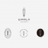
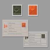
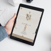
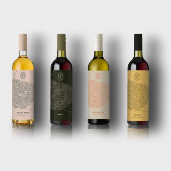
| DESIGN NAME: Kumala Reserve PRIMARY FUNCTION: Corporate Identity INSPIRATION: The visual identity was inspired by ancient South African art, such as ancient rock painting, ancient South African masks, patterns etc. Ancient South African art has always been perceived as mysterious and sacred. The purpose of the design is to hight the brand's country of origin by linking it with ancient time of South African. UNIQUE PROPERTIES / PROJECT DESCRIPTION: The purpose of the rebranding was to truly link its country of origin - South Africa and attract younger wine drinkers by associating the brand with ancient South African art, and giving it a mysterious touch. The elements of South African art was used in the design, including ancient masks, fabric patterns, rustic typefaces and rock cracks with the attempt to arouse consumers' fantasies about ancient South African spirit and culture. OPERATION / FLOW / INTERACTION: The purpose of introducing the new visual system was to truly link to its South African heritage and bring a touch of mystery. The main icon was inspired by ancient South African masks (masks are often perceived as a mysterious charm), The palette has a warm, fun feel that has rejuvenated the serious image of the brand. The whole visual identities positioned of the brand as the wine choice for a nonconformist young professional who's fallen in love with South African culture. PROJECT DURATION AND LOCATION: The project started in August 2018 in London and finished in October in Edinburgh. FITS BEST INTO CATEGORY: Graphics, Illustration and Visual Communication Design |
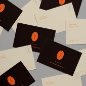
PRODUCTION / REALIZATION TECHNOLOGY: I began this project by looking at their current positioning, goals, target market and setting up focus groups to understand the gap between consumers' perception towards the brand and their current brand positioning. It turned out that the company wanted the brand reflect the true character of their regional provenance in South Africa, but consumers did not necessarily receive the message that the company wanted to deliver. SPECIFICATIONS / TECHNICAL PROPERTIES: Wine bottle: 75 cl Height : 28,8 cm Diameter : 8,2 cm Business cards: 85mm*55mm TAGS: branding, Packaging, Graphic design, brand identity, wine brand, South African wine, Bottle design RESEARCH ABSTRACT: I used both primary and secondary research methods for this project. The research objective was to find the gap between consumers perception towards the brand and how the brand want to position themselves, and to develop a visual solution to close the gap. I began the strategy process by looking at their positioning, differentiators, messaging and the value of the brand. I then did some market research in the aim of understanding the situation of South African wine in UK and UK wine drinkers. I set up some focus group with people aged from 20-35 to understand how the brand's target consumers truly perceive this brand. It turned out that consumers did not recognise the country of origin immediately by looking at it's current visual identities and most of them claimed that they are more likely to purchase wine brand with unique bottle, especially in gathering occasions. These results led to the early ideas of the rebranding including historical heritage, quality and unique. CHALLENGE: The biggest creative challenge in the process was to choose the right colour palette in order to balance the South African heritage and the playful mindset of young drinkers. ADDED DATE: 2018-10-09 13:01:09 TEAM MEMBERS (1) : Nicole Chai IMAGE CREDITS: Nicole Chai, 2018. |
||||
| Visit the following page to learn more: https://n-chai.me/kumala-reserve/ | |||||
| AWARD DETAILS | |
 |
Kumala Reserve Corporate Identity by Nicole Chai is Winner in Graphics, Illustration and Visual Communication Design Category, 2018 - 2019.· Read the interview with designer Nicole Chai for design Kumala Reserve here.· Press Members: Login or Register to request an exclusive interview with Nicole Chai. · Click here to register inorder to view the profile and other works by Nicole Chai. |
| SOCIAL |
| + Add to Likes / Favorites | Send to My Email | Comment | Testimonials | View Press-Release | Press Kit |
Did you like Nicole Chai's Graphic Design?
You will most likely enjoy other award winning graphic design as well.
Click here to view more Award Winning Graphic Design.


