DESIGN NAME:
1in360
PRIMARY FUNCTION:
Brand Identity Redesign
INSPIRATION:
Over an extended period of time, I had closely monitored an assortment of hosted-show brands. However, I had never come across a brand which instills a strong sense of diversity, nor one which places a strong emphasis on perspective design. Almost every brand within the entertainment sector follows a set trend which shortly becomes obsolete, thus limiting the potential and scope of creativity. Because of this, it was a great opportunity to create something new and contribute to the ongoing expansion of the entertainment industry.
UNIQUE PROPERTIES / PROJECT DESCRIPTION:
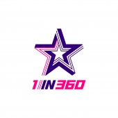
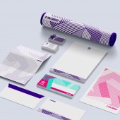
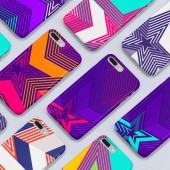
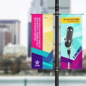
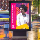
The uniqueness of the design comes from its distinctive multi-layered stripe arrangement, characterized by two variations of thickness and colour. This particular combination in itself is sufficient in portraying its unique features of expression, augmenting the ideogram of fame or stardom. The design is inspired by the weave-side vector technique, extended geometrically around the pentagram.
OPERATION / FLOW / INTERACTION:
The modifications builds upon the former star logo to enhance the symbol’s dynamism, whilst creating a more sophisticated and contemporary feel. This expresses 1in360’s unique brand design, emphasizing specialization, professionalism and a sense of pride within the hearts of affiliated stakeholders.
PROJECT DURATION AND LOCATION:
This project for the first season was based in London. It started in October 2017 and finished in May 2018. It is still preparing for next season 2019.
FITS BEST INTO CATEGORY:
Graphics, Illustration and Visual Communication Design
|
PRODUCTION / REALIZATION TECHNOLOGY:
In this project, I drew rough sketches of logos based on star-shaped design. Additionally, Adobe software (Photoshop, Illustrator, Aftereffect, Premiere) and 3D program called "Cinema 4D" were used to construct ideas.
SPECIFICATIONS / TECHNICAL PROPERTIES:
The image dimensions are set out to be 85*115 pixels, with a minimum-resolution of 72 DPI. There are 2 designs for the logo, one consisting of clear-white background, and the other in purple. The main colours should be purple and pink but it can be depicted in monochromatic format. The logo had been centered on canvas, not positioned to corners or edges.
TAGS:
1 in 360
RESEARCH ABSTRACT:
I had contemplated on ways to effectively portray 1in360’s unique brand image and tried to find how to reflect the brand name on the brand image. In consideration of the setting for this brand, which is a talent show in search for a superstar, it has formulated a typical star shape as the main symbol and continuous stripe pattern to express the faculty of 360 degrees. By using the continuous stripe technique within the logo, it creates strong visualization and represents 1 in 360’s unique brand image. This is engaging and evocative of current pop-culture tastes around the world.
CHALLENGE:
The hardest part of this design activity had to be the conception of distinctive features and definitive qualities pertaining to 1 in 360's appearance. This should be instinctively distinguishable with any other brands which also contain the same star shape emblem.
ADDED DATE:
2018-09-09 16:32:57
TEAM MEMBERS (3) :
Art director : Dongho Kim and Yunyoung Lee , and
IMAGE CREDITS:
Art director : Dongho Kim, Yunyoung Lee
PATENTS/COPYRIGHTS:
Copyright©20181in360 Ltd. All rights reserved
|
