Machinery Park Headquarters Building Headquarters by Yi Xu |
Home > Winners > #69000 |
 |
|
||||
| DESIGN DETAILS | |||||
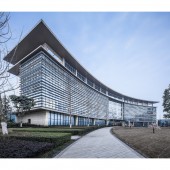
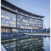
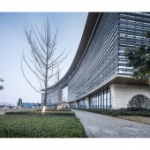
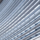
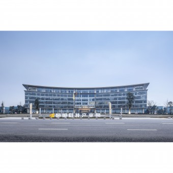
| DESIGN NAME: Machinery Park Headquarters Building PRIMARY FUNCTION: Headquarters INSPIRATION: Inspired by the curve between bright and dark sides of dawn, and fascinated by the power of light to sculpture the form, the architects try to present the building with a special form by light and space. The building embodies an open attitude of the company. UNIQUE PROPERTIES / PROJECT DESCRIPTION: The headquarters office of Machinery Park is located at Lingang economic development zone in China. The six-floor building has a total area of 12000 square meters. It embraces the entrance square by its curve layout and expanding shape. With the curtain wall system it creates an image of simplicity and decency. Light pours in to bring a delicate and comfortable working atmosphere. OPERATION / FLOW / INTERACTION: The light has its various moods on either sunny or cloudy days, either at dawn or dusk. A large area of glass curtain wall and horizontal aluminum louvers are used to filter the light to bring romance to the rational building with light and shadow. PROJECT DURATION AND LOCATION: The projects started in 2015 in Yibin, Sichuan, China, and was completed in 2016. FITS BEST INTO CATEGORY: Architecture, Building and Structure Design |
PRODUCTION / REALIZATION TECHNOLOGY: Stone is a natural material with both slight differences and integrality of each piece. It creates the main theme of the building with a decent image as a headquarter office. SPECIFICATIONS / TECHNICAL PROPERTIES: The ground floor is lifted 2 meters higher to emphasis the vertical scale of the building. It is connected with entrance square by grass slopes to create different layers of site experience. The outline of both ground and top floors are offset to bring two corridors of grey space, which encourages communication and increases interestingness of space. The facade is enriched to form a classic 'three-segment& TAGS: Office, Building, Modern, Stone, Headquarters RESEARCH ABSTRACT: The curve form stands still while the light is fluent, which makes the building an existence as an abstract change and an experience of variation. Light is a transparent media, curve is an expression of form, and building is a massive subject. All of them are connected in the project. CHALLENGE: The basic design language is limited to the very simplicity and delicacy. Form focuses on the core issue of layout and function, while materials are supposed to reflect the characteristic of the building. ADDED DATE: 2018-06-22 05:57:35 TEAM MEMBERS (7) : Architect: Xu Yi, Architect: Chen Xiao, Architect: Xu Junfeng, Architect: Li Meng, Architect: Cao Zhen, Architect: Wang Dengdeng and Architect: Timothy IMAGE CREDITS: Image #1: Photographer Hu Yijie, Shanghai, 2017. Image #2: Photographer Hu Yijie, Shanghai, 2017. Image #3: Photographer Hu Yijie, Shanghai, 2017. Image #4: Photographer Hu Yijie, Shanghai, 2017. Image #5: Photographer Hu Yijie, Shanghai, 2017. |
||||
| Visit the following page to learn more: http://suo.im/5kJDVn | |||||
| AWARD DETAILS | |
 |
MacHinery Park Headquarters Building Headquarters by Yi Xu is Winner in Architecture, Building and Structure Design Category, 2018 - 2019.· Read the interview with designer Yi Xu for design Machinery Park Headquarters Building here.· Press Members: Login or Register to request an exclusive interview with Yi Xu. · Click here to register inorder to view the profile and other works by Yi Xu. |
| SOCIAL |
| + Add to Likes / Favorites | Send to My Email | Comment | Testimonials | View Press-Release | Press Kit |
Did you like Yi Xu's Architecture Design?
You will most likely enjoy other award winning architecture design as well.
Click here to view more Award Winning Architecture Design.


