Beeopic Honey by Sophia Georgopoulou |
Home > Winners > #67903 |
 |
|
||||
| DESIGN DETAILS | |||||
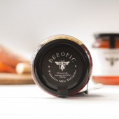
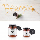
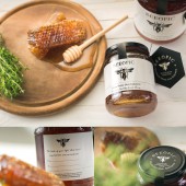
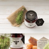
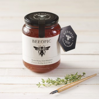
| DESIGN NAME: Beeopic PRIMARY FUNCTION: Honey INSPIRATION: The main inspiration of this project was the beekeepers lifestyle. Beekeeping is not just a business but a lifestyle, one that demands the beekeeper to follow his beehives needs. UNIQUE PROPERTIES / PROJECT DESCRIPTION: BEEOPIC is a brand new premium honey from Kalymnos, Greece. Dionysis Trikilis (the client and the beekeeper) asked us to create the brand name and the visual identity and packaging of his product. In the briefing we were informed about the dedication beekeeping demands in order to achieve high quality honey. This is how the name BEEOPIC was born, a play on the English word biopic which is used to describe a cinematic or television biography of a person. Following the creative concept that dictates the brand name narrating beekeeper’s life we took a leap and decided that the design should depict the idea that the bee itself “writes” his life. By choosing this idea we came up with a design that shows a bee with its lower part of the body being a fountain pen. The rough design of bee-pen along with the tense logotype in black and white create an overall strong and clear impression to the consumer. The packaging also carries a small brochure that follows the brand’s aesthetics and provides biographical information about the beekeeper and the way he sees his life with the bees. OPERATION / FLOW / INTERACTION: Every Beeopic Honey product comes with a little hanged card explain the biography of the beekeeper as long as details about the product. On the actual jar there is a space where you can write the persons' name that you want to give this product as a gift. Beeopic products can be found online on www.beeopic.gr PROJECT DURATION AND LOCATION: This project started in May 2017 and the first batch of products were finalised in August 2017. The project is still ongoing with new label designs for new products. FITS BEST INTO CATEGORY: Packaging Design |
PRODUCTION / REALIZATION TECHNOLOGY: Glass jar in 500gr and 1000gr sticker label printed in Offset method hanged card with details of the product SPECIFICATIONS / TECHNICAL PROPERTIES: Label Design of 1000g / 25,2 x 18cm (total size with top sticker) Label Design of 500g / 21 x 14cm (total size with top sticker) hanged card for both sizes / 12 x7 cm (open) TAGS: honey, thyme, kalymnos, bee, pen, fountain pen, black, design award, graphic design greece, sophiagdotcom, sophia georgopoulou, greece, food, beekeeper, biography, pen, greek honey RESEARCH ABSTRACT: The main research regarding this project was the other honey brands mainly in the Greek but also in the European Market. We tried to see the main visual codes of the market and the same time we tried to differentiate the brand Beeopic trying to express its main values, concept and quality. CHALLENGE: The hardest part of the journey was the physical distance, since we are based in Athens (Greece) and the Client is based in Kalymnos. But the most interesting part was that the whole collaboration took part through Skype and emails. ADDED DATE: 2018-04-01 16:05:34 TEAM MEMBERS (4) : Design: Sophia Georgopoulou, Brand Name & Copy: Nikos Vlachogianis, Photographer: George Pavlakos and Printer: Petros Daniil IMAGE CREDITS: Image #1: Photographer George Pavlakos, 2017 Image #2: Photographer George Pavlakos, 2017 Image #3: Photographer George Pavlakos, 2017 Image #4: Photographer George Pavlakos, 2017 Image #5: Photographer George Pavlakos, 2017 PATENTS/COPYRIGHTS: Copyrights belong to Sophia Georgopoulou, 2017. |
||||
| Visit the following page to learn more: http://www.sophiag.com | |||||
| AWARD DETAILS | |
 |
Beeopic Honey by Sophia Georgopoulou is Winner in Packaging Design Category, 2017 - 2018.· Read the interview with designer Sophia Georgopoulou for design Beeopic here.· Press Members: Login or Register to request an exclusive interview with Sophia Georgopoulou. · Click here to register inorder to view the profile and other works by Sophia Georgopoulou. |
| SOCIAL |
| + Add to Likes / Favorites | Send to My Email | Comment | Testimonials | View Press-Release | Press Kit |
Did you like Sophia Georgopoulou's Packaging Design?
You will most likely enjoy other award winning packaging design as well.
Click here to view more Award Winning Packaging Design.


