| THE AWARD |
| CATEGORIES |
| REGISTRATION |
| SUBMIT YOUR WORK |
| ENTRY INSTRUCTIONS |
| TERMS & CONDITIONS |
| PUBLICATIONS |
| DATES & FEES |
| METHODOLOGY |
| CONTACT |
| WINNERS |
| PRESS ROOM |
| GET INVOLVED |
| DESIGN PRIZE |
| DESIGN STORE |
| THE AWARD | JURY | CATEGORIES | REGISTRATION | PRESS | WINNERS | PUBLICATIONS | ENTRY INSTRUCTIONS |
Beeopic Honey by Sophia Georgopoulou |
Home > Winners > Design #67903 >Interview |
 |
|
FS: What is the main principle, idea and inspiration behind your design?
SG: The main inspiration of this project was the beekeepers lifestyle. Beekeeping is not just a business but a lifestyle, one that demands the beekeeper to follow his beehives needs.
FS: What has been your main focus in designing this work? Especially what did you want to achieve?
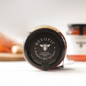
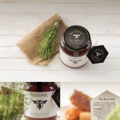
SG: Following the creative concept that dictates the brand name narrating beekeeper’s life we took a leap and decided that the design should depict the idea that the bee itself “writes” his life. By choosing this idea we came up with a design that shows a bee with its lower part of the body being a fountain pen. The rough design of bee-pen along with the tense logotype in black and white create an overall strong and clear impression to the consumer. The packaging also carries a small brochure that follows the brand’s aesthetics and provides biographical information about the beekeeper and the way he sees his life with the bees.
FS: What are your future plans for this award winning design?
SG: Help my client increase his sales and my work to be recognised.
FS: How long did it take you to design this particular concept?
SG: This project started in May 2017 and the first batch of products were finalised in August 2017. The project is still ongoing with new label designs for new products.
FS: Why did you design this particular concept? Was this design commissioned or did you decide to pursuit an inspiration?
SG: I was commissioned by my client, Dionisio Trikilis to design his honey.
FS: Who is the target customer for his design?
SG: Honey lovers!
FS: How did you come up with the name for this design? What does it mean?
SG: BEEOPIC is a brand new premium honey from Kalymnos, Greece. Dionysis Trikilis (the client and the beekeeper) asked us to create the brand name and the visual identity and packaging of his product. In the briefing we were informed about the dedication beekeeping demands in order to achieve high quality honey. This is how the name BEEOPIC was born, a play on the English word biopic which is used to describe a cinematic or television biography of a person.
FS: Which design tools did you use when you were working on this project?
SG: my sketchbook and adobe Illustrator.
FS: Who did you collaborate with for this design? Did you work with people with technical / specialized skills?
SG: Brand Name & Copy: Nikos Vlachogianis, Photographer: George Pavlakos and Printer: Petros Daniil
FS: Is your design influenced by data or analytical research in any way? What kind of research did you conduct for making this design?
SG: The main research regarding this project was the other honey brands mainly in the Greek but also in the European Market. We tried to see the main visual codes of the market and the same time we tried to differentiate the brand Beeopic trying to express its main values, concept and quality.
FS: What are some of the challenges you faced during the design/realization of your concept?
SG: The hardest part of the journey was the physical distance, since we are based in Athens (Greece) and the Client is based in Kalymnos. But the most interesting part was that the whole collaboration took part through Skype and emails.
FS: Thank you for providing us with this opportunity to interview you.
A' Design Award and Competitions grants rights to press members and bloggers to use parts of this interview. This interview is provided as it is; DesignPRWire and A' Design Award and Competitions cannot be held responsible for the answers given by participating designers.
| SOCIAL |
| + Add to Likes / Favorites | Send to My Email | Comment | View Press-Release |


