Oxfam Shop Hong Kong Logo Identity by Leo Chan and Kobe So |
Home > Winners > #67895 |
 |
|
||||
| DESIGN DETAILS | |||||
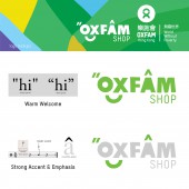
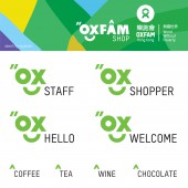
| DESIGN NAME: Oxfam Shop Hong Kong PRIMARY FUNCTION: Logo Identity INSPIRATION: We have become used to shopping for the best discounts on mass produced items. However, we know that this can put unfair market pressure on producers or smallholder farmers from poor communities. Change is possible though! By developing Fair Trade, adopting organic agriculture and advocating production which is good to nature, we are putting our focuses back on the lives of small producers and the environment instead of profits of big corporation. UNIQUE PROPERTIES / PROJECT DESCRIPTION: Here at the Oxfam Shop, Oxfam Hong Kong is proud to bring you a world of quality through Oxfam’s Fair Trade products as well as locally produced products from various social enterprises. Oxfam Fair Trade guarantees a long term collaboration with cooperatives. Through purchasing these products, you are supporting small producers and farmers, and are helping to building a better world. World without poverty is not only a dream, take action to support fair trade, enjoy the happy shopping experience. OPERATION / FLOW / INTERACTION: Quotation Mark - to indicate a passage of particular importance. Accent Mark - to emphasis a syllable or word in speech by stress or pitch. Both of above would like to invite public to shop for change! We want every customer speaks in Oxfam language, enjoy the happy experience and support the well selected local and imported fairtrade products in Oxfam Shop Hong Kong. PROJECT DURATION AND LOCATION: The project started in April 2017 and the Oxfam Shop opened on November 8th in Jardine House, Central, Hong Kong FITS BEST INTO CATEGORY: Social Design |
PRODUCTION / REALIZATION TECHNOLOGY: World without poverty is not only a dream, take action to support fair trade, enjoy the happy shopping experience. An enjoyable and happy job is fundamental to a happy life. Oxfam Shop is devoted to creating a variety of opportunities for development for the members of the community, so that they can balance family and work whilst earning money in a respectable way. This means more workers have the opportunity to benefit from fairer terms of trade and invest additional income from Fairtrade sales in developing and improving their communities. SPECIFICATIONS / TECHNICAL PROPERTIES: Official Oxfam Tstar Pro and Global Headline corporate fonts had been applied in the logotype in order to align with the Oxfam International. The Quotation mark and accent mark on logotype represented a distinctive way of giving a warm welcome to every customer, Through purchasing the fair trade products, you are supporting small producers and farmers, and are helping to building a better world. World without poverty is not only a dream, take action to support fair trade, enjoy the happy shopping experience. TAGS: Oxfam, fairtrade, farmer, social, retail RESEARCH ABSTRACT: Together, we are striving to tackle social and environmental issues through advocating ethical consumption and providing job opportunities for disadvantaged groups. Oxfam Shop acts as a platform to welcome everyone to join as an Oxfam Shopper, supporting fair trade and ethical consumption to build a better world. CHALLENGE: Since we have to stick to the name with Oxfam wording as shop name, in order to avoid confusions with the official Oxfam logo, we tried different approaches and adaptation with Oxfam corporate fonts and created a happy face to present the attitude behind the mission of Oxfam Hong Kong. ADDED DATE: 2018-04-01 08:38:44 TEAM MEMBERS (2) : Leo P. H. Chan - Creative Director and Kobe So - Designer IMAGE CREDITS: Leo Chan and Kobe So, 2017. |
||||
| Visit the following page to learn more: http://www.facebook.com/OxfamShopHongKon |
|||||
| AWARD DETAILS | |
 |
Oxfam Shop Hong Kong Logo Identity by Leo Chan and Kobe So is Winner in Graphics, Illustration and Visual Communication Design Category, 2017 - 2018.· Read the interview with designer Leo Chan and Kobe So for design Oxfam Shop Hong Kong here.· Press Members: Login or Register to request an exclusive interview with Leo Chan and Kobe So. · Click here to register inorder to view the profile and other works by Leo Chan and Kobe So. |
| SOCIAL |
| + Add to Likes / Favorites | Send to My Email | Comment | Testimonials | View Press-Release | Press Kit |
Did you like Leo Chan and Kobe So's Graphic Design?
You will most likely enjoy other award winning graphic design as well.
Click here to view more Award Winning Graphic Design.


