TEDx University of Guilan Visual Identity by Nima Rahimiha and Mohammad Hossein Naghibi |
Home > Winners > #66790 |
 |
|
||||
| DESIGN DETAILS | |||||
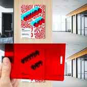
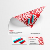
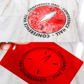
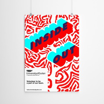
| DESIGN NAME: TEDx University of Guilan PRIMARY FUNCTION: Visual Identity INSPIRATION: The overarching vision of TEDx is seeing the world through innovative ideas to gain a deeper understanding. Pertaining to this theme, Inside-Out targeted the color red- the original identity color for TEDx- as a color filter to demonstrate two different perspectives of one subject. The aim was to use the color filter technique to help the audience see a complex subject more clearly and coherently from a different angle. In line with the mission of TEDx, this design wanted to let the user see both the inner and outer worlds of a subject in a holistic manner. UNIQUE PROPERTIES / PROJECT DESCRIPTION: We were asked to design an identity for the TEDx event that could interact with the audience about the subject matter and the main theme. Part of the client's brief for the main theme required Inside-Out to have a different outlook and rise above the conventional existing designs: "A new point of view to the aspects of life that seemed to be concealed by the routines of daily life". The challenge was to integrate the context of inner and outer worlds in one poster which was comprehensible and yet aesthetically pleasing. OPERATION / FLOW / INTERACTION: We used a red transparent plastic cover for attendees to filter the light by colors. This enabled us to remove the complexity of a visual subject to show the concept of Inside-Out. In other words, with the help of the filter something complex becomes simpler to understand by eliminating all colors and drawing the focus to the main topic on the red cover. The process of using the red filter engaged the audience to be a part of this design by allowing them to experience the perception of inner and outer meanings dynamically. PROJECT DURATION AND LOCATION: The project design started in April 2017 and was finished in June 2017 and was officially showcased in the TEDx event in Guilan, Iran on July 14, 2017. FITS BEST INTO CATEGORY: Graphics, Illustration and Visual Communication Design |
PRODUCTION / REALIZATION TECHNOLOGY: The presented medium for the work was primarily using a posters (Various dimensions) and regular prints for stationary items used for the event. Stickers were also printed for the venue and used on the walls. An agenda booklet for the event's programs was also printed and handed out to each attendee. A website was also designed for the purpose of larger outreach with the same design concept of Inside-Out represented in the overall layout of the web page. SPECIFICATIONS / TECHNICAL PROPERTIES: - TAGS: Visual Identity, Logo,stationery,post RESEARCH ABSTRACT: - CHALLENGE: The crucial aspect of the design was to accommodate two design concepts in one image. At the same time, the overall message was meant to be understandable with or without the red filter. ADDED DATE: 2018-03-04 11:13:14 TEAM MEMBERS (2) : Nima Rahimiha and Mohammad Hossein Naghibi IMAGE CREDITS: Nima Rahimiha and Mohammad Hossein Naghibi, 2017. |
||||
| Visit the following page to learn more: http://rahimiha.com/project/tedx | |||||
| AWARD DETAILS | |
 |
Tedx University of Guilan Visual Identity by Nima Rahimiha and Mohammad Hossein Naghibi is Winner in Graphics, Illustration and Visual Communication Design Category, 2017 - 2018.· Read the interview with designer Nima Rahimiha and Mohammad Hossein Naghibi for design TEDx University of Guilan here.· Press Members: Login or Register to request an exclusive interview with Nima Rahimiha and Mohammad Hossein Naghibi. · Click here to register inorder to view the profile and other works by Nima Rahimiha and Mohammad Hossein Naghibi. |
| SOCIAL |
| + Add to Likes / Favorites | Send to My Email | Comment | Testimonials | View Press-Release | Press Kit |
Did you like Nima Rahimiha and Mohammad Hossein Naghibi's Graphic Design?
You will most likely enjoy other award winning graphic design as well.
Click here to view more Award Winning Graphic Design.


