The Biggie Restobar by Nidhish Kurup |
Home > Winners > #66466 |
 |
|
||||
| DESIGN DETAILS | |||||
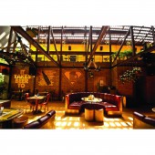
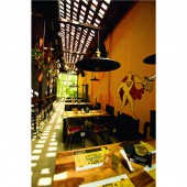
| DESIGN NAME: The Biggie PRIMARY FUNCTION: Restobar INSPIRATION: The existing trees on site and around it was a great inspiration. The structure was designed to frame the available greenery and celebrate them. The open terrace on top was also designed below the existing tree canopy. The name The beer cafe, Biggie was another inspiration to create a space that is larger than life and big, yet warm and comforting like a cafe. Finally, Beer was itself a great inspiration with a number of interior and branding elements celebrating this piece de resistance. UNIQUE PROPERTIES / PROJECT DESCRIPTION: Designed to resemble an abandoned warehouse, the biggie started as an old house with a separate garage. A new MS structure was conceived to connect and envelop the two existing structures and create a large double height central seating space. The first floor looks into this space and the entire volume opens out to the garden behind with existing trees. The old areas were renovated to match the new spaces. Clay tile roof with glass inserts bring in a play of light and shadow patterns all through the day. OPERATION / FLOW / INTERACTION: The Biggie was deliberately designed with a muted elevation and a narrow entrance passage that gives little idea about the amount of space on offer inside. The guests are led through a narrow entrance passage along a water body with flooring resembling flowing beer. This leads to the foyer with a feature wall that creates an illusion of infinite beer bottles. The central seating area and the volume of the space comes as a surprise. The entire first floor looks into this space which also houses the long bar counter and a small stage for performances. The flooring here is designed to look like rising beer froth when viewed from the upper floor. The whole space frames the landscape behind and opens out to more seating in the garden. The old structure with smaller volumes were designed to be a small lounge and meeting room which can also be cordoned off into a private party area with its own cozy outdoor space. PROJECT DURATION AND LOCATION: The design for the project started in March 2015. The project hit site in July 2015 and was completed by March 2016. FITS BEST INTO CATEGORY: Architecture, Building and Structure Design |
PRODUCTION / REALIZATION TECHNOLOGY: Texture painted mild steel members for the new structure. Clay roof tiles, clay underlay tiles and clay tiles with glass inserts for roofing. Exposed brick walls and fiber reinforced cement board for partitions. A combination of yellow oxide floor and polished cement tiles for the flooring in the central seating area. Vitrified tiles and laminated wooden flooring in other areas. Polished concrete, black kadappa stone, polished jaisalmer stone, composite decking planks and artificial turf for external deck and terrace flooring. SPECIFICATIONS / TECHNICAL PROPERTIES: Site area: 489 sq.m Built up area: 405 sq.m Deck and terrace area: 223 sq.m TAGS: architecture, cafe, bar, bangalore, india, beer, biggie RESEARCH ABSTRACT: To use the existing load bearing single storey structure, the top floor was designed to be light-weight with a mild steel framework and fiber reinforced cement board partition walls. To make the space as interesting during the day as it is during the night, clay tiles with glass inserts were used to have a play of light and shadow. A number of beer elements were designed to highlight the central feature of the space, beer. These include the flowing beer floor at the entrance, the infinite beer bottle wall feature at the foyer, the rising beer froth flooring in the central seating space, back-lit beer bottles as feature along the bar, Oktoberfest figurines for toilet signs, the beer skyline and the biggie man artwork along the main wall panel in the first floor and a number of other bold branding elements. CHALLENGE: Speed of construction, the cost of the structure and the weight of the materials used were some of the challenges while designing the Biggie. The existing load bearing single storey structure was retained to save on time and money. The new structure was designed with Mild steel structural members which while adding to the feel of an abandoned warehouse also aids in quicker construction and in saving weight that is being loaded over the existing structure. The wall panels in the first floor were all cement board panels for the same reasons. Another challenge was to design a space with a big volume justifying the larger than life image of the brand 'Biggie' while still retaining the warm and cozy character of a cafe. The most important challenge was to retain and highlight all the existing trees and plants on site and around it and making it a part of the user experience. ADDED DATE: 2018-02-28 15:42:36 TEAM MEMBERS (5) : Architect: Nidhish Kurup, Architect: Chaitra Saraf, Architect: Shruti Bihani, Site co-ordinator: Alex Paul and Architectural Intern: Sthuthi Kiran K T IMAGE CREDITS: Photographer: Nikhil Valsaraj PATENTS/COPYRIGHTS: Copyrights belong to zerogravity studio, 2016. |
||||
| Visit the following page to learn more: https://www.zerogravitystudio.in | |||||
| AWARD DETAILS | |
 |
The Biggie Restobar by Nidhish Kurup is Winner in Architecture, Building and Structure Design Category, 2017 - 2018.· Read the interview with designer Nidhish Kurup for design The Biggie here.· Press Members: Login or Register to request an exclusive interview with Nidhish Kurup. · Click here to register inorder to view the profile and other works by Nidhish Kurup. |
| SOCIAL |
| + Add to Likes / Favorites | Send to My Email | Comment | Testimonials | View Press-Release | Press Kit |
Did you like Nidhish Kurup's Architecture Design?
You will most likely enjoy other award winning architecture design as well.
Click here to view more Award Winning Architecture Design.


