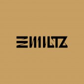
Kanji-Line: Tengafuchin Typography art by Mitsuru Kamikubo |
Home > Winners > #65776 |
 |
|
||||
| DESIGN DETAILS | |||||
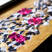
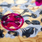
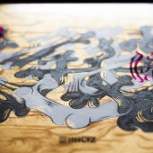
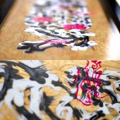
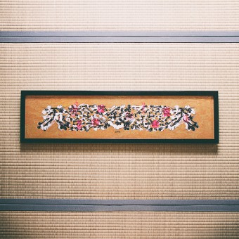
| DESIGN NAME: Kanji-Line: Tengafuchin PRIMARY FUNCTION: Typography art INSPIRATION: Work inspired by beard letters, graffiti art and calligraphy, which is a traditional Japanese style of letters. UNIQUE PROPERTIES / PROJECT DESCRIPTION: These works were created as a series exploring Kanji and street art. One rule of writing is that a character only takes on its meaning after its last stroke has been drawn. Any lines that violate this principle are only "lines" and are not recognized as having any meaning. However, people also explore meaning while partially following this principle and still exploring combinations outside of its jurisdiction. The Kanji-Line series of works utilizes the forms of Chinese characters as "characters&quo OPERATION / FLOW / INTERACTION: This work searched for the relationship between letters and pictures. Kanji used in some Asian countries is originally a picture changed to letters. By decomposing kanji into pictures again, I drew a pattern that attracted people's attention. PROJECT DURATION AND LOCATION: The project started in February 2017 and finished in May 2017 in Tokyo. FITS BEST INTO CATEGORY: Fine Arts and Art Installation Design |
PRODUCTION / REALIZATION TECHNOLOGY: picture:Acrylic paint, Stencil, Fluorescent spray flame:wood, paint SPECIFICATIONS / TECHNICAL PROPERTIES: size:W1035 x H250 x D24mm TAGS: typography, japan, kanji, graffiti, tokyo, wa, zen, graphics, china, RESEARCH ABSTRACT: I tried to combine a unique Japanese culture with graffiti art outside Japan to try new expressions. It is very important to inherit the old culture to the next generation, but I think that cultivating a new culture is a work born by trying a new method in the old culture. Besides, even if you create another pattern with the technology in the past you will not be able to draw people's interests. I will continue to explore new expressions using "kanji". CHALLENGE: The more difficult problem is the shape of a motif. It has a shape like a charactor, but it is not a charactor. It looks like a picture, but it looks like a charactor. I looked for boundaries that viewers could read and could not read. At the same time it must be a comfortable line. Before taking a brush I used the most time to figure out what shape it is. ADDED DATE: 2018-02-27 04:46:40 TEAM MEMBERS (1) : IMAGE CREDITS: IMAGE CREDITS: Image #1: MILTZ Image #2: MILTZ Image #3: MILTZ Image #4: MILTZ Image #5: MILTZ Video: MILTZ PDF: MILTZ PATENTS/COPYRIGHTS: Copyrights belong to Mitsuru Kamikubo, Year 2017. |
||||
| Visit the following page to learn more: http://bit.ly/2ET7Nbh | |||||
| AWARD DETAILS | |
 |
Kanji-Line: Tengafuchin Typography Art by Mitsuru Kamikubo is Winner in Fine Arts and Art Installation Design Category, 2017 - 2018.· Read the interview with designer Mitsuru Kamikubo for design Kanji-Line: Tengafuchin here.· Press Members: Login or Register to request an exclusive interview with Mitsuru Kamikubo. · Click here to register inorder to view the profile and other works by Mitsuru Kamikubo. |
| SOCIAL |
| + Add to Likes / Favorites | Send to My Email | Comment | Testimonials | View Press-Release | Press Kit |
Did you like Mitsuru Kamikubo's Fine Art Design?
You will most likely enjoy other award winning fine art design as well.
Click here to view more Award Winning Fine Art Design.


