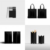
BTS Brand Identity Design by PlusX and BigHit Entertainment |
Home > Winners > #65466 |
| CLIENT/STUDIO/BRAND DETAILS | |
 |
NAME: BigHit Entertainment PROFILE: Big Hit Entertainment is a South Korean entertainment company established in 2005 by Bang Si-hyuk. It currently manages the singer Lee Hyun and idol group BTS. In particular, BTS has a history of winning the brand identity 'winner' prize at the 2018 iF Awards. |
| AWARD DETAILS | |
 |
Bts Brand Identity Design by Plusx and Bighit Entertainment is Winner in Graphics, Illustration and Visual Communication Design Category, 2017 - 2018.· Read the interview with designer PlusX and BigHit Entertainment for design BTS here.· Press Members: Login or Register to request an exclusive interview with PlusX and BigHit Entertainment. · Click here to register inorder to view the profile and other works by PlusX and BigHit Entertainment. |
| SOCIAL |
| + Add to Likes / Favorites | Send to My Email | Comment | Testimonials | View Press-Release | Press Kit |
Did you like Plusx and Bighit Entertainment's Graphic Design?
You will most likely enjoy other award winning graphic design as well.
Click here to view more Award Winning Graphic Design.


