Relux Logo by Kei Sato |
Home > Winners > #64888 |
 |
|
||||
| DESIGN DETAILS | |||||
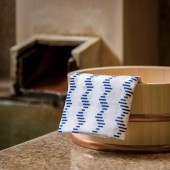
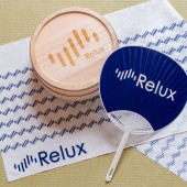
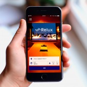
| DESIGN NAME: Relux PRIMARY FUNCTION: Logo INSPIRATION: The seven lines in the symbol represent the biorhythm of our feelings such as joy, sadness, or surprise, as well as each of the seven days of the week. This is intended to convey that "Relux" is there for how you feel each and every day. The poster uses this symbol with a various colors to represent our wide range of feelings as human beings and the experience of discovering new lodging on our journeys. UNIQUE PROPERTIES / PROJECT DESCRIPTION: This is the logo design and branding for "Relux", an internet service for making reservations at lodging facilities. "Relux" is a combination of the words "relax" and "luxury", as the service carefully selects only high-class lodging facilities for its users. OPERATION / FLOW / INTERACTION: By using a symbol to create a unique Japanese pattern design for "Relux", I was able to allow it to function as a motif which gives a sense of unity to the brand when developing posters, merchandise, and other products. PROJECT DURATION AND LOCATION: This project began in March 2016 in Tokyo. The logo was finished in July 2016, and I went on to create posters, promotional items, and a brand movie. I am continuing to work on the branding at the present time as well. FITS BEST INTO CATEGORY: Graphics, Illustration and Visual Communication Design |
PRODUCTION / REALIZATION TECHNOLOGY: The seven lines in the symbol was designed using the golden ratio. I considered many design factors, including the length, thickness, number, angle, and roundness of the lines, and, in the end, was able to create a symbol with a shape that is pleasing to the eye. SPECIFICATIONS / TECHNICAL PROPERTIES: (Poster)Width728mm x Height1030mm (Wall Poster)Width2912mm x Height2060mm (Round Fan)Width295mm x Height420mm (Hand towel)Width900mm x Height330mm (Round Plastic Wash Basin)Width225mm x Height115mm TAGS: Symbol, Logo, Branding, Poster, Stationary, Goods, Web, Line, Japan RESEARCH ABSTRACT: There are many online lodging reservation services in competition in the world today. In order to show the individuality of "Relux" and distinguish it from similar services, I performed thorough research on the logo design, brand colors, and characteristics of their competition. For this symbol, I researched the movement patterns of an electrocardiogram graph for a person at rest. CHALLENGE: Rather than a design which functions only as a symbol, I kept in mind the idea of allowing the design to function as a pattern as well when creating it. By linking the seven lines in the symbol together in repetition, I was able to create a powerful branding for "Relux" and evolve the design into a new, modern version of traditional Japanese patterning. ADDED DATE: 2018-02-23 07:36:51 TEAM MEMBERS (1) : Art Director: Kei Sato, Graphic Designer: Kei Sato, Photographer: Kenichi Shimoyana IMAGE CREDITS: Image #1: Art Director Kei Sato Image #2: Art Director Kei Sato Image #3: Art Director Kei Sato Image #4: Art Director Kei Sato Image #5: Art Director Kei Sato PATENTS/COPYRIGHTS: Copyrights belong to Number8 Creative Inc., 2018. Copyrights belong to Loco Partners Inc., 2018. |
||||
| Visit the following page to learn more: http://rlx.jp | |||||
| AWARD DETAILS | |
 |
Relux Logo by Kei Sato is Winner in Graphics, Illustration and Visual Communication Design Category, 2017 - 2018.· Read the interview with designer Kei Sato for design Relux here.· Press Members: Login or Register to request an exclusive interview with Kei Sato. · Click here to register inorder to view the profile and other works by Kei Sato. |
| SOCIAL |
| + Add to Likes / Favorites | Send to My Email | Comment | Testimonials | View Press-Release | Press Kit |
Did you like Kei Sato's Graphic Design?
You will most likely enjoy other award winning graphic design as well.
Click here to view more Award Winning Graphic Design.


