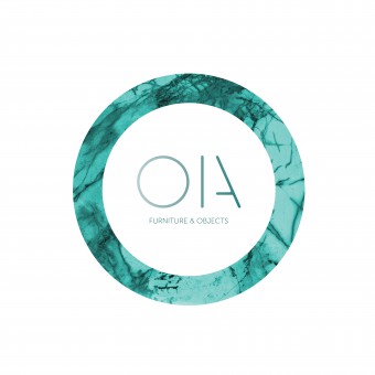
OIA Furniture and Objects Corporate Identity by Andre Teoman |
Home > Winners > #64206 |
 |
|
||||
| DESIGN DETAILS | |||||
| DESIGN NAME: OIA Furniture and Objects PRIMARY FUNCTION: Corporate Identity INSPIRATION: OIA was inspired in a fictional futuristic minimalistic universe created to give the brand a unique brand DNA. Before any sketch or names the initial moodboard was filled with visual imagery from works such as Space Odissey to Bladerunner combining different views of the future. We knew that it had to be duo-syllable and shouldn't be a descriptive word, it should just sound like a futuristic language. The logo was made as visual system that would adapt to different communication factors. UNIQUE PROPERTIES / PROJECT DESCRIPTION: Oia is a new brand from the BARMAT group. The differentiating industrial factor of the company was thin laminated marbles from all around the world. This factor made it focused on minimalist and futuristic objects that could be produced by BARMAT. The idea was to differentiate the producer from the brand. This way the group can show what it best do in international shows and events all around the world at the same time it takes a small step to grow a new brand in the design market. The idea was to create much more than a simple brand that sells products but one with a unique identity. OPERATION / FLOW / INTERACTION: All the work flow created in the website was inspired in a living organism. Instead of just open tabs and different links it was intended to create a website that would work always on the same space by opening parts that would give you access to other information. This experience was brought to other aspects of the brand such as the brochure and even the stand. PROJECT DURATION AND LOCATION: The project started in the end of January of 2017 and was presented at Maison et Objet in September of 2017. FITS BEST INTO CATEGORY: Graphics, Illustration and Visual Communication Design |
PRODUCTION / REALIZATION TECHNOLOGY: We reasearched a lot of spatial industry details. Like the crosses of nasa pictures or the fact that all their documentation is filled with markers over what's been written and translated it to our brochures and website. Or simple movie imagery of what the future will look like was the inspiration to create the brand presentation stand at Maison et Objet 2017. We had the luck to be creating this from scratch alongside with the products and all its visual identity and that was a benefical factor to create a brand that would reflect the future in all it's aspects without focusing on the use of digital technology. SPECIFICATIONS / TECHNICAL PROPERTIES: There were not much restrictions in terms of the dimensions for the corporate branding, mostly were taken in considerations standard dimensions for the products and that the comunication would work in all mobile devices. TAGS: graphic design, futuristic, minimalistic, portuguese brand, furniture and objects, marble, portugal RESEARCH ABSTRACT: Before we even started sketching or changing name ideas, we built a visual mood board of good futuristic references allied to good minimalistic life examples. That was the backbone of the entire project. The decision to ally this two visual references was because the client wanted a brand that would use marble in high quality products allied to an accessible price range. We couldn't go crazy with forms and experiences that would increase the product price so all the brand identity was created around what this product would look like. Hence the decision to start the project with only visual imagery even before drafting the brand itself. CHALLENGE: The big challenge was mostly about timing. We wanted to present the brand in the same year we started conversations and that made us focus mostly on this project for a year. And my personal style. My studio has a very emotional aspect in all projects that we are involved in so we had to adapt these emotions to details that would fit in a fictional universe that OIA represents. ADDED DATE: 2018-02-16 10:34:10 TEAM MEMBERS (1) : IMAGE CREDITS: André Teoman Studio |
||||
| Visit the following page to learn more: http://www.oia.design/ | |||||
| AWARD DETAILS | |
 |
Oia Furniture and Objects Corporate Identity by Andre Teoman is Winner in Graphics, Illustration and Visual Communication Design Category, 2017 - 2018.· Read the interview with designer Andre Teoman for design OIA Furniture and Objects here.· Press Members: Login or Register to request an exclusive interview with Andre Teoman. · Click here to register inorder to view the profile and other works by Andre Teoman. |
| SOCIAL |
| + Add to Likes / Favorites | Send to My Email | Comment | Testimonials | View Press-Release | Press Kit |
Did you like Andre Teoman's Graphic Design?
You will most likely enjoy other award winning graphic design as well.
Click here to view more Award Winning Graphic Design.


