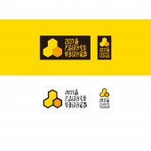
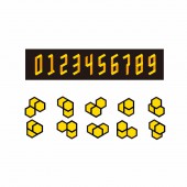
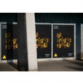
The 2017 Product Design Exhibition Graduation Design Exhibition by Yinan Lyu, Vin Wen and Xi Chou |
Home > Winners > #64012 |
| CLIENT/STUDIO/BRAND DETAILS | |
 |
NAME: Calx Station PROFILE: Calx Station® is a beyond and advanced Brand & Digital Marketing service group in China. Calx Station® was founded in 2011, Beijing, China. With in huge brand marketing and digital marketing experience, we had successful served for over 100 Asian clients and brands in 15 industries. |
| AWARD DETAILS | |
 |
The 2017 Product Design Exhibition Graduation Design Exhibition by Yinan Lyu, Vin Wen and Xi Chou is Winner in Graphics, Illustration and Visual Communication Design Category, 2017 - 2018.· Read the interview with designer Yinan Lyu, Vin Wen and Xi Chou for design The 2017 Product Design Exhibition here.· Press Members: Login or Register to request an exclusive interview with Yinan Lyu, Vin Wen and Xi Chou. · Click here to register inorder to view the profile and other works by Yinan Lyu, Vin Wen and Xi Chou. |
| SOCIAL |
| + Add to Likes / Favorites | Send to My Email | Comment | Testimonials | View Press-Release | Press Kit |
Did you like Yinan Lyu, Vin Wen and Xi Chou's Graphic Design?
You will most likely enjoy other award winning graphic design as well.
Click here to view more Award Winning Graphic Design.


