Guapos Wine Label by Cesar Moura |
Home > Winners > #62826 |
 |
|
||||
| DESIGN DETAILS | |||||
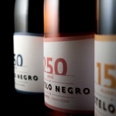
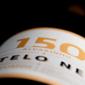
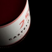
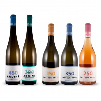
| DESIGN NAME: Guapos PRIMARY FUNCTION: Wine Label INSPIRATION: Modernity, diference, quality. These were the conceptual pillars for this project. Inspired by the landscapes that the North of Portugal offers, the sense of serenity and the altitude where the vineyards grow. This collection is born through a modern touch combined with an intellectual Nipponese approach and the cleanliness of Nordic tendencies. UNIQUE PROPERTIES / PROJECT DESCRIPTION: The main foundation of this company is simple but powerful: family. The challenge was to create two different brands that shared the same corporate identity, binding them together. That can be seen when the bottles are all aligned, the top-edge of the label makes a wavy line connecting all of them, this symbolizes the altitude where the vineyards grow. OPERATION / FLOW / INTERACTION: The different labels for this brand were designed to work as a group when displayed inline on a shelf, the image and the lines created when looking at them reminds us of Portuguese landscapes, where this wine is born. At the same time when held by the consumer, each label has its own personality. A different color represents a different grape variety, combined with the finishing touches that bring the label to life. PROJECT DURATION AND LOCATION: The project started in December 2016 and finished in March 2017. FITS BEST INTO CATEGORY: Packaging Design |
PRODUCTION / REALIZATION TECHNOLOGY: The chosen fine paper (Waterproof), the different edge of each label and the varnish on the letters brings to life the pretended elegance. The choice of the materials and final touches were meticulously planned to make the bottle stand out when held by the consumer. SPECIFICATIONS / TECHNICAL PROPERTIES: 260mm x 88mm Offset print with a special edge and varnish TAGS: wine, premium, varnish, quality, paper, details RESEARCH ABSTRACT: The design was reached by looking outside from the Portuguese wine label. Countries such as Argentina, New Zealand and Australia, have lots of amazing wine labels, full of quality on their soul. Internet research on blogs, behance, world wide portfolios, gave me the capability to develop a unic work. CHALLENGE: Thinking outside the box is always difficult. To create a collection where all the bottles interact with each other was the main goal for this project. ADDED DATE: 2017-12-27 16:54:36 TEAM MEMBERS (1) : IMAGE CREDITS: Photographer: César Moura |
||||
| Visit the following page to learn more: http://bit.ly/2pJpJD4 | |||||
| AWARD DETAILS | |
 |
Guapos Wine Label by Cesar Moura is Winner in Packaging Design Category, 2017 - 2018.· Read the interview with designer Cesar Moura for design Guapos here.· Press Members: Login or Register to request an exclusive interview with Cesar Moura. · Click here to register inorder to view the profile and other works by Cesar Moura. |
| SOCIAL |
| + Add to Likes / Favorites | Send to My Email | Comment | Testimonials | View Press-Release | Press Kit | Translations |
Did you like Cesar Moura's Packaging Design?
You will most likely enjoy other award winning packaging design as well.
Click here to view more Award Winning Packaging Design.


