Spring Town Corporate Identity by Li Zhenhua and Huang Wei |
Home > Winners > #62243 |
 |
|
||||
| DESIGN DETAILS | |||||
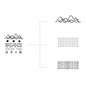
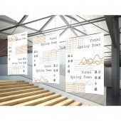
| DESIGN NAME: Spring Town PRIMARY FUNCTION: Corporate Identity INSPIRATION: It's a sign of a hot spring town, a town in the mountains. Therefore, the creative ideas of signs come from mountains, water and people, and people live in harmony with the natural environment. UNIQUE PROPERTIES / PROJECT DESCRIPTION: This is a Chinese element style logo design, but it is made up of dots and lines, with contemporary aesthetic. It has a very deep representative of Chinese culture. OPERATION / FLOW / INTERACTION: Operation with the computer software Photoshop. PROJECT DURATION AND LOCATION: The project started in June 2016 in Jingdezhen and finished in August 2017 in Jingdezhen, and was exhibited in Jingdezhen in August 2017. FITS BEST INTO CATEGORY: Graphics, Illustration and Visual Communication Design |
PRODUCTION / REALIZATION TECHNOLOGY: The logo is designed with hand drawn sketches and synthesized by computer software. SPECIFICATIONS / TECHNICAL PROPERTIES: To determine the size according to the need to print the file. TAGS: Hot spring, logo, design, brand RESEARCH ABSTRACT: The logo was designed to orient the aesthetic and Western aesthetic combination. Chinese point, line and surface elements with the perfect combination of feeling. It is representative of the relationship between people and heaven and earth, ecological environment. CHALLENGE: The most difficult part of this design is how to design a fusion of Chinese culture and Western aesthetics. ADDED DATE: 2017-11-12 15:14:11 TEAM MEMBERS (2) : Director: Li Zhenhua and Graphic Designer: Huang Wei IMAGE CREDITS: Image #1: Director, Li Zhenhua Image #2: Graphic Designer, Huang Wei Image #3: Graphic Designer, Huang Wei Image #4: Director, Li Zhenhua |
||||
| Visit the following page to learn more: http://www.jxgymy.com/ | |||||
| AWARD DETAILS | |
 |
Spring Town Corporate Identity by Li Zhenhua and Huang Wei is Winner in Graphics, Illustration and Visual Communication Design Category, 2017 - 2018.· Read the interview with designer Li Zhenhua and Huang Wei for design Spring Town here.· Press Members: Login or Register to request an exclusive interview with Li Zhenhua and Huang Wei. · Click here to register inorder to view the profile and other works by Li Zhenhua and Huang Wei. |
| SOCIAL |
| + Add to Likes / Favorites | Send to My Email | Comment | Testimonials | View Press-Release | Press Kit |
Did you like Li Zhenhua and Huang Wei's Graphic Design?
You will most likely enjoy other award winning graphic design as well.
Click here to view more Award Winning Graphic Design.


