Cocofamilia Logo and VI by Kazuaki Kawahara |
Home > Winners > #62052 |
 |
|
||||
| DESIGN DETAILS | |||||
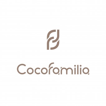
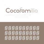
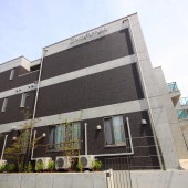
| DESIGN NAME: Cocofamilia PRIMARY FUNCTION: Logo and VI INSPIRATION: Within the logo is embedded the message 'forming a bridge to the heart', which is derived from the building's slogan ('Together, from the heart, like family') and 'Good Bridge Group', the name of the corporate group to which the company that operates Cocofamilia belongs. Whenever viewers see this logo, it will remind them of their own guiding principles and sense of existential meaning. We have named the monogram, with its 'f' motif, the 'f-chain'. UNIQUE PROPERTIES / PROJECT DESCRIPTION: Cocofamilia is an upscale rental apartment building for seniors, with nursing and medical services. It is located in Numazu, Shizuoka Prefecture, Japan. We have provided Cocofamilia with services including name development, logo design, and advertising design. OPERATION / FLOW / INTERACTION: The message hidden within the logo has earned great reviews, both from within the company and from the outside. PROJECT DURATION AND LOCATION: The project started in August 2016 in Japan and finished in July 2017 in Japan. FITS BEST INTO CATEGORY: Graphics, Illustration and Visual Communication Design |
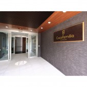
PRODUCTION / REALIZATION TECHNOLOGY: When the 'f' is read as an 'r', and the 'a' is read as an 'o', the word 'Cocoro' - which means 'heart' in Japanese - emerges. Seeing this in conjunction with the shape of an arch bridge, as found in the 'm', reveals the 'forming a bridge to the heart' message. Giving distinctive shapes to the letters 'f', 'a', and 'm' made it possible to hide the message 'forming a bridge to the heart' in the logo. Specifically, the 'f' is also an 'r', while the 'a' is also an 'o'. The 'm' carries on the distinctive shaping approach of this 'f'. At the same time, we were also able to embed a shape within it that is reminiscent of an arch bridge. We have named this monogram, which uses the 'f' from the logo as a motif, the 'f-chain'. It has also been put to use in a variety of places. It represents the connections between the building's staff, the tenants, and the tenants' families. SPECIFICATIONS / TECHNICAL PROPERTIES: The logo and visual identity system are used in a variety of tools, including brochures and signage. TAGS: logo, VI, cocofamilia, f-chain, embedded, name development, branding RESEARCH ABSTRACT: Among other companies' rental flats for seniors, many are low-priced, with low-quality services. In this case, we were called upon to provide a design with a high-quality sensibility that would draw a line between Cocofamilia and these other buildings. CHALLENGE: Given that it needed to be a design that conveyed an upscale sensibility and a sense of universality, our biggest challenges were how to embed a hidden message within this design, and how to give it both the durability and the practical usability that would allow it to be used in any setting. In the end, we feel that we were able to solve all of these problems. ADDED DATE: 2017-10-24 04:20:57 TEAM MEMBERS (1) : Art Director/Designer : Kazuaki Kawahara IMAGE CREDITS: Kazuaki Kawahara, 2017. |
||||
| Visit the following page to learn more: http://www.latona-m.com | |||||
| AWARD DETAILS | |
 |
Cocofamilia Logo and Vi by Kazuaki Kawahara is Winner in Graphics, Illustration and Visual Communication Design Category, 2017 - 2018.· Read the interview with designer Kazuaki Kawahara for design Cocofamilia here.· Press Members: Login or Register to request an exclusive interview with Kazuaki Kawahara. · Click here to register inorder to view the profile and other works by Kazuaki Kawahara. |
| SOCIAL |
| + Add to Likes / Favorites | Send to My Email | Comment | Testimonials | View Press-Release | Press Kit | Translations |
Did you like Kazuaki Kawahara's Graphic Design?
You will most likely enjoy other award winning graphic design as well.
Click here to view more Award Winning Graphic Design.


