Ghetaldus Optika Corporate Identity by Studio 33 |
Home > Winners > #61943 |
 |
|
||||
| DESIGN DETAILS | |||||
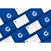
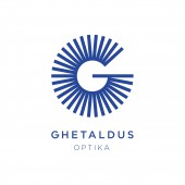
| DESIGN NAME: Ghetaldus Optika PRIMARY FUNCTION: Corporate Identity INSPIRATION: The character G represents the initial of the company, as well as the visual link to the graphical element from the old visual identity. However, this time around it has a completely different function, with modern visual expression. The primary activity of the company Ghetaldus is related to the eye and eyesight. The symbolism of the logo that wants to achieve a high-quality transmission of vision, mission and functions of the brand must clearly present the brand purpose and scope. UNIQUE PROPERTIES / PROJECT DESCRIPTION: Ghetaldus Optics is the largest manufacturer and distributer of glasses and contact lenses on the Croatian market. Ghetaldus Optics was founded in 1957 and used to be a synonym for optics in Croatia. In the transition process the company has lost its distinctiveness. The aim of the new visual identity is not only for the client to pop out as something new, fresh, active and visible, but also to restore customers confidence with clear communication of professionalism, quality and tradition. OPERATION / FLOW / INTERACTION: The new visual identity helped brand to pop out and be the number one optics brand in Croatia. The second stage of branding was creating brand architecture for Optics, Policlinic, Optometry and Private Label, which now has better visibility and makes Ghetaldus brand even better. PROJECT DURATION AND LOCATION: The project started in October 2016 in Zagreb and finished in August 2017 in Osijek. FITS BEST INTO CATEGORY: Graphics, Illustration and Visual Communication Design |
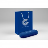
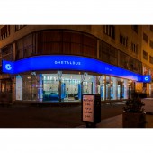
PRODUCTION / REALIZATION TECHNOLOGY: Branding, Identity Implementation, Advertising, Signage, Print, Digital SPECIFICATIONS / TECHNICAL PROPERTIES: There are more than 200 Ghetaldus shops in Croatia, and more than 100 Policlinics. Branding included signage system for different requirements of architecture and urbanism for all the shops, vehicles branding, stationery design, private label products branding (eyeglasses, sunglasses, lenses, lenses fluids), bags, recipes, ... We also created advertising system with 5 different advertisement campaigns and complete image campaigns (Optics, Policlinics) with full marketing coverage (billboards, city-lights, mega-boards, banners, TV, flyers, posters, etc TAGS: logo, corporate identity, branding, ghetaldus, optics, eye, croatia, design, graphic design RESEARCH ABSTRACT: Research before rebranding was conducted in the area of visibility, brand recognition, target audiences, market presence, client evaluation, and overall impact of the Ghetaldus brand as one of the largest optics brands in Croatia. CHALLENGE: Ghetaldus is the largest manufacturer and distributer of glasses and contact lenses in Croatia. Ghetaldus was founded in 1957 and used to be a synonym for ophthalmic optics. In the transition process the company has lost its distinctiveness as a result of poor communication. The aim of the new visual identity is not only to pop out as something fresh, active and visible, but also to restore customers confidence with clear communication of professionalism, quality and tradition. ADDED DATE: 2017-10-11 07:16:58 TEAM MEMBERS (3) : Designer and Creative Director: Leo Vinkovic, Designer and Art Director: Igor Penovic and Designer: Mario Majkic IMAGE CREDITS: Image #5 : Marija Gasparovic (Freelance Photographer) |
||||
| Visit the following page to learn more: http://studio33.rocks | |||||
| AWARD DETAILS | |
 |
Ghetaldus Optika Corporate Identity by Studio 33 is Winner in Graphics, Illustration and Visual Communication Design Category, 2017 - 2018.· Read the interview with designer Studio 33 for design Ghetaldus Optika here.· Press Members: Login or Register to request an exclusive interview with Studio 33. · Click here to register inorder to view the profile and other works by Studio 33. |
| SOCIAL |
| + Add to Likes / Favorites | Send to My Email | Comment | Testimonials | View Press-Release | Press Kit | Translations |
Did you like Studio 33's Graphic Design?
You will most likely enjoy other award winning graphic design as well.
Click here to view more Award Winning Graphic Design.


