SH House Residential by Paulo Martins |
Home > Winners > #61861 |
 |
|
||||
| DESIGN DETAILS | |||||
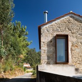
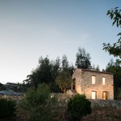
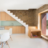
| DESIGN NAME: SH House PRIMARY FUNCTION: Residential INSPIRATION: This renovation was inspired in the past history of the local. The smell of the vineyards and the placidity of the surroundings inspired me to keep things as they deserve to be, in the place they belong without looking for a piece of design disconnected from the feelings and emotions of the place. Even that way, a contemporary language was subtly added to mark the design as contemporary, magnifying the relation with the views. UNIQUE PROPERTIES / PROJECT DESCRIPTION: With the original outline, the only change was in the existing stairwells, through the usage of weathering steel and dimensioning its usage according to the visual weight in order to hierarchize the absence of mass. This way, it was possible to balance the whole building. The original outline was as important as the contemporary style added to the building. Clear colours and a minimalist language were used in order to maximize the bounds and give an idea of wider and open area. OPERATION / FLOW / INTERACTION: This is a house for a weekend break in the countryside. Divided in two floors, the social zone is in the lower floor, maintaining a relationship with the outdoor space, and in the upper level is the bedroom and bathroom. A place for parking is marked with a permeable concrete structure, along with the plot entrance. PROJECT DURATION AND LOCATION: The project started in 2008 and finished in 2016. It is situated in Sever do Vouga, Portugal FITS BEST INTO CATEGORY: Architecture, Building and Structure Design |
PRODUCTION / REALIZATION TECHNOLOGY: The materials used are: Stone, epoxy resin, wood in the first floor, plasterboard and concrete. SPECIFICATIONS / TECHNICAL PROPERTIES: The house has 45 square meters divided in two floors. TAGS: architecture, house, countryside, renovation, stone, minimalism, portugal, concrete, white RESEARCH ABSTRACT: Putting effort in the design and in its relation with the local and the users, more than in the expensive and fancy materials, was an excellent exercise to achieve good results without spending lots of money. It was very important as i've shown to the community that architecture is accessible for everyone. CHALLENGE: The challenge was the debug the existing leaving only the essential, adding just a few elements to balance the building and enhance the whole construction and it's relation with the surroundings. ADDED DATE: 2017-10-05 17:59:44 TEAM MEMBERS (1) : Paulo Martins IMAGE CREDITS: Photographer: ITS. Ivo Tavares Studio |
||||
| Visit the following page to learn more: http://paulomartins.com.pt | |||||
| AWARD DETAILS | |
 |
Sh House Residential by Paulo Martins is Winner in Architecture, Building and Structure Design Category, 2017 - 2018.· Read the interview with designer Paulo Martins for design SH House here.· Press Members: Login or Register to request an exclusive interview with Paulo Martins. · Click here to register inorder to view the profile and other works by Paulo Martins. |
| SOCIAL |
| + Add to Likes / Favorites | Send to My Email | Comment | Testimonials | View Press-Release | Press Kit |
Did you like Paulo Martins' Architecture Design?
You will most likely enjoy other award winning architecture design as well.
Click here to view more Award Winning Architecture Design.


