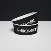
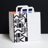
WikiWiki Poke Shop Branding by Joel Derksen |
Home > Winners > #61701 |
 |
|
||||
| DESIGN DETAILS | |||||
| DESIGN NAME: WikiWiki Poke Shop PRIMARY FUNCTION: Branding INSPIRATION: After seeking design studios in Chicago and Michigan, WikiWiki Poke Shop hired us to break out of the category norms: Provenance or "Tiki" cliche Hawaiian language. Instead, his brief was to make something loud, energetic, and jellyfish inspired. With the restaurant being situated in a medium-size city in Michigan, the design brought the feeling of London and Amsterdam to the town. The brand name - Wiki Wiki - allowed for plenty of typographic exploration, resulting in a dynamic identity that can be changed up frequently with its bold visuals. UNIQUE PROPERTIES / PROJECT DESCRIPTION: Wiki Wiki's bold approach to Poke seafood dishes led us to take an equally bold approach: black and white, bold colours, and a dynamic identity. OPERATION / FLOW / INTERACTION: These items are used to house food for take-away. The user receives them upon purchase of a meal. PROJECT DURATION AND LOCATION: Location: Grand Rapids Michigan (client), Amsterdam (designer). 5 months starting March 2016. FITS BEST INTO CATEGORY: Graphics, Illustration and Visual Communication Design |
PRODUCTION / REALIZATION TECHNOLOGY: Paper - bags, cartons and chopsticks. SPECIFICATIONS / TECHNICAL PROPERTIES: Various TAGS: Bold, Branding, Food, Restaurant, Poke, Fast-Casual RESEARCH ABSTRACT: Main research involved developing a shared visual language between client and designer with moodboards and iterative design processes. CHALLENGE: The main challenges were on implementation side, namely finding suppliers to execute on the selected designs. ADDED DATE: 2017-09-30 16:59:00 TEAM MEMBERS (1) : Joel Derksen IMAGE CREDITS: Photographer: Joel Derksen |
||||
| Visit the following page to learn more: http://joelderksen.com/work/wiki-wiki-po |
|||||
| AWARD DETAILS | |
 |
Wikiwiki Poke Shop Branding by Joel Derksen is Winner in Graphics, Illustration and Visual Communication Design Category, 2017 - 2018.· Read the interview with designer Joel Derksen for design WikiWiki Poke Shop here.· Press Members: Login or Register to request an exclusive interview with Joel Derksen. · Click here to register inorder to view the profile and other works by Joel Derksen. |
| SOCIAL |
| + Add to Likes / Favorites | Send to My Email | Comment | Testimonials | View Press-Release | Press Kit |
Did you like Joel Derksen's Graphic Design?
You will most likely enjoy other award winning graphic design as well.
Click here to view more Award Winning Graphic Design.


