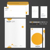
NIEH Creative Studio Brand Identity by Jonathan Nieh |
Home > Winners > #61464 |
 |
|
||||
| DESIGN DETAILS | |||||
| DESIGN NAME: NIEH Creative Studio PRIMARY FUNCTION: Brand Identity INSPIRATION: What inspired me to come up this design is a desire to truly find myself, and to create a logo that will show the world who I am. I just started freelance design career early this year, and I was eager to use this career shifting opportunity to ask myself questions that I could not answer before. Question like who am I? And what kind of person do I want to present myself to the public? UNIQUE PROPERTIES / PROJECT DESCRIPTION: NIEH are the four letters that I carry in the back of my name but it also captures the proud family history in Taiwan. Upon closer inspection, the “i" accentuates the "EH" from the rest representing my connection to Canada for having lived in the land of the free for twenty years. OPERATION / FLOW / INTERACTION: The NIEH logo was not just designed for public appearance but also act as a reminder to myself. As a result, the letters edge have transitioned from sharp to round corners as one must be willing to be flexible and adaptable in order to unlock innovative designs. PROJECT DURATION AND LOCATION: The project started in June 2016 in Taipei and finished in April 2017 in Taipei. FITS BEST INTO CATEGORY: Graphics, Illustration and Visual Communication Design |
PRODUCTION / REALIZATION TECHNOLOGY: The project began with brainstorming connections and generating ideas on paper. Next I challenged myself for each idea I wrote and see if they can be answered in a simple and clear way. After the question and answer stage, I used pencil to start drawing the first round concept designs on paper. SPECIFICATIONS / TECHNICAL PROPERTIES: The minimun size (height) of the logo is 0.5in(approx 1.27cm). The logo is designed in two colors: Pantone Black 6C (primary color) and Pantone Orange 2010C Business card was made with letterpress on wool paper to give it an extra soft hand touch feel. TAGS: brand identity, logo, graphic design, letters, personal RESEARCH ABSTRACT: The NIEH logo was decided to build based on letters from the beginning; therefore, the research was focused on finding the right typeface that can truly represent NIEH. During the research design stage process, the only way is to keep ask questions and experiment different combination of typefaces. CHALLENGE: As this was a logo created to represent my personal brand, I had to ask myself questions from a third person's perspective and really analyze my answers over and over again. There was a lot of dilemma back and forth with what I wanted to convey through my logo. ADDED DATE: 2017-09-29 05:13:07 TEAM MEMBERS (1) : Jonathan Nieh IMAGE CREDITS: Photographer / Illustrator / Designer: Jonathan Nieh |
||||
| Visit the following page to learn more: https://www.niehcreative.com | |||||
| AWARD DETAILS | |
 |
Nieh Creative Studio Brand Identity by Jonathan Nieh is Winner in Graphics, Illustration and Visual Communication Design Category, 2017 - 2018.· Read the interview with designer Jonathan Nieh for design NIEH Creative Studio here.· Press Members: Login or Register to request an exclusive interview with Jonathan Nieh. · Click here to register inorder to view the profile and other works by Jonathan Nieh. |
| SOCIAL |
| + Add to Likes / Favorites | Send to My Email | Comment | Testimonials | View Press-Release | Press Kit |
Did you like Jonathan Nieh's Graphic Design?
You will most likely enjoy other award winning graphic design as well.
Click here to view more Award Winning Graphic Design.


