Feiner Herr Corporate Identity by Hojin Kang and Sebastian Haus |
Home > Winners > #60381 |
 |
|
||||
| DESIGN DETAILS | |||||
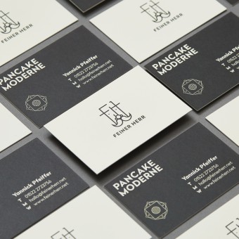
| DESIGN NAME: Feiner Herr PRIMARY FUNCTION: Corporate Identity INSPIRATION: We identified this project as a refreshing new concept in a saturated market: somewhere between tradition and innovation. To stand out we studied traditional design and graphic approaches as well as linguistic specifics and mixed these impressions with the product itself: the pancake's recipes. Trying to break the market's rules and create an identity that would achieve more than just the representation of the product and philosophy. UNIQUE PROPERTIES / PROJECT DESCRIPTION: We translated the food concept, a new take on traditional pancakes, to our corporate identity: tradition meets zeitgeist. From the name, which is an old German description literally meaning a gentleman who creates tasty things, to the craft: a modern-minimalistic interpretation of Art-Deco elements, to create an original and timeless design. The contemporary translation of ornamental tiles allows a variable use and consistent reinterpretation of our concept. OPERATION / FLOW / INTERACTION: The brand Feiner Herr is represented on many occasions in Germany's capital and most creative city: Berlin. From festivals to events, from private clients to large international companies: the cosmopolitan city enjoys the brand and its product so much that it recently led to the opening of the official Feiner Herr Cafe called Cafe Feiner Hubert. Of course, under its original branding. PROJECT DURATION AND LOCATION: The food truck project started in summer 2016 and was launched in early 2017 in Berlin. In spring 2017 Feiner Herr opened the first immobile doors: the Cafe Feiner Hubert. FITS BEST INTO CATEGORY: Graphics, Illustration and Visual Communication Design |
PRODUCTION / REALIZATION TECHNOLOGY: Different technologies were used and mixed: from classic craft and illustration to printing on real floor tiles, from digital design to handmade stamps. SPECIFICATIONS / TECHNICAL PROPERTIES: The Feiner Herr identity is represented through many different supports. Classical print techniques, social media and online formats (such as GIFs), as well as vehicle painting have been used to roll out the design and create attention around both brand and product. But most importantly for a new and delicious product: the word of mouth has spread quickly and consistently since Feiner Herr's creation. TAGS: branding, graphic, logo, corporate identity, pancakes, food truck, design RESEARCH ABSTRACT: When starting our research for the project, we quickly recognized that Feiner Herr was an absolute bull's eye for the branding name. So we studied the designs from the era when Feiner Herr was still commonly used in German. It was important to come up with a concept that is very flexible and easy to roll out. We kept the uniqueness by mixing those design elements with elements taken out of the product itself, based on ingredients and recipes. Which added a tasty part in our documentary research. CHALLENGE: On the one hand finding new perspectives in the booming industry of food-trucks that are refreshing, credible and do embody and sell the product. We did a lot of conceptual steps, sketching and researching before we started the actual design process. On the other hand developing a creative language that is traditional in its core, but is understood in an non-traditional and international surrounding as Berlin: Feiner Herr - Pancake Moderne. ADDED DATE: 2017-09-14 22:13:01 TEAM MEMBERS (3) : Hojin Kang (Concept, Art Direction, Design), Sebastian Haus (Concept, Art Direction, Design) and Johannes Hoeller (Photography) IMAGE CREDITS: Photographer Johannes Hoeller, 2016/2017 |
||||
| Visit the following page to learn more: http://design.feiner-herr.com | |||||
| AWARD DETAILS | |
 |
Feiner Herr Corporate Identity by Hojin Kang and Sebastian Haus is Winner in Graphics, Illustration and Visual Communication Design Category, 2017 - 2018.· Read the interview with designer Hojin Kang and Sebastian Haus for design Feiner Herr here.· Press Members: Login or Register to request an exclusive interview with Hojin Kang and Sebastian Haus. · Click here to register inorder to view the profile and other works by Hojin Kang and Sebastian Haus. |
| SOCIAL |
| + Add to Likes / Favorites | Send to My Email | Comment | Testimonials | View Press-Release | Press Kit |
Did you like Hojin Kang and Sebastian Haus' Graphic Design?
You will most likely enjoy other award winning graphic design as well.
Click here to view more Award Winning Graphic Design.


