Anti-Glitch Foundation Corporate Identity by Papanapa |
Home > Winners > #60372 |
 |
|
||||
| DESIGN DETAILS | |||||
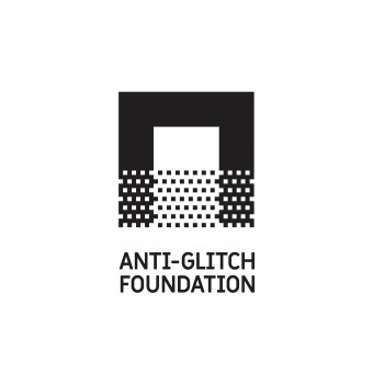
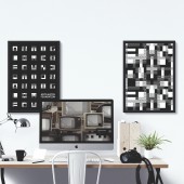
| DESIGN NAME: Anti-Glitch Foundation PRIMARY FUNCTION: Corporate Identity INSPIRATION: Anti-Glitch Foundation is a post-production company and we were asked to develop a new visual identity to represent the technological, creative and automated process behind the brand services. Our research and exploration process lead us to a rich visual universe inspired by the 8 bit language; the incomprehension and inconsistency left by glitches; and the half-tones present on low-res technology. We also incorporated many film structures' concepts such as fragments, montage, exaggeration and conflict, as the fundamental basis for the entire visual system, increasing the narrative within the brand. UNIQUE PROPERTIES / PROJECT DESCRIPTION: With all the visual concepts in mind, an experimental font was completely developed, where each letter is made out of the combination of the two weights on the font set (A and B), bringing all the inspirations together and creating a unique, vibrant and tactile visual universe to be applied throughout the entire brand visual materials and communication. OPERATION / FLOW / INTERACTION: - PROJECT DURATION AND LOCATION: The project had a 3 month duration and since the client is based in a different city, we had a few meetings in Sao Paulo (Brazil) and many others via Skype. FITS BEST INTO CATEGORY: Graphics, Illustration and Visual Communication Design |
PRODUCTION / REALIZATION TECHNOLOGY: Since the the custom-made font is the main player on this project, our method and process during its creation was based in exploring different visual languages until the final idea was conceived and approved. SPECIFICATIONS / TECHNICAL PROPERTIES: - TAGS: Visual Identity, Logo, Branding, Typography, Stationery RESEARCH ABSTRACT: Our research began with an extensive film bibliography, where most of the titles were dedicated to discuss technical concepts and aspects of film making. In the end, we ended up electing Eisenstein's essay "The Cinematographic Principle and Ideogram" as the project's holy grail, driving us to an inspiring and visual universe and causing a huge creative impact in our process. The client had also a very important role during the entire project, collaborating with insights, references and creative questions. CHALLENGE: Our main challenge was to get inside the clients' mind during the research and creative process and understand he's very personal view about the company. When he first came to the studio, we had to learn a lot about the company background, services and specially the owners view about what and how he wants to change the industry. That was a very labor intense process but also, at the same time, an amazing and powerful creative fuel for us to dive in, pushing the identity to a bold and vibrant result. ADDED DATE: 2017-09-14 18:06:11 TEAM MEMBERS (3) : André Arruda, Daniela Chun and Gustavo Garcia IMAGE CREDITS: Papanapa, 2017. |
||||
| Visit the following page to learn more: http://www.papanapa.com/portfolio/anti-g |
|||||
| AWARD DETAILS | |
 |
Anti-Glitch Foundation Corporate Identity by Papanapa is Winner in Graphics, Illustration and Visual Communication Design Category, 2017 - 2018.· Read the interview with designer Papanapa for design Anti-Glitch Foundation here.· Press Members: Login or Register to request an exclusive interview with Papanapa. · Click here to register inorder to view the profile and other works by Papanapa. |
| SOCIAL |
| + Add to Likes / Favorites | Send to My Email | Comment | Testimonials | View Press-Release | Press Kit |
Did you like Papanapa's Graphic Design?
You will most likely enjoy other award winning graphic design as well.
Click here to view more Award Winning Graphic Design.


