Neighbour Program Branding by Halfnot Indesign |
Home > Winners > #60213 |
 |
|
||||
| DESIGN DETAILS | |||||
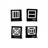
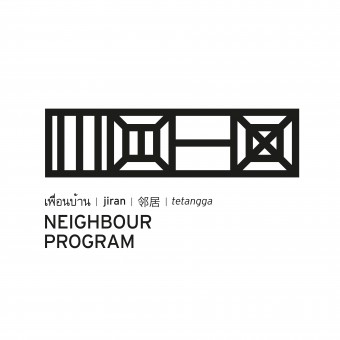
| DESIGN NAME: Neighbour Program PRIMARY FUNCTION: Branding INSPIRATION: We believe that reconnecting neighbouring countries and uniting people, ideas and culture can can be applied anywhere in the world to bring a lot good things together advancing the countries creative industry. UNIQUE PROPERTIES / PROJECT DESCRIPTION: Aimed at reconnecting art and design institutions within Southeast Asian region, the logo for the program was inspired by the idea of people living next to each other, each country is represented by a single icon. The icons are a simplified form of a typical roof from each country as if seen from above. The icons can be viewed as being arranged like houses in a row, based on their geographical position, or as individuals. As the number of member grows, the logo can evolve by adding more icons. OPERATION / FLOW / INTERACTION: With the support from all, Neighbour could build a network where art and design institutions from Southeast Asia could make connections with one another, creating opportunities for academic affiliation, cross-cultural events, guest lecturer visits, school visits, internship opportunities, employment opportunities. Also the sharing of resources and the opening up of more portfolio shows, events highlights and publicity materials. PROJECT DURATION AND LOCATION: We create the identity for Neighbour Progam in 2013. The program is still going until now. Each year the program will choose one country as a host. Institutions that play host will be responsible to archive creative processes, research and works accumulated throughout each workshop. FITS BEST INTO CATEGORY: Graphics, Illustration and Visual Communication Design |
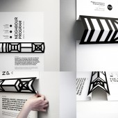
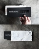
PRODUCTION / REALIZATION TECHNOLOGY: With a simple 3D pop-up construction for the poster, the strip of roof shapes is intended to further accentuate the illusion of neighbouring countries standing together while maintaining their diversity and distinctly cultural heritage. We also provide a simple instruction printed on the poster on where to fold along the dotted line which later will be hidden after the roof shape is formed. SPECIFICATIONS / TECHNICAL PROPERTIES: Poster size: 45 x 90 cm (flat), 45 x 7 5x 6 cm (with 3D roof shape constructed). Individual rooftop icons are silk-screen printed on black T-shirts representing each country member. The T-shirt was designed to easily indentify each member belongs to which country during workshop and fieldtrips. Using environmentaly friendly material, traditional weaving technique was used for the invitation envelope to communicate working together between the country members. TAGS: Neighbour Program, Southeast Asia design, platform, network, art and design education, relationship within neighbour countries, roof icon, logo system, logo evolve, houses in a row, HALFNOT indesign. RESEARCH ABSTRACT: With shared history and culture, yet despite staying next to each other, the Southeast Asian countries have their own uniqueness. The logo was inspired by the idea of being neighbour itself, “living next to each other” each country is represented with a house. We studied typical roof shape of the countries and use a simplified form of the house’s roof (as seen from above) as icons. CHALLENGE: The challenge we face was how to come up with a brand that could represent several different countries that each have their own uniqueness. The brand has to be simple yet dynamic enough to be able to adapt to future progress along the years (eg. the additional of country members) and yet still simple and bold enough to represent these countries. ADDED DATE: 2017-09-11 09:39:17 TEAM MEMBERS (2) : Creative Director: Jacky Halim and Art Director: Jane Jahja IMAGE CREDITS: HALFNOT indesign |
||||
| Visit the following page to learn more: http://www.halfnotindesign.com/test-neig |
|||||
| AWARD DETAILS | |
 |
Neighbour Program Branding by Halfnot Indesign is Winner in Graphics, Illustration and Visual Communication Design Category, 2017 - 2018.· Read the interview with designer Halfnot Indesign for design Neighbour Program here.· Press Members: Login or Register to request an exclusive interview with Halfnot Indesign. · Click here to register inorder to view the profile and other works by Halfnot Indesign. |
| SOCIAL |
| + Add to Likes / Favorites | Send to My Email | Comment | Testimonials | View Press-Release | Press Kit | Translations |
Did you like Halfnot Indesign's Graphic Design?
You will most likely enjoy other award winning graphic design as well.
Click here to view more Award Winning Graphic Design.


