Kaleidoscope Visual art by Tsutomu Fujishima |
Home > Winners > #59074 |
 |
|
||||
| DESIGN DETAILS | |||||
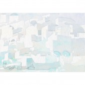
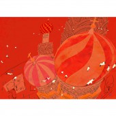
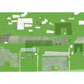
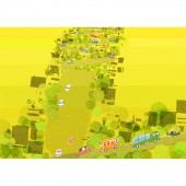
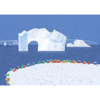
| DESIGN NAME: Kaleidoscope PRIMARY FUNCTION: Visual art INSPIRATION: This project was inspired by five colors of "rlung rta" of Tibet. Using five colors of "blue, white, red, green, the yellow", one area is described under the theme of one color. The power of the color to constitute the world is expressed by five colors of pictures. UNIQUE PROPERTIES / PROJECT DESCRIPTION: One piece of painting is described in one color. One world is completed with five colors. Five colors mean "sky, wind, fire , water, ground" . This is elements constituting the world. This is designed to be able to feel the energy of the color. The painting is not explanation of the real scenery. I expressed an impression to receive from the land as a color in the line which I simplified. OPERATION / FLOW / INTERACTION: The power of the color maximizes it by displaying five colors of pictures in the wall surface. Power of the beauty is born in the space. PROJECT DURATION AND LOCATION: It was produced in 2015. It was displayed in Tokyo JAPAN in 2015. It was displayed by Italia Bologna children's Book Fair in 2016. FITS BEST INTO CATEGORY: Graphics, Illustration and Visual Communication Design |
PRODUCTION / REALIZATION TECHNOLOGY: Using paper-cutting, I adopted the accidental nature. I added play by putting the line which was not a line to write by hand. I expressed the form that entered the heart when I saw the scenery by throwing away a small element carefully. I think that it is important that the thing of various elements harmonizes. I think like patchwork harmonizing rather than collage. SPECIFICATIONS / TECHNICAL PROPERTIES: Width 475mm x Height 340mm,One piece TAGS: art,poster, picture, blue, red, white, yellow, green, the world, trip RESEARCH ABSTRACT: I think that power of the beauty is created through the combination of colors. I studied that I drew power of the beauty to the maximum by reducing a color. I want you to feel the power of the color to be born when five pieces gathered. In addition, I studied possibility of the abstract expression. I did not create a detailed landscape. However, I devised it to express charm to have of the land. CHALLENGE: The point that was difficult by this project is "a white picture". It was difficult to create the form of the town while keeping transparency of the white. I used a shadow of the paper-cutting as a method to give a three-dimensional impression. ADDED DATE: 2017-07-22 10:20:07 TEAM MEMBERS (1) : IMAGE CREDITS: Main image is #1:Illustrator Tsutomu Fujishima,Blue: Greenland,2015. Optional image#2:Illustrator Tsutomu Fujishima,White: Greece,2015. Optional image#3:Illustrator Tsutomu Fujishima,Red: Russia,2015. Optional image#4:Illustrator Tsutomu Fujishima,Green:Scotland,2015. Optional image#5:Illustrator Tsutomu Fujishima,Yellow: San Francisco /USA,2015. PATENTS/COPYRIGHTS: Tsutomu Fujishima,JAPAN,Artist Illustrator, 2015. |
||||
| Visit the following page to learn more: https://www.tomfujishima.com/ | |||||
| AWARD DETAILS | |
 |
Kaleidoscope Visual Art by Tsutomu Fujishima is Winner in Graphics, Illustration and Visual Communication Design Category, 2017 - 2018.· Read the interview with designer Tsutomu Fujishima for design Kaleidoscope here.· Press Members: Login or Register to request an exclusive interview with Tsutomu Fujishima. · Click here to register inorder to view the profile and other works by Tsutomu Fujishima. |
| SOCIAL |
| + Add to Likes / Favorites | Send to My Email | Comment | Testimonials | View Press-Release | Press Kit |
Did you like Tsutomu Fujishima's Graphic Design?
You will most likely enjoy other award winning graphic design as well.
Click here to view more Award Winning Graphic Design.


