Chollipo Arboretum Corporate Identity by Siwook Oh and Dukyong Kim - Sejong Icon |
Home > Winners > #58579 |
 |
|
||||
| DESIGN DETAILS | |||||
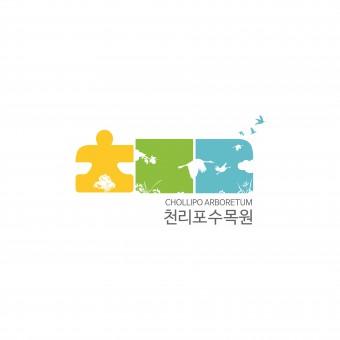
| DESIGN NAME: Chollipo Arboretum PRIMARY FUNCTION: Corporate Identity INSPIRATION: We described the logo of ‘Chollipo Arboretum’ using Korean consonants ‘ㅊㄹㅍ’ which stands for ‘천리포(Chollip UNIQUE PROPERTIES / PROJECT DESCRIPTION: Chollipo Arboretum has the most diverse range of plants in Korea, with over 15,800 varieties in collection and conservation. In addition, its location at the western edge of Korea enables it to encompass plants from both cool and warm temperature zones. It is an arboretum with traditional Korean beauty. For that, we designed the logo using consonants of the Korean name of Chollipo Arboretum. It is not a usual case in Korea to use consonants of Korean letters only in logos. OPERATION / FLOW / INTERACTION: - PROJECT DURATION AND LOCATION: - FITS BEST INTO CATEGORY: Graphics, Illustration and Visual Communication Design |
PRODUCTION / REALIZATION TECHNOLOGY: - SPECIFICATIONS / TECHNICAL PROPERTIES: - TAGS: Chollipo, Arboretum, Sejong icon, Corporate identity, Logo, Branding RESEARCH ABSTRACT: - CHALLENGE: - ADDED DATE: 2017-06-28 05:41:58 TEAM MEMBERS (2) : Art Director: Siwook Oh and Designer: Dukyong Kim IMAGE CREDITS: Siwook Oh and Dukyong Kim - Sejong Icon, 2017. PATENTS/COPYRIGHTS: Copyrights belong to Chollipo Arboretum. |
||||
| Visit the following page to learn more: http://www.chollipo.org/, http://sejongicon.com/ | |||||
| AWARD DETAILS | |
 |
Chollipo Arboretum Corporate Identity by Siwook Oh and Dukyong Kim-Sejong Icon is Winner in Graphics, Illustration and Visual Communication Design Category, 2017 - 2018.· Read the interview with designer Siwook Oh and Dukyong Kim - Sejong Icon for design Chollipo Arboretum here.· Press Members: Login or Register to request an exclusive interview with Siwook Oh and Dukyong Kim - Sejong Icon. · Click here to register inorder to view the profile and other works by Siwook Oh and Dukyong Kim - Sejong Icon. |
| SOCIAL |
| + Add to Likes / Favorites | Send to My Email | Comment | Testimonials | View Press-Release | Press Kit |
Did you like Siwook Oh and Dukyong Kim-Sejong Icon's Graphic Design?
You will most likely enjoy other award winning graphic design as well.
Click here to view more Award Winning Graphic Design.


