Optics and Chromatics Exhibition poster by Timea Andoka |
Home > Winners > #58492 |
 |
|
||||
| DESIGN DETAILS | |||||
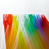
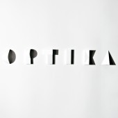
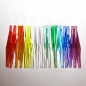
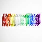
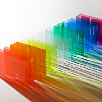
| DESIGN NAME: Optics and Chromatics PRIMARY FUNCTION: Exhibition poster INSPIRATION: Goethe's Theory of Colours appeared in 1810. On the occasion of the bicentennial anniversary of the book the Society of Hungarian Graphic Designers and Typographers announces an international design competition entitled Goetheorie. The title of poster Optics and Chromatics refers to a place where Goethe points out that unlike Newton he is not so much interested in the science of sight (Optics) but rather in the theory of colours (Chromatics). He wants to demonstrate the way we actually experience colours, and not the way we are supposed to experience them according to the laws of mathematics. UNIQUE PROPERTIES / PROJECT DESCRIPTION: The title Optics and Chromatics refers to the debate between Goethe and Newton on the nature of colours. This debate is represented by the clash of the two letterform compositions, one is calculated, geometric, with sharp contours, the other relies on the impressionistic play of colourful shadows. In 2014 this design served as the cover for Pantone Plus Series Artist Covers. The Pantone Formula Guide and Pantone Solid Chips feature covers showcasing works of art from my project, Optics and Chromatics. (creative manager and designer at Pantone by Timothy Heyer, director of creative marketing at Pantone by Karen Lantelme) OPERATION / FLOW / INTERACTION: Numerous photos have been taken of the two letterform compositions for the project. Changing the perspective and the light conditions meant plenty of possibilities for the visualization. The two pictures that were finally chosen for the poster are the ones which – complementing each other – accentuate the most the difference between the two colour theories. PROJECT DURATION AND LOCATION: The poster was made at Budapest, Hungary, 2010. It was exhibited at Design Terminal, Budapest, Hungary, 05 November 2010 – 09 January 2011, Donau Buro, Ulm, Germany, 04 July – 13 July 2014 and The World Paper Products, Jeonju, South Korea, 20 – 28 February 2017 FITS BEST INTO CATEGORY: Fine Arts and Art Installation Design |
PRODUCTION / REALIZATION TECHNOLOGY: paper, coloured plastic sheet, light, shadow SPECIFICATIONS / TECHNICAL PROPERTIES: original poster size: 70×100 cm TAGS: chromatics, optics, Goethe, light, colour, shadow, experimental typography, crafts RESEARCH ABSTRACT: It is essential to know in detail the polemy on colour theory between Newton and Goethe when analyzing the relationship between light, shadow and colour. I consider Goethe’s Theory of Colours as one of the basic pieces of work when studying colour experience: it highlights the fact that the colour vision is a greatly changeful, resilient and impressionistic factor, thus not possible to give a description by some exact mathematical formulas – at least not in an adequate manner. The poster enters this several-century-long scientific debate with the resources of contemporary experimental typography. The project’s afterlife shows the timeliness of this inspection: Pantone published its first Limited-edition Artist Covers with this piece of work in 2014. CHALLENGE: Two new font-designs had to be invented to express the nature of the polemy on colour theory. The two types of letter consist of different materials and form: one is made of paper and shadow, the other is of coloured foil and light. The symmetrical, geometric shapes of the white paper and the sharp shadows in the hard light make the word ’optics’ legible. The word ’cromatics’ is built from coloured foil sheets that create colourful, intertangled beams in different angles of light. ADDED DATE: 2017-06-24 11:29:47 TEAM MEMBERS (1) : Art director, graphic design, type design and paper craft: Tímea Andorka IMAGE CREDITS: all images © Tímea Andorka, 2017 PATENTS/COPYRIGHTS: all images © Tímea Andorka, 2017 |
||||
| Visit the following page to learn more: http://andorkatimea.com | |||||
| AWARD DETAILS | |
 |
Optics and Chromatics Exhibition Poster by Timea Andoka is Winner in Graphics, Illustration and Visual Communication Design Category, 2017 - 2018.· Read the interview with designer Timea Andoka for design Optics and Chromatics here.· Press Members: Login or Register to request an exclusive interview with Timea Andoka. · Click here to register inorder to view the profile and other works by Timea Andoka. |
| SOCIAL |
| + Add to Likes / Favorites | Send to My Email | Comment | Testimonials | View Press-Release | Press Kit | Translations |
Did you like Timea Andoka's Graphic Design?
You will most likely enjoy other award winning graphic design as well.
Click here to view more Award Winning Graphic Design.


