Co-Creation! Camp Branding by Kei Sato |
Home > Winners > #57598 |
 |
|
||||
| DESIGN DETAILS | |||||
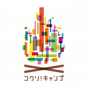
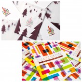
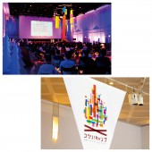
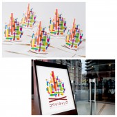
| DESIGN NAME: Co-Creation! Camp PRIMARY FUNCTION: Branding INSPIRATION: There are three major purposes in this event. 1) encourage the evolution of all participants, and get brought back will and ideas. 2) provide infinite connections to people who have the same thought. 3) produce the seeds of the project to evolve the region, Japan and the world. In order to make places where people participating in this event can discuss real intention, I designed a symbol of bonfire. Bonfire makes people relax and it provides an atmosphere in which people can talk honestly. UNIQUE PROPERTIES / PROJECT DESCRIPTION: This is the logo design and branding for the event "Co-Creation! Camp", which people talk about local revitalization for the future. Japan is faced with unprecedented social issues such as low birthrate, population aging, or depopulation of the region. The people involved in the tourism industry can’t activate the tourism by only working hard for their own region and organization. "Co-Creation! Camp" has created to exchange their information and help each other beyond the various problems. Various colors are symbolized every person's will, and it led many ideas and produced more than 100 projects. OPERATION / FLOW / INTERACTION: The report of the project has carried out on the web site and anyone can held "Co-Creation! Camp" event using the methods and tips opened on the web site. PROJECT DURATION AND LOCATION: The project started in February 2015 in Tokyo/Japan. This is a new brand; to evolve the seeds of project that is born in this event, and produce an another seed. Now "Co-Creation! Camp" is held once a year and throughout the day. FITS BEST INTO CATEGORY: Graphics, Illustration and Visual Communication Design |
PRODUCTION / REALIZATION TECHNOLOGY: After the research, I came up with the idea concept through thumbnail sketching and finished the work by using Adobe Illustrator and Adobe Photoshop. SPECIFICATIONS / TECHNICAL PROPERTIES: (Poster)Width728mm x Height1030mm (Pamphlet)Width210mm x Height297mm (Leaflet)Width210mm x Height297mm (Sign)Width210mm x Height297mm (Mobile)Width3000mm x Height 5000mm x Depth3000mm TAGS: Branding, Symbol, Logo, Pamphlet, Leaflet, Poster, Sign, Colorful, Event, Co-Creation, Camp, Japan RESEARCH ABSTRACT: During the research, I observed the shapes of many bonfire by looking at the photographs and real fire. CHALLENGE: The main creative challenge was to develop a visual identity system that can be used not only two dimensions but also three dimensions. ADDED DATE: 2017-04-07 06:43:29 TEAM MEMBERS (1) : Creative Director: Takahiro Nagahama, Art Director: Kei Sato, Graphic Designer: Kei Sato, Photographer: Kenichi Shimoyana, Producer: Ai Sanda, Creative Team: Haruma Yonekawa, Ryo Shimomura, Moe Uchimura, Yasuhiro Tamura, Daisuke Yano IMAGE CREDITS: Image #1: Art Director Kei Sato Image #2: Art Director Kei Sato Image #3: Art Director Kei Sato Image #4: Art Director Kei Sato Image #5: Art Director Kei Sato PATENTS/COPYRIGHTS: Copyrights belong to Number8 Creative Inc., 2017. Copyrights belong to Recruit Lifestyle Co., Ltd., 2017. |
||||
| Visit the following page to learn more: http://number8creative.co.jp | |||||
| AWARD DETAILS | |
 |
Co-Creation! Camp Branding by Kei Sato is Winner in Graphics, Illustration and Visual Communication Design Category, 2016 - 2017.· Read the interview with designer Kei Sato for design Co-Creation! Camp here.· Press Members: Login or Register to request an exclusive interview with Kei Sato. · Click here to register inorder to view the profile and other works by Kei Sato. |
| SOCIAL |
| + Add to Likes / Favorites | Send to My Email | Comment | Testimonials | View Press-Release | Press Kit | Translations |
Did you like Kei Sato's Graphic Design?
You will most likely enjoy other award winning graphic design as well.
Click here to view more Award Winning Graphic Design.


