|
|
|
|
|
DESIGN DETAILS |
DESIGN NAME: Fattoria il Gambero - Winery
PRIMARY FUNCTION: Visual Identity
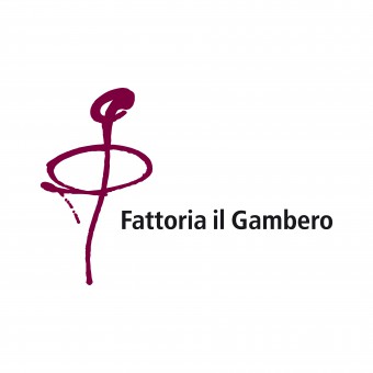
INSPIRATION: The origin of the logo was a stylized G which conveyed the sense of a corkscrew uncorking a bottle and at the same time looked like the road leading to the company. The sans serif font makes this not entirely defined symbol more substantial and solid. The burgundy color was chosen to represent a full-bodied red wine like the Pinot Nero, one of the company’s battle horses. For labels the symbol G was used as a graphic sign, the colors reflects the type of wine: for younger wines the label is clear with colorful graphics while for wines most important the label base is colored with darker and shiny graphics.
UNIQUE PROPERTIES / PROJECT DESCRIPTION: Fattoria il Gambero positioned itself on the market with a well-balanced approach in between the dynamic and the contemporary, while still greatly relying on its history, which dates back to 1880. The intention was thus to imbue the entire image with innovation, color and contemporaneity, while maintaining all the characteristics of the past, as in the embossed paper used for the Brochure. This project was handled at 360°, from the brand to the labels, from the website to the brochure. All communication was based on the owner's family, a big family who followed his father in a big project. The names of the wines found their inspiration in the horses of the owner’s grandfather.
OPERATION / FLOW / INTERACTION: -
PROJECT DURATION AND LOCATION: The project started in April 2004 an finish on May 2013
FITS BEST INTO CATEGORY: Graphics, Illustration and Visual Communication Design
|
PRODUCTION / REALIZATION TECHNOLOGY: The cleanliness and modernity of the wine labels, printed on a coated paper, was contrasted with the embossed paper of the brochure or the uncoated paper business cards to convey two different feelings: modernity, but backed by history.
SPECIFICATIONS / TECHNICAL PROPERTIES: -
TAGS: Logo, Brand, Brand identity, Digital, Exhibition, Sign, Promotion, Print
RESEARCH ABSTRACT: -
CHALLENGE: -
ADDED DATE: 2017-04-03 10:32:50
TEAM MEMBERS (3) : Creative Director: Laura Ferrario, Photo: Sauro sorana and
IMAGE CREDITS: Fotoforma
|
|
CLIENT/STUDIO/BRAND DETAILS |
|
NAME: Ferrariodesign
PROFILE: The studio is specializes in visual communication consultancy for companies and in this the client is assited at 360°: logo design, corporate identity, catalogs, brochures, exhibition design, packaging and digital.
Ferrariodesign worked as a Graphic Designers for over 20 years, aiming to face every single project by asking: who is the message to be communicated aimed at and how can be reached the end user in the simplest and most immediate way.
In fact, the phrase that represents the studio is: " For all companies who want to keep up with the pace of the world, but attract the gaze of those watching". To achieve this in a society full of visual inputs, it is necessary to strike immediately to be recognized with a few well-directed messages. Creativity is being able to attract attention through the visual message and make people stop, even just for a moment. It is being remembered! In a world where everyone is racing to go faster it’s important to understand how things are being observed and the importance of providing a clear communication and a strong visual impact. Here is the winning approach, adopted over the years for the most diverse clients, who have enabled me to maintain an open mind and that creative freshness needed to guarantee solutions that are never obvious or predictable. Because working every day in different sectors means having one single specialization, that of quality.
|
|
|
COMMENTS |
Giulia Esposito |
Comment #5434 on December 25, 2022, 5:43 pm |
I am absolutely delighted and inspired by the work of this talented designer! The "Fattoria il Gambero - Winery" visual identity is incredibly powerful and visually stunning! It captures the essence of the winery perfectly and conveys the message of quality and elegance. The attention to detail and the creativity of the design is remarkable. I am truly impressed and inspired by this marvellous work and I want to congratulate the designer, Laura Ferrario, on their well-deserved success!
|
|
|
Did you like Laura Ferrario's Graphic Design?
You will most likely enjoy other award winning graphic design as well.
Click here to view more Award Winning Graphic Design.
Did you like Fattoria Il Gambero-Winery Visual Identity? Help us create a global awareness for good graphic design worldwide. Show your support for Laura Ferrario, the creator of great graphic design by gifting them a nomination ticket so that we could promote more of their great graphic design works.
|
|
|
|
|