L'AGRICOLA Corporate Identity by Cesura Barbara Creative Director |
Home > Winners > #57335 |
 |
|
||||
| DESIGN DETAILS | |||||
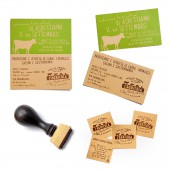
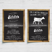
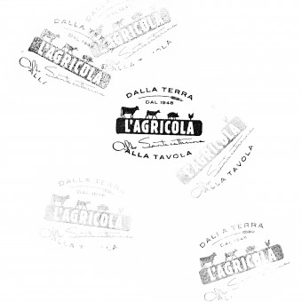
| DESIGN NAME: L'AGRICOLA PRIMARY FUNCTION: Corporate Identity INSPIRATION: We get inspired by the place, by the simplicity of the people, the care that the entire company has to detail and above all the love and passion of owner Aldo Santacatterina are bred puts in the care of the animals who are Underlying all. He is personally responsible for making all major decisions, but it has its person behind every detail because the details are important to the overall perception. UNIQUE PROPERTIES / PROJECT DESCRIPTION: Redesign the company brand who will be present in all the official occasions from the sign outside the building to corporate material such as letters, business card, papers and furthermore the packaging identity. OPERATION / FLOW / INTERACTION: - PROJECT DURATION AND LOCATION: - |
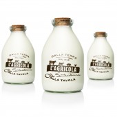
PRODUCTION / REALIZATION TECHNOLOGY: The brand has been printed and used in several different ways. For the business card they applied the logo manually using a stamp. For the bottles have been used serigraphy SPECIFICATIONS / TECHNICAL PROPERTIES: - TAGS: Corporate identity, restyling, relaunch RESEARCH ABSTRACT: As per our methodology we worked to look for a concept that could express the soul of the brand, the Vision it wants to express to the rest of the world. In this case we needed to spend some days together with the client inside his company, his shop to understand HOW they are used to work, the feeling they have and how do they really manage the relation with clients, with animals and with the production operation. What we discovered was so interesting and amazing the needed to be expressed through a brand and all the materials in a way that could communicate the magic binomio between simplicity and excellence. CHALLENGE: It has been necessary to live directly the experience of the company in order to undestand if the values we were told were real or something was missing or not revealed. Once we knew them and saw the way they live and work it become more easy to define a Brand Vision document that helped them to recognize themselfs and helped us to create the new brand. ADDED DATE: 2017-03-31 07:24:07 TEAM MEMBERS (2) : Giacomo Stefanelli and Barbara Cesura IMAGE CREDITS: Cesura Barbara Creative Director, 2016. |
||||
| Visit the following page to learn more: http://www.neom.it/en/progetti/agricola- |
|||||
| AWARD DETAILS | |
 |
L'agricola Corporate Identity by Cesura Barbara Creative Director is Winner in Graphics, Illustration and Visual Communication Design Category, 2016 - 2017.· Read the interview with designer Cesura Barbara Creative Director for design L'AGRICOLA here.· Press Members: Login or Register to request an exclusive interview with Cesura Barbara Creative Director. · Click here to register inorder to view the profile and other works by Cesura Barbara Creative Director. |
| SOCIAL |
| + Add to Likes / Favorites | Send to My Email | Comment | Testimonials | View Press-Release | Press Kit |
Did you like Cesura Barbara Creative Director's Graphic Design?
You will most likely enjoy other award winning graphic design as well.
Click here to view more Award Winning Graphic Design.


