Book and Cover Design Exhibition Catalogue by Stefan Canuel |
Home > Winners > #57260 |
 |
|
||||
| DESIGN DETAILS | |||||
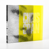
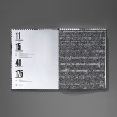
| DESIGN NAME: Book and Cover Design PRIMARY FUNCTION: Exhibition Catalogue INSPIRATION: It was essential that the design of the book be sympathetic to the work of this contemporary artist. The halftone dot was chosen as an approach for the cover as this technique has been one constant in the artist’s multifaceted career. The yellow color sleeve was incorporated as a way to reference the many layers in this artist’s practice, and the use of one of the Chorus faces on the cover was a humorous nod to the visitor experience. A selection of Chorus works were also used throughout the catalogue as dividers between sections. The rationale behind this was to tie the inside of the book in with the cover and extend the idea of commentary and the importance of the halftone in this artist’s work. The endpapers was a great concept collaboration between the artist and I to create a unique work, that brought a personal touch to the book. A spot-UV varnish was used on the cover to give the image a three-dimensional quality similar to his works. UNIQUE PROPERTIES / PROJECT DESCRIPTION: This book accompanies an exhibition at the National Gallery of Canada of paintings, prints and drawings by Canadian artist Chris Cran. The book includes reproductions of all of the works in the show, along with a number of the artist’s other pieces, and spans from his early career to present day. The artist produced a remarkable series of paintings using the halftone dot in the early 1990s, and the technique has been carried through to recent work in his series of small round paintings of people’s faces – his Chorus works – that he places around the exhibition space. These works represent visitors themselves, and with their various expressions provide silent commentary on the works that they accompany. OPERATION / FLOW / INTERACTION: The book slides out of the clear yellow sleeve to discover the second aspect of the book. A nice black and white halftone image with a relief over the black to mimic painted dots. PROJECT DURATION AND LOCATION: The project started in September 2015 in Ottawa and finished in May 2016 in Ottawa. FITS BEST INTO CATEGORY: Graphics, Illustration and Visual Communication Design |
PRODUCTION / REALIZATION TECHNOLOGY: 204 pages casebound (sewn into book blocks, trimmed to size, spine is glued, and hardcover bound to .098" thick binder's board) book. Printed 4 colors process on Sterling Premium 7pt matte. Cover printed pantone black with a 5mm thick spot UV coating over black ink. The sleeve was printed full bleed on 4 sides in Pantone yellow with type knockoff on clear polypropylene. The sleeve was open on both sides to allow the book to slide easily when push. SPECIFICATIONS / TECHNICAL PROPERTIES: A casebound book using a printed sheet has a cover wrap with UV coating, 29.3 cm by 23.4 cm by 2.8 cm; 4 sided polypropylene book sleeve, 29.6 cm by 23.4 cm by 3.1 cm; printed in Canada by Flash Reproductions; Typefaces used in the book, Press Gothic for large titles and subtitles and Sina for bodytext. TAGS: Contemporary Art, Book, Publication, Print, Exibition Catalogue, Graphic Design RESEARCH ABSTRACT: Project Initiation – To establish a personal relationship with the client, a face-to-face meeting with the artist, the curator and the chief of publication was necessary. Also to ensure the client knows what he wants from the project and to establish a realistic schedule of how the project should proceed. Research & Analysis – The design research entails taking into account the artist’s past catalogues, market trends for contemporary art books, the history of the artist, in this case Chris Cran, his future production, and the future of the publication as well. When trying to convey a design idea I will often use mood boards. Strategy – Developing a strategy before putting pencil to paper. In this case it was the use of halftone dot that made the artist popular in the early 1990s more so then using one of his recent works. Running the strategy to the artist to get approval or disapproval was necessary at this stage. Development – Developing several different concepts. The idea here was to create different options before choosing the most viable one. Through the help of the curator, these ideas were narrowed down to one or two ideas for further development and refinement. Presentation – Presenting a good amount of inside spreads for the book. Making a paper mock-up for the cover and case was also a good idea for this project. It was the time for the client to review the designs and provide feedback based on their objectives and needs. CHALLENGE: Working with an artist on a book is always a challenge. It is crucial that an artist’s work is respected, yet at the same time it is important to add another dimension to give depth and autonomy to the final product. Because the image on the front cover of this catalogue is an altered version of the original artwork, I had to convince the artist that this would be the best approach. It was important to relate to him the value in making a book that would be an object in its own right. Altering, cropping and overlapping text is always a potential issue when working on art publications. The collaboration with the artist was crucial. The curator of the exhibition, the In-house editors and the production manager were also part of the team to make this project happen. ADDED DATE: 2017-03-30 16:40:20 TEAM MEMBERS (7) : Designer: Stefan Canuel, Chief Publications and Copyright: Ivan Parisien, English Editor: Caroline Wetherilt, French Editor: Marie Christine Gilbert, Production Manager: Anne Tessier, Production Artist: Natalie Ann Garneau and IMAGE CREDITS: Stefan Canuel, 2016. |
||||
| Visit the following page to learn more: https://scanuel.myportfolio.com/ | |||||
| AWARD DETAILS | |
 |
Book and Cover Design Exhibition Catalogue by Stefan Canuel is Winner in Graphics, Illustration and Visual Communication Design Category, 2016 - 2017.· Read the interview with designer Stefan Canuel for design Book and Cover Design here.· Press Members: Login or Register to request an exclusive interview with Stefan Canuel. · Click here to register inorder to view the profile and other works by Stefan Canuel. |
| SOCIAL |
| + Add to Likes / Favorites | Send to My Email | Comment | Testimonials | View Press-Release | Press Kit |
Did you like Stefan Canuel's Graphic Design?
You will most likely enjoy other award winning graphic design as well.
Click here to view more Award Winning Graphic Design.


