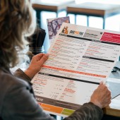
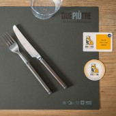
DuePiùTre – Più Che Hamburger Visual Identity by Laura Ferrario

Home > Winners > #57055


DESIGN DETAILS
DESIGN NAME:
DuePiùTre – Più Che Hamburger

PRIMARY FUNCTION:
Visual Identity

INSPIRATION:
A reliable and easy dog, which, however has a well defined personality, all of which perfectly reflects the values of the bistrot. Both the name and the symbol did not convey the idea of food, so by means of the chef's hat and pay off it was possible to highlight what the restaurant really offers: more than hamburgers with an Italian taste. Yellow is the color of the sun, of joy, of dynamism and creativity, of wisdom and of the word. Yellow and black are the most powerful combination.

UNIQUE PROPERTIES / PROJECT DESCRIPTION:
DuePiuTre is a small bistrot based on the idea of proposing not just hamburgers, but also pastrami and beer can chicken all revisited and spiced up with fresh and genuine Italian products. The choice of the bulldog was made both because it had been the mascot of the United States Navy, and because it is the dog owned by one of the partners. The project was handled at 360 degrees, from the brand to the signage, from the website to social networks, from the wallpaper to the decor of the interior.

OPERATION / FLOW / INTERACTION:
-

PROJECT DURATION AND LOCATION:
The project started in April 2015 in Milano and is going on now concerning social and communication

FITS BEST INTO CATEGORY:
Graphics, Illustration and Visual Communication Design

PRODUCTION / REALIZATION TECHNOLOGY:
The bistrot mood is based on the concept of healthy and environmentally friendly food, so we tried to use natural materials such as wood, iron, paper and recycled cardboard.

SPECIFICATIONS / TECHNICAL PROPERTIES:
-

TAGS:
Logo, Brand, Brand identity, Digital, Exhibition, Social media, Sign, Promotion

RESEARCH ABSTRACT:
-

CHALLENGE:
The hardest thing was to find a solution to the flowers in the vases because there was little light and they all dried out. Finally, we created photographic postcards of flowers and applied them to the sticks we then planted in the clay pots: the result was an innovative garden.

ADDED DATE:
2017-03-27 14:21:29

TEAM MEMBERS (3) :
Creative Director: Laura Ferraio, Photo: Sauro Sorana, Chiara Zoppei and Copy: Mauro Marinoni, Chiara Villa

IMAGE CREDITS:
Fotoforma

Visit the following page to learn more: http://duepiutre.it


CLIENT/STUDIO/BRAND DETAILS
NAME:
Ferrariodesign

PROFILE:
The studio is specializes in visual communication consultancy for companies and in this the client is assited at 360°: logo design, corporate identity, catalogs, brochures, exhibition design, packaging and digital. Ferrariodesign worked as a Graphic Designers for over 20 years, aiming to face every single project by asking: who is the message to be communicated aimed at and how can be reached the end user in the simplest and most immediate way. In fact, the phrase that represents the studio is: " For all companies who want to keep up with the pace of the world, but attract the gaze of those watching". To achieve this in a society full of visual inputs, it is necessary to strike immediately to be recognized with a few well-directed messages. Creativity is being able to attract attention through the visual message and make people stop, even just for a moment. It is being remembered! In a world where everyone is racing to go faster it’s important to understand how things are being observed and the importance of providing a clear communication and a strong visual impact. Here is the winning approach, adopted over the years for the most diverse clients, who have enabled me to maintain an open mind and that creative freshness needed to guarantee solutions that are never obvious or predictable. Because working every day in different sectors means having one single specialization, that of quality.


NOMINATION DETAILS

Duepiùtre – Più Che Hamburger Visual Identity by Laura Ferrario is a Nominee in Graphics, Illustration and Visual Communication Design Category.

· This project is currently confidential as results have not been announced yet. Images and further details of the project is not available for public yet, please check back later. If you are the owner of this design, please login to view the images.

· Click here to register today inorder to be able to view the profile and other works by Laura Ferrario when results are announced.


AWARD DETAILS

Duepiùtre – Più Che Hamburger Visual Identity by Laura Ferrario is Winner in Graphics, Illustration and Visual Communication Design Category, 2016 - 2017.


· Press Members: Login or Register to request an exclusive interview with Laura Ferrario.

· Click here to register inorder to view the profile and other works by Laura Ferrario.


SOCIAL
+ Add to Likes / Favorites | Send to My Email | Submit Comment | Comment | Testimonials | View Press-Release | Press Kit


COMMENTS
Giulia Esposito Comment #5355 on December 25, 2022, 5:17 pm
As a design enthusiast, I am truly thrilled to see the creative work of "DuePiùTre – Più Che Hamburger" garnering the A' Design Award. It is a remarkable achievement and a testament to the designer's finesse. The Visual Identity is truly remarkable, with a unique blend of colour, typography and graphic elements that come together seamlessly. It showcases a great deal of creativity and attention to detail. The use of bold, vivid colours creates a very powerful impact that resonates with the audience. The overall design is truly captivating and leaves a lasting impression. I congratulate the designer on their success and am sure that this award is just the beginning for them. Congratulations to Laura Ferrario for their outstanding work!
Chloe Turner Comment #51040 on January 3, 2023, 5:47 pm
I love the clever use of the chef's hat and pay off to convey the idea of this bistro offering more than just hamburgers. The powerful combination of yellow and black to represent the sun, joy, and creativity is an inspired choice that truly brings this visual identity to life. It's a great example of how a simple yet strong visual can effectively express a brand's values. Well done!

Did you like Laura Ferrario's Graphic Design?
You will most likely enjoy other award winning graphic design as well.
Click here to view more Award Winning Graphic Design.


Did you like Duepiùtre – Più Che Hamburger Visual Identity? Help us create a global awareness for good graphic design worldwide. Show your support for Laura Ferrario, the creator of great graphic design by gifting them a nomination ticket so that we could promote more of their great graphic design works.

See other A' Design Award and Competition WinnersA' Design Award Presentation Submit Your Designs
 
design award logo

BENEFITS
THE DESIGN PRIZE
WINNERS SERVICES
PR CAMPAIGN
PRESS RELEASE
MEDIA CAMPAIGNS
AWARD TROPHY
AWARD CERTIFICATE
AWARD WINNER LOGO
PRIME DESIGN MARK
BUY & SELL DESIGN
DESIGN BUSINESS NETWORK
AWARD SUPPLEMENT

METHODOLOGY
DESIGN AWARD JURY
PRELIMINARY SCORE
VOTING SYSTEM
EVALUATION CRITERIA
METHODOLOGY
BENEFITS FOR WINNERS
PRIVACY POLICY
ELIGIBILITY
FEEDBACK
WINNERS' MANUAL
PROOF OF CREATION
WINNER KIT CONTENTS
FAIR JUDGING
AWARD YEARBOOK
AWARD GALA NIGHT
AWARD EXHIBITION

MAKING AN ENTRY
ENTRY INSTRUCTIONS
REGISTRATION
ALL CATEGORIES

FEES & DATES
FURTHER FEES POLICY
MAKING A PAYMENT
PAYMENT METHODS
DATES & FEES

TRENDS & REPORTS
DESIGN TRENDS
DESIGNER REPORTS
DESIGNER PROFILES
DESIGN INTERVIEWS

ABOUT
THE AWARD
AWARD IN NUMBERS
HOMEPAGE
AWARD WINNING DESIGNS
DESIGNER OF THE YEAR
MUSEUM OF DESIGN
PRIME CLUBS
SITEMAP
RESOURCE

RANKINGS
DESIGNER RANKINGS
WORLD DESIGN RANKINGS
DESIGN CLASSIFICATIONS
POPULAR DESIGNERS

CORPORATE
GET INVOLVED
SPONSOR AN AWARD
BENEFITS FOR SPONSORS
IMPRESSUM IMPRINT

PRESS
DOWNLOADS
PRESS-KITS
PRESS PORTAL
LIST OF WINNERS
PUBLICATIONS
RANKINGS
CALL FOR ENTRIES
RESULTS ANNOUNCEMENT

CONTACT US
CONTACT US
GET SUPPORT

Good design deserves great recognition.
A' Design Award & Competition.