Cakes Corporate Identity by Mike Amirov |
Home > Winners > #57030 |
 |
|
||||
| DESIGN DETAILS | |||||
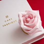
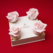
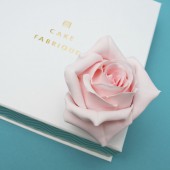
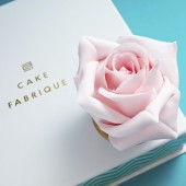
| DESIGN NAME: Cakes PRIMARY FUNCTION: Corporate Identity INSPIRATION: It was important for me to convey the person's general ideas about the product - it simplifies communication. You represent the form from the outside, want to know what's inside. This formed the basis for product design. UNIQUE PROPERTIES / PROJECT DESCRIPTION: Intuitive design, integrity of design. Skillful use in packaging:olive pit pattern is covered with transparent lacquer to give the surface finish. The logotype is pressed with golden foil. OPERATION / FLOW / INTERACTION: The consumer sees the packaging, he takes it in his hands, feels the texture of the UV varnish and gold stamping. Then he opens the top of the package and sees the product itself. PROJECT DURATION AND LOCATION: The project began in the spring of 2016 and ended in the summer of 2016 FITS BEST INTO CATEGORY: Graphics, Illustration and Visual Communication Design |
PRODUCTION / REALIZATION TECHNOLOGY: Specification: Construction: laminated tubes for cakes Materials: 2 mm binding paper, coated paper 170 g, offset paper 190 g Application: full-color offset printing, matt lamination, selective UV varnish, gold foil stamping SPECIFICATIONS / TECHNICAL PROPERTIES: Boxes-tubes are hermetic, strong - the lid does not come in contact with the surface of the cake, preserving the integrity of the structure. Construction: the almost flat base of the box has wide edges; The lid rests on the resulting outer edge and due to the narrow gap formed inside it does not violate the personal space of the internal contents. Boxes made of binding cardboard are strong and cope with unfavorable factors: moisture, light exposure, impacts and during transportation, crushing, etc. TAGS: logo, identity, packaging, cake RESEARCH ABSTRACT: We looked through the market of original cakes and packaging, into which the cake is placed. Also have decided that it is necessary to bring more aesthetics and the invoice in created design. Have redesigned the logo of the brand, created a package with the application of ultraviolet lacquer and gold stamping. This allowed us to rebuild from competitors and reach a new level. CHALLENGE: The logo was the hardest The choice of color and material for packaging was also difficult ADDED DATE: 2017-03-26 21:45:29 TEAM MEMBERS (2) : founder/designer: Mike Amirov and art director/designer: Stas Petrov IMAGE CREDITS: Mike Amirov, 2016. |
||||
| Visit the following page to learn more: http://renovartio.com/ | |||||
| AWARD DETAILS | |
 |
Cakes Corporate Identity by Mike Amirov is Winner in Graphics, Illustration and Visual Communication Design Category, 2016 - 2017.· Read the interview with designer Mike Amirov for design Cakes here.· Press Members: Login or Register to request an exclusive interview with Mike Amirov. · Click here to register inorder to view the profile and other works by Mike Amirov. |
| SOCIAL |
| + Add to Likes / Favorites | Send to My Email | Comment | Testimonials | View Press-Release | Press Kit |
Did you like Mike Amirov's Graphic Design?
You will most likely enjoy other award winning graphic design as well.
Click here to view more Award Winning Graphic Design.


