DESIGN NAME:
North America Nextgen Leaders Academy
PRIMARY FUNCTION:
Brand identity
INSPIRATION:
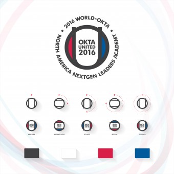
The symbol of the logo rotates clockwise every year. The rotation of the symbol means "future, progress, advancement". As it rotates by 90 degrees every year, it represents 3, 6, 9, 12 o'clock and “east, west, south, north”.
All venue of conference will use different logos each year while maintaining the same concept until 2020. Not only does it mean unity of the logo, but it also implies the successful integration of the organizations based on diversified regions and conferences.
UNIQUE PROPERTIES / PROJECT DESCRIPTION:
2016 North America Nextgen Leaders Academy is a North American integration conference held in New York as part of the vision 2020 project hosted by World-okta North America. The particular event was co-sponsored by chapters in 12 regions based in North America. It aims to develop a long-term plan by 2020 while continuously promoting, managing and supporting the next generation of leaders through this conference.
OPERATION / FLOW / INTERACTION:
World-okta is one of the leaders in Korea's business community. It has built a 35 year long tradition of the largest economic network, with approximately 12,500 members from 143 chapters in 72 countries, which are all serving an important role in each country. This organization is conducting various programs globally while promoting and supporting various Korean business leaders and their keen interests. As one of those programs, “Nextgen Leaders Academy” is held annually in different parts of the world in order to discover and train the next generation Korean business leaders under the support of the Korean government. “2016 North America Nextgen Leaders Academy” is also part of this program. I support their plan with a great program.
PROJECT DURATION AND LOCATION:
The new branding for 2016 North America Nextgen Leaders Academy was started to use in August 2016, and all venue of conference in North America will use different logos each year while maintaining the same concept until 2020.
FITS BEST INTO CATEGORY:
Graphics, Illustration and Visual Communication Design
|
PRODUCTION / REALIZATION TECHNOLOGY:
Since every project is unique, the approach may differ, but will always include the following components: research, creating, refining, revisions, and finalizing. To get the best output of this project, the printing parts of the project were produced by high quality offset printing and manufacturing technologies in New York. The 3D material like badges, name-tags, and stickers were made and manufactured by a high quality modeling team and a special printing team in Korea and Canada.
SPECIFICATIONS / TECHNICAL PROPERTIES:
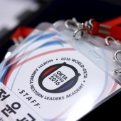
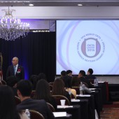
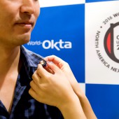
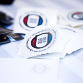
This logo is used various applications like pins, textbooks, stickers, invitation business cards, certificates, cue cards, and name tags, etc.
TAGS:
North America, Nextgen leaders, Branding, Logo, Symbol, Vision 2020, OKTA, New York, Korea, Korean
RESEARCH ABSTRACT:
This logo illustrates the vision of World-okta by 2020. It is used at each venue and published throughout North America and in the world. The purpose of the logo is not for a single or lifetime event, but it rather aims to capture the purpose of vision 2020.
“2016 North America Nextgen Leaders Academy” logo basic layout is based on the combination of OKTA's "O" and United's "U", while "okta united" and the year “2016” in the center integrated the entire logo. The colors of logo were inspired by national flag of Korea while highlighting that the foundation of World-okta and the 2016 North America Nextgen Leaders Academy began in Korea. Red and blue are positioned on the left and right of the symbol indicates the "harmony of yin and yang". This represents the harmony and prosperity between the World-okta and the chapters within the North America. On the outer edge of the symbol, you can use the full name, “2016 World-okta North America Nextgen Leaders Academy” to directly illustrate the purpose of the logo. This part can either be excluded or included to fit depending on the circumstances while the year on the logo can change annually.
The symbol of the logo rotates clockwise every year. The rotation of the symbol means "future, progress, advancement". As it rotates by 90 degrees every year, it represents 3, 6, 9, 12 o'clock and “east, west, south, north”.
CHALLENGE:
It is always hard to re-design for existing brand and logo. Especially, the overall design challenge of this project might be how to reflect the purpose of the logo for North America nextgen leaders academy. This branding is not for a single or lifetime event, but it rather aims to capture the purpose of vision 2020. Therefore, I need to find a way to all venue of conferences will use different logos each year while maintaining the same concept until 2020. That is the hardest part of the design.
ADDED DATE:
2017-03-21 05:43:41
TEAM MEMBERS (4) :
Creative Director: Sangmin Shim, Creative Team: Sangmin Shim, Jaegon Yoo, Gina Huh, Graphic Designer: Sangmin Shim, Paul Kang and Photographer: Jina Lee, Hyunjong Jin
IMAGE CREDITS:
Image #2: Photographer Jina Lee, okta united, 2016
Image #3: Photographer Jina Lee, okta united, 2016
Image #4: Photographer Hyunjong Jin, okta united, 2016
Image #5: Photographer Hyunjong Jin, okta united, 2016
|
