Polikultura Visual identification by Lit Group |
Home > Winners > #56843 |
 |
|
||||
| DESIGN DETAILS | |||||
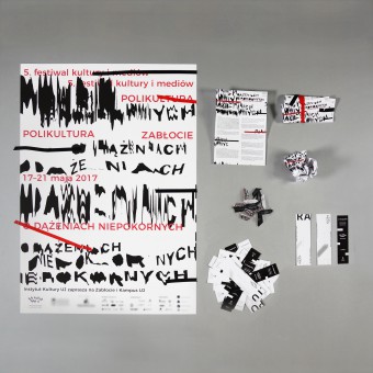
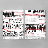
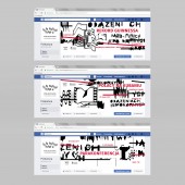
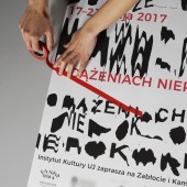
| DESIGN NAME: Polikultura PRIMARY FUNCTION: Visual identification INSPIRATION: We were inspired by censorship, correction, provocation, energy, protest, all the means of expression that emphasize the rebellious character of the project such as strikethroughs and deformations of letters. UNIQUE PROPERTIES / PROJECT DESCRIPTION: Our project is a visual identification for the 5th edition of media and culture festival. During the designing process of the poster we were trying to refer to the motto of this year edition, which is: About rebellious pursuance... Through many attempts to interpret that motto we decided to refer to the censorship, breaking the codes and rebel against the current norms and rules. OPERATION / FLOW / INTERACTION: The posters will be presented in a public space. The viewer can just read the information, but also the design encourages to check what is covered with the tape so everyone can interact with the poster and shear off the tape. Leaflets are going to be given in two forms. One will be folded, and the other one will be squashed as leaflets usually are when they meant to be thrown away. This form will make a viewer curious what is inside and unfold the leaflet. PROJECT DURATION AND LOCATION: The date of the festival is 17-21 may 2017. Our project will be presented about three weeks before the event. There will be printed posters, citylights, spots, leaflets, invitations and graphics in the social media. Polikultura is well known in Krakow and posters will be seen in the city center and in the Zablocie district, where most of the events take place. We started the work on the project in October 2016 in Krakow and finished it in March. FITS BEST INTO CATEGORY: Graphics, Illustration and Visual Communication Design |
PRODUCTION / REALIZATION TECHNOLOGY: We were experimenting with scanning letters on the low resolution scanner settings. Firstly letters were printed and cut from paper to get the effect of ragged edges and mistakes in the construction of letters. Then during scanning we were moving the paper to reach the effect of deformation. SPECIFICATIONS / TECHNICAL PROPERTIES: Posters were printed on B1 format, leaflets DL. Pantone used is 185C. TAGS: Poster, festival, visal identification, logo, events, polikultura, censorship, protest, disortion, animation. RESEARCH ABSTRACT: The project was based on the brief prepared by festival organizators. We were working in programs such as Adobe Photoshop, Adobe Illustrator, Adobe InDesign and Adobe After Effects. CHALLENGE: The most difficult part was to find a form of expression that will present the rebellious character of the project and will be readable and clear as well. ADDED DATE: 2017-03-19 22:50:00 TEAM MEMBERS (4) : Designer: Zofia Dziurawiec, Designer: Zuzanna Opozda, Designer: Maria Smaga and Designer: Paulina Łabuz IMAGE CREDITS: Image #1: Photographer Zofia Dziurawiec, Documentation of a project, 2017. Image #2: Photographer Zofia Dziurawiec, Documentation of a project, 2017. Image #3: Photographer Zofia Dziurawiec, Documentation of a project, 2017. Image #4: Photographer Zuzanna Opozda, Documentation of a project, 2017. Image #5: Photographer Zofia Dziurawiec, Documentation of a project, 2017. Video credits: Zofia Dziurawiec, Documentation of a project, 2017. PATENTS/COPYRIGHTS: Copyrights belong to Zofia Dziurawiec, Zuzanna Opozda, Maria Smaga, Paulina Łabuz, 2017. |
||||
| Visit the following page to learn more: http://www.polikultura.pl/ | |||||
| AWARD DETAILS | |
 |
Polikultura Visual Identification by Lit Group is Winner in Graphics, Illustration and Visual Communication Design Category, 2016 - 2017.· Read the interview with designer Lit Group for design Polikultura here.· Press Members: Login or Register to request an exclusive interview with Lit Group. · Click here to register inorder to view the profile and other works by Lit Group. |
| SOCIAL |
| + Add to Likes / Favorites | Send to My Email | Comment | Testimonials | View Press-Release | Press Kit |
Did you like Lit Group's Graphic Design?
You will most likely enjoy other award winning graphic design as well.
Click here to view more Award Winning Graphic Design.


