Royal North Shore Hospital Sydney Wayfinding environmental graphics by AGD - Anne Gordon and Tim Walker |
Home > Winners > #56777 |
 |
|
||||
| DESIGN DETAILS | |||||
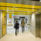
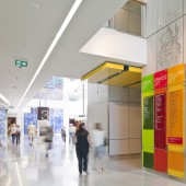
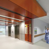
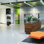
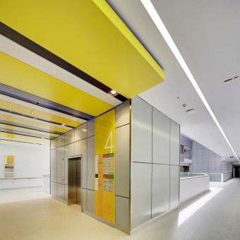
| DESIGN NAME: Royal North Shore Hospital Sydney PRIMARY FUNCTION: Wayfinding environmental graphics INSPIRATION: In hospital design, architects are often forced to maximise space and this does not tend to offer much individuality or complexity of shapes in the outcome of a department, ward or level of a building. A wayfinding strategy has to work with often quite repetitive spaces, emotional users, plain colours and the idea that a wall or lift core could somehow become memorable, and help people find their way to somewhere - and way out again - is something very new and revolutionary within hospitals. To patients and staff, this solution is a welcoming and uplifting mode of communication. "Goodbye!" to the 'old' solution where the approach was listing every department on every sign at every corner junction and only ever using black and white to present the message. As wayfinding experts our brief was to resolve how to constitute the building’s most important visual asset into a comprehensive and simple wayfinding strategy and give warm ambience through environmental graphics that would compliment the interior design. Our inspiration came from bringing the outside colours into the building and using three lift core colours. This meant that users would still search a destination by name then determine the correct lift by colour in order to get to the right level. Using the lobby ceiling ‘tongues’ which protruded the internal corridor spaces, for that extra punch and connection to a colour that could be seen from a distance, also helps users remember their steps for the return journey. We ensured that we had the right balance of contrast for maximum legibility for the messages on the signs, without losing the purposefulness of the colour strategy. UNIQUE PROPERTIES / PROJECT DESCRIPTION: So how does a wayfinding strategy work? Ultimately, the wayfinding strategy must be very simple. The solution for the Royal North Shore Hospital's wayfinding was not just designing ‘better’ signs. Legibility, colour and graphics may be physical tools of necessity but it is the comprehension of the sign’s meaning that is important and the ability to relate to the information, recognise the parts of the signage system and organise this into a pattern. The signs become the tools of scale, position, nomenclature, messages, materials, graphics and colour. They were designed to be consistent, logical and flexible - no environment is static forever, especially in a health care environment. In the Royal North Shore Hospital project, the building had three colours for lift lobbys which was great for vertical separation of destinations that were accessed by an elevator. However in hospitals, there is a lot of travel and movement between departments on the same level and often on different levels. We solved how to provide orientation and information to people in the hospital building regardless of their destination level or the lift core colour they used. By making the strategy quite clear from the main entrance, providing hospital wide and specific to that level information at the lift lobby, the dominating colour would then be able to take over as final tool for orientation and simplify that sometimes difficult return journey for visitors. OPERATION / FLOW / INTERACTION: The old and established circulation pathways to wards or departments changed dramatically. A new building with one main entrance means that the legibility of the coloured lift cores were central to the wayfinding strategy. The innovation was truly the use of colour as a wayfinding tool to correspond with vertical circulation rather than the usual solution which would have been to colour code levels within a multi-storey building. PROJECT DURATION AND LOCATION: The Royal North Shore Hospital is one of Sydney's oldest research, healing, trauma and teaching hospitals. The year 2009 marked the beginning of a huge redevelopment and Campus Masterplan. Our work commenced in March 2010 with the Community Health Centre and was completed August 2014 when the Acute Services Building was opened by the NSW Minister for Health FITS BEST INTO CATEGORY: Graphics, Illustration and Visual Communication Design |
PRODUCTION / REALIZATION TECHNOLOGY: With the development of digital technology and the ability to directly print in millions of colours and white to nearly any material and shape, environmental design cannot help but become an intrinsic part of any building’s fabric and there are very few limitations to the materials that can be utilised in any solution. Sustainability in wayfinding ensured that all materials specified were as long lasting as possible. We chose materials which incorporated the capacity to be up-cycled either back to raw material, for example aluminium, or be re-used as the same component in another sign if and when its message needs to be updated and it can be reused. SPECIFICATIONS / TECHNICAL PROPERTIES: For the ongoing flexibility that the signage requires, we used magnetically attached panels to avoid seeing mechanical face fixings. Glass was used for the main directory boards, both for protection, easy maintenance and cleaning and also provided the hospital end users with the ability to update department locations. Ultimately the result of good wayfinding is minimal signage which of course means less energy used to manufacture, highlighting a modular kit-of-parts design solution and maximum damage resistance for sustainable results. We were able to use these ideas within a relatively small budget TAGS: Wayfinding, signage, environmental graphics, colour, strategy, design, directional RESEARCH ABSTRACT: Before proposing the strategy and design solution, we researched the cognitive decision making theory of a wayfinding user in a hospital environment. Potential user 'journeys' were mapped out and tested. We explored the strategic systems and design solutions in other Hospitals and ranked their success against a range of contributing factors such as patient experiences, efficiency, sustainable design and Australian Design Codes. CHALLENGE: Health Care facilities offer their own specific challenges - they are very fluid environments with the propensity to change department and destination locations both during and after construction. The most pressing challenge for us was making sure that the client, the final owner of the signage, would have the flexibility built into the design to adapt to any of these changes. Without that flexibility, we knew that signage messages would not reflect change and the ugliest of temporary solutions would result - the staff do-it-yourself sign! ADDED DATE: 2017-03-17 00:43:23 TEAM MEMBERS (6) : Creative Director : Anne Gordon, Design Director : Tim Walker , Senior Designer : Coco Reynolds , Senior Designer : Juanita Franzi , Junior designer : Cherie Mable and IMAGE CREDITS: Image 1 / Photographer Rowan Turner / Lift Lobby Directory Boards and wayfinding signage Image 2 / Photographer Rowan Turner / Lift Lobby Directory Boards and wayfinding signage Image 3 / Photographer Rowan Turner / Main entrance / Directory and freestanding sign Image 4 / Photographer Rowan Turner / Directory Boards and wayfinding signage Image 5 / Photographer Rowan Turner / Freestanding sign and directory |
||||
| Visit the following page to learn more: https://www.annegordondesign.com | |||||
| AWARD DETAILS | |
 |
Royal North Shore Hospital Sydney Wayfinding Environmental Graphics by Agd-Anne Gordon and Tim Walker is Winner in Graphics, Illustration and Visual Communication Design Category, 2016 - 2017.· Read the interview with designer AGD - Anne Gordon and Tim Walker for design Royal North Shore Hospital Sydney here.· Press Members: Login or Register to request an exclusive interview with AGD - Anne Gordon and Tim Walker. · Click here to register inorder to view the profile and other works by AGD - Anne Gordon and Tim Walker. |
| SOCIAL |
| + Add to Likes / Favorites | Send to My Email | Comment | Testimonials | View Press-Release | Press Kit |
Did you like Agd-Anne Gordon and Tim Walker's Graphic Design?
You will most likely enjoy other award winning graphic design as well.
Click here to view more Award Winning Graphic Design.


