D5 Studio Graphic Branding Corporate visual branding language for D by Jaco Payawal |
Home > Winners > #55835 |
 |
|
||||
| DESIGN DETAILS | |||||
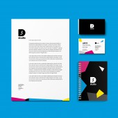
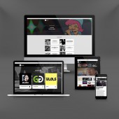
| DESIGN NAME: D5 Studio Graphic Branding PRIMARY FUNCTION: Corporate visual branding language for D INSPIRATION: The overall feel is that of a party. The way D on D5 Studio is executed as that of a window to the party. The graphic or image that fills it depends on the title it is featuring. Thus, the D can (and does) contain video and a multitude of stills. The italicized 5 communicates the single-minded vision of the company: to be above and ahead of the content curve, where the top bar hovers and slightly protrudes above the bottom curve. This is how the 5 on D5 Studio is constructed. UNIQUE PROPERTIES / PROJECT DESCRIPTION: D5 Studio needed a visual branding language that, one, would set itself apart from other content creation groups, two, serve as a window of the content D5 Studio offers, three, (to a certain extent) reflects the aesthetic sensibilities of the publics it serves, and four, would express the company vision. D5 Studio is an amalgamation of different content genre, creative pursuits, personalities and purpose. Mainly because that is who its audience is, millenials to GenY people. OPERATION / FLOW / INTERACTION: - PROJECT DURATION AND LOCATION: - FITS BEST INTO CATEGORY: Graphics, Illustration and Visual Communication Design |
PRODUCTION / REALIZATION TECHNOLOGY: The D5 Studio branding language optimizes the use of negative space and CMYK colors. SPECIFICATIONS / TECHNICAL PROPERTIES: - TAGS: - RESEARCH ABSTRACT: - CHALLENGE: - ADDED DATE: 2017-02-28 15:41:18 TEAM MEMBERS (4) : Creative Head: Paulo Famularcano, Head of Design: Jaco Payawal, Senior Art Director: Red Redrico and Art Director: Cons Reyes IMAGE CREDITS: Jaco Payawal, 2016. |
||||
| Visit the following page to learn more: http://www.d5.studio/ | |||||
| AWARD DETAILS | |
 |
D5 Studio Graphic Branding Corporate Visual Branding Language For D by Jaco Payawal is Winner in Graphics, Illustration and Visual Communication Design Category, 2016 - 2017.· Read the interview with designer Jaco Payawal for design D5 Studio Graphic Branding here.· Press Members: Login or Register to request an exclusive interview with Jaco Payawal. · Click here to register inorder to view the profile and other works by Jaco Payawal. |
| SOCIAL |
| + Add to Likes / Favorites | Send to My Email | Comment | Testimonials | View Press-Release | Press Kit |
Did you like Jaco Payawal's Graphic Design?
You will most likely enjoy other award winning graphic design as well.
Click here to view more Award Winning Graphic Design.


