DESIGN NAME:
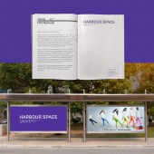
Harbour.Space University
PRIMARY FUNCTION:
Identity System
INSPIRATION:
The Big Bang Theory, cryptography, patriotic feelings of a student for his 'Alma Mater', the city of Barcelona, computer and data science, geek community
UNIQUE PROPERTIES / PROJECT DESCRIPTION:
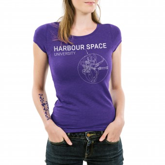
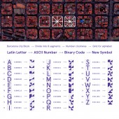
Logo and identity system for a hi-tech university in Barcelona. Within the identity we created a secret coded language for students and staff using the shape of a city block in Barcelona, the ASCII table and binary code of each letter. We designed a logo with a meaningful detail - a very small dot between the words that represents a singularity and the technical progress in miniaturisation.
OPERATION / FLOW / INTERACTION:
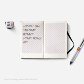
Students and teachers can use the coded alphabet for communication with each other. The knowledge and ability for reading and writing in this language means that a person is a part of a friendly and big, yet a bit closed and specific university community. Later on we are planning to create a simple mobile app that will encode and decode our symbols into regular latin alphabet using image recognition technology and the camera of a mobile phone.
PROJECT DURATION AND LOCATION:
It took approximately one year to create a huge identity system with hundreds of components besides the logo — the alphabet, coat of arms, many posters and media, advertising and different documentation layouts, guidelines for the usage of brand components, brochures and catalogues, uniform and souvenirs and many many more. The project was created partly in Barcelona, partly in Russia.
FITS BEST INTO CATEGORY:
Graphics, Illustration and Visual Communication Design
|
PRODUCTION / REALIZATION TECHNOLOGY:
We realised that a University brand should arouse patriotic feelings within the community of students and teachers (similar to territory brands — cities and countries, sport teams etc.) — so it should contain a mascot and a coat of arms. But the strongest patriotic feelings are associated with the language, so we challenged ourselves to invent a unique alphabet that will be connected with hi-tech and computers and the place of the university — Barcelona. Finally we found the idea for the language — binary codes of letters with the form of Barcelona city blocks. For the mascot we chose pangolin, cause it searches for bugs and eats them, like the programmers who "search for bugs" in their programme code. Pangolins also have natural armour with a regular structure — it represents the cyber security and data science departments. Pangolins are also quite cunning animals, which represents the hi-tech entrepreneurship department. And finally — they have a long tongue, which is simply funny, cause studying at Harbour.Space University can't be boring!
SPECIFICATIONS / TECHNICAL PROPERTIES:
-
TAGS:
education, university, language, alphabet, coding, binary, hi-tech, Barcelona
RESEARCH ABSTRACT:
We researched different special non-latin alphabets — navy language, deaf people sign system, Braille alphabet, etc. We also made research in machine languages and principles of encoding latin letters into computer binary code, the history of the ASCII table. We explored the structure of streets and blocks in the Barcelona centre and their shape. After that we cpmbined all that components and created a unique whole new alphabet, based on all those components and meanings.
CHALLENGE:
There are a few identity systems in the world history of branding, that actually uses a whole new alphabet, that was specially created for it only. This idea suits very well in such a brand like a university. That was a big challenge for us to create something new in this field and a language that would be connected with the high-tech profile of the university and the city it is situated in. We also added other patriotic elements in the system — a mascot, a coat of arms and so on.
ADDED DATE:
2017-02-28 14:45:11
TEAM MEMBERS (1) :
IMAGE CREDITS:
Andrey Brokhman, 2016.
|
