Hyku Mobile application by Hyku Llc |
Home > Winners > #55539 |
 |
|
||||
| DESIGN DETAILS | |||||
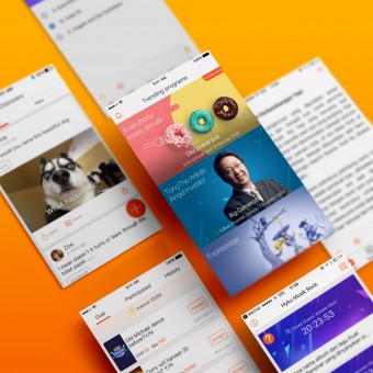
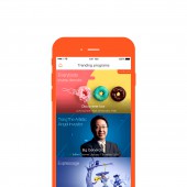
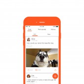
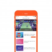
| DESIGN NAME: Hyku PRIMARY FUNCTION: Mobile application INSPIRATION: The inspiration for Hyku stemmed from the need of someone for additional content and interaction while watching television, whether a song in the background, or a shirt an actor is sporting, all relevant content will be automatically displayed on Hyku, synced perfectly with the programming. With technology backed by 22 patents, Hyku provides the most accurate content sync on the market. Inspiration is derived from my passion of media and television, and I hope to share Hyku with other viewers. UNIQUE PROPERTIES / PROJECT DESCRIPTION: The design is offering a new interactive way of second screen synchronization with television programming and live streaming. Large panels show current TV shows on main page, while intuitive notification allows users of all technological competence to smoothly navigate the app. Within each show, this design aesthetically displays perfected synced content, in order to satisfy the demands of app users. OPERATION / FLOW / INTERACTION: Users start on the main page, with all the shows. To access each show, click on the relevant box, and for more episodes, scroll to the bottom. The second icon (Discovery), on the bottom navigation bar, is for user-submitted content. The third icon (Duels) is a patent-pending live wagering game. The fourth icon (Message) is for users to socially engage with others. The last icon (Me) is where users can access their profile, points and to spend points on the marketplace for real-life items. PROJECT DURATION AND LOCATION: The idea for this project was conceived in March 2011 in Waterloo, Canada, started in March 2014, in Zhuhai, China and the latest version is completed in February 2017, in Zhuhai China. In May 2016, it was exhibited at the Broadcast Asia conference in Singapore. Currently it is used in the China and Indonesia markets. FITS BEST INTO CATEGORY: Interface, Interaction and User Experience Design |
PRODUCTION / REALIZATION TECHNOLOGY: Sketch 4.2 / Adobe Photoshop CC 2017 / After effect CC 2017 SPECIFICATIONS / TECHNICAL PROPERTIES: Above iOS 8.0 / Above android 4.2 TAGS: Second screen, television, media, perfect sync, Hyku, duels, discovery, marketplace, social media, movies RESEARCH ABSTRACT: This project begun with a four-month marketing and consumer research period in 2014, to determine whether to pursue. Twenty-five television directors from across China, including the most popular, were interviewed, resulting in an eighty-eight percent approval rating for Hyku’s concept and design. Interviews included an early demo of Hyku’s capabilities, as well as key value propositions – leading one prominent director to claim that Hyku was the best television application she has ever seen. CHALLENGE: The most difficult aspect of the design is user experience and interface. Technologically challenged users need to use the application as effectively as savvy users. User behavior data, as well as user observations were made over a two-year period to improve and enhance Hyku’s usability, leading to the current, February 2017 design. Boxes were made larger to highlight shows on the main page, logic was simplified for ease of navigation and icons were added for aesthetic and functional value. ADDED DATE: 2017-02-27 13:26:10 TEAM MEMBERS (2) : Ronghao Jin and Juan Lin IMAGE CREDITS: Hyku Llc, 2016. PATENTS/COPYRIGHTS: Copyrights belong to Hyku LLC, 2014-2017 |
||||
| Visit the following page to learn more: http://www.hyku.com | |||||
| AWARD DETAILS | |
 |
Hyku Mobile Application by Hyku Llc is Winner in Mobile Technologies, Applications and Software Design Category, 2016 - 2017.· Read the interview with designer Hyku Llc for design Hyku here.· Press Members: Login or Register to request an exclusive interview with Hyku Llc. · Click here to register inorder to view the profile and other works by Hyku Llc. |
| SOCIAL |
| + Add to Likes / Favorites | Send to My Email | Comment | Testimonials | View Press-Release | Press Kit |
Did you like Hyku Llc's Mobile Design?
You will most likely enjoy other award winning mobile design as well.
Click here to view more Award Winning Mobile Design.


