Meet Chuanchuan Logo by Sitong Liu |
Home > Winners > #55532 |
 |
|
||||
| DESIGN DETAILS | |||||
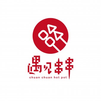
| DESIGN NAME: Meet Chuanchuan PRIMARY FUNCTION: Logo INSPIRATION: Snack is an important part of Chinese cuisine as it is popular and served in different forms and ways. Chuanchuan is a popular and common type of snack in China. It is also often served as street food. By using thin and long bamboo sticks, a variety of meat and vegetables are skewered together. These skewers are often cooked and seasoned in a big pot of spicy soup which is called hot pot. In Mandarin, Chuanchuan means skewers literally and the action of skewering. Inspired by this vocally visual expression, I reflect the presentation and look of Chuanchuan on my logo. UNIQUE PROPERTIES / PROJECT DESCRIPTION: This logo consists of two based graphics, squares and triangles, which stand for various foods materials. Furthermore, the overall shape of this logo is a round-shape, which symbolizes the hot pot. Because of its spicy taste, I choose ebullient red to fill up the graphic. The red color makes people feel appetitive, warm and homely. In the Chinese character, I also use square-form typeface to make the whole logo act in cooperation with each other. As I explained before, the Chinese character Chuan looks like a bamboo stick with skewers, which also included in chuanchuan's element. OPERATION / FLOW / INTERACTION: - PROJECT DURATION AND LOCATION: 2016, Nov-2017, Feb China, guangdong FITS BEST INTO CATEGORY: Graphics, Illustration and Visual Communication Design |
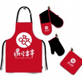
PRODUCTION / REALIZATION TECHNOLOGY: business card, saucer, washcloth SPECIFICATIONS / TECHNICAL PROPERTIES: This whole corporate identity projects include a wide range of executions, such as packaging materials, signage. TAGS: Logo, corporate identity, culture, food RESEARCH ABSTRACT: Nowadays, the Sichuan cuisine is more and more popular and accepted by people in the world. Chuanchuan is a kind of Sichuan cuisine, which represent the culture of Chinese food. Although more restaurants begin to serve Chuanchuan, most of them do not have a proper, or good-looking logo, which somehow reduce the attractiveness of their fantastic food. This logo designed to be simplier, to be easier understand, and be more straightforward, which could possibly attract more customers. CHALLENGE: To make the logo simple enough but not be ignored among other hotpot brands. To make it easily understand, when people have at a glance at it, but also can make them keep interest. Meanwhile, the logo should keep traditional elements and show Chinese feature. ADDED DATE: 2017-02-27 13:03:09 TEAM MEMBERS (1) : Sitong Liu IMAGE CREDITS: Sitong Liu, 2016. |
||||
| Visit the following page to learn more: http://www.zcool.com.cn/work/ZMjE0MTAwNz |
|||||
| AWARD DETAILS | |
 |
Meet Chuanchuan Logo by Sitong Liu is Winner in Graphics, Illustration and Visual Communication Design Category, 2016 - 2017.· Read the interview with designer Sitong Liu for design Meet Chuanchuan here.· Press Members: Login or Register to request an exclusive interview with Sitong Liu. · Click here to register inorder to view the profile and other works by Sitong Liu. |
| SOCIAL |
| + Add to Likes / Favorites | Send to My Email | Comment | Testimonials | View Press-Release | Press Kit | Translations |
Did you like Sitong Liu's Graphic Design?
You will most likely enjoy other award winning graphic design as well.
Click here to view more Award Winning Graphic Design.


