|
|
Have Salon Brand Identity Brand Identity Design by Zi Huai Shen |
|
|

|
|
| DESIGN DETAILS |
DESIGN NAME:
Have Salon Brand Identity
PRIMARY FUNCTION:
Brand Identity Design
INSPIRATION:
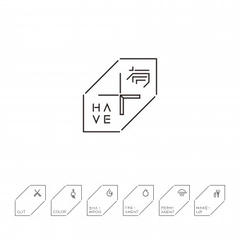
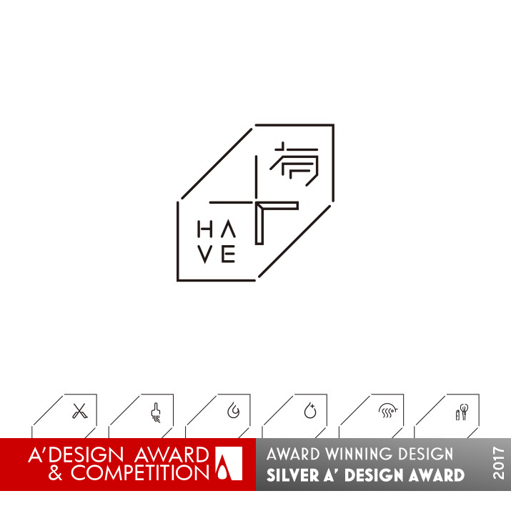
My inspiration is my customer design requirements. They hope salon is no longer a simple place for haircut. Therefore, we use the concept of 3D space and hide “solid geometry” and “time” inside the arrow. It stands for both the multi-functions within limited space and a feeling of 3D in the line of time. The design of our logo can explain our initial idea that we want to make the quests from different field can enjoy both the service and the environment.
UNIQUE PROPERTIES / PROJECT DESCRIPTION:
“Have” uses a bidirectional arrow as its logo. It represents “outstanding, advanced and leading”, which also means that we have the ambition to go toward the top of the world and to lead the fashion trend. Each part of it can show the depth and creativity when making the design. The lines of the logo gather in the middle and expand to different directions can fully show the feature of the brand. The tidy geometric straight lines in the logo represent that even though we have the variety of different styles.
OPERATION / FLOW / INTERACTION:
Customer ideal is to make people have better taste. By art space, fashion design and variety of creation, which make most people share with one another in “Have Salon.” Therefore, “Have” uses a bidirectional arrow as its logo, “Time” in the middle was shaped like a pair of scissors, which means the customer can enjoy the wonderful moment when having a new hairstyle. The lines of the logo gather in the middle and expand to different directions can fully show the feature of the brand.
PROJECT DURATION AND LOCATION:
The project started in Jul 2016 in Taiwan and finished in Sep 2016 in Taiwan.
FITS BEST INTO CATEGORY:
Graphics, Illustration and Visual Communication Design
|
PRODUCTION / REALIZATION TECHNOLOGY:
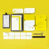
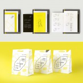
Invitations, Posters, Bags, Commercial Space Planning, Web Design
SPECIFICATIONS / TECHNICAL PROPERTIES:
Paper Handbag Width 243mm x Depth 120mm x Height 296mm
Business Card Width 90mm x Height 51mm
Invitation Card Width 180mm x Height 95mm
TAGS:
Brand Identity Design
RESEARCH ABSTRACT:
Given a research for hair salon market, it shows that most of hair salon is likely a barber place. It may be more professional than salon, but not special.
CHALLENGE:
We found that beautiful experience of hair design is the most expectant image to everyone. Therefore, we have an idea to plan a space which has diverse styles in the field of hair salon in Taiwan for the very first time. By continuous innovation, we can create a diverse salon, where customers and designers with different culture and living style can share their thoughts.
ADDED DATE:
2017-02-27 11:42:17
TEAM MEMBERS (1) :
IMAGE CREDITS:
Zi Huai Shen, 2016.
|
| Visit the following page to learn more: http://www.sumpdesign.com |
|
| CLIENT/STUDIO/BRAND DETAILS |
 |
NAME:
HAVE SALON
PROFILE:
Salon is no longer a simple place for haircut. It not only lead the field of hair- design to a aesthetic communication, but also enrich people’s mind to a high level. We found that beautiful experience of hair design is the most expectant image to everyone. Therefore, we have an idea to plan a space which has diverse styles in the field of hair salon in Taiwan for the very first time. By continuous innovation, we can create a diverse salon, where customers and designers with different culture and living style can share their thoughts. At this comfortable, simple, modern and fashionable space, “Have” would present the unique visual design and keep growing to lead the trend. Searching for the technique for different style, we’ll have the consumers to experience the variety sense of beauty and strengthen the personality. The design of our logo can explain our initial idea that we want to make the quests from different field can enjoy both the service and the environment. We would supply the special dessert and tea at random. So consumer can see, touch, taste, hear and smell at the same time. And we pick up some monthly fashion magazines and different best-selling books as well, just to make our consumers can keep up with the international fashion trend.
|
|
|
| COMMENTS |
| Giulia Esposito |
Comment #4986 on December 25, 2022, 3:11 pm |
|
Wow! I am absolutely blown away by this gorgeous brand identity design. The colors, font, and visuals of this work are truly stunning and capture the essence of the salon brand perfectly. It is truly inspiring to see how a simple design can be so powerful. The designer has done an amazing job of creating an eye-catching, modern design that communicates the brand's message in an effective and attractive way. Bravo! Kudos to Zi Huai Shen for this fantastic work!
|
| Paul Williams |
Comment #35632 on January 3, 2023, 11:25 am |
|
Have Salon Brand Identity is an exemplary work that truly stands out for its creativity, innovation, and sophistication. It is an outstanding example of good design and a perfect fit for the A' Design Award. The bidirectional arrow logo is a great representation of the ambition to be a leader in the fashion trend. The use of solid geometry and time in the logo is a unique concept that conveys the brand's message of a multi-functional space in a limited area. The research behind the project is also impressive, as it shows a commitment to creating a unique salon experience that is accessible to customers and designers from different backgrounds. It is a testament to Zi Huai Shen's hard work and dedication in creating such a remarkable piece of work.
|
| Paul Phillips |
Comment #41562 on January 3, 2023, 1:29 pm |
|
This award-winning work demonstrates a great understanding of the importance of brand identity and how it can convey a unique message. The "Have Salon Brand Identity" is an excellent example of the creative power of design, using a bidirectional arrow to convey the brand's ambition to lead the fashion trend. The lines of the logo gathering in the middle and expanding to different directions show the depth and creativity of the design, while the tidy geometric straight lines demonstrate the variety of different styles. An impressive design that truly deserves recognition!
|
| Adam Harris |
Comment #43792 on January 3, 2023, 2:26 pm |
|
I am truly impressed by the ingenuity of the design for Have Salon Brand Identity. The bidirectional arrow logo with its clever use of 3D space and time is a great example of creative innovation. The lines of the logo gathering in the middle and expanding to different directions perfectly captures the core of the brand and its ambitions. The research into the hair salon market and the challenge of creating a diverse salon that customers and designers with different cultures and lifestyles can share is truly remarkable. This award winning work deserves to be celebrated!
|
| Elena Petrenko |
Comment #45460 on January 3, 2023, 3:08 pm |
|
This award-winning work is a creative and inspiring brand identity design that showcases the ambition, depth, creativity and uniqueness of the featured brand.
|
| Chloe Turner |
Comment #48877 on January 3, 2023, 4:45 pm |
|
I'm in awe of this incredible piece of design! This brand identity is truly unique, and it's obvious to see why it won the award. The concept of incorporating 3D space and time within the arrow is genius, and it's clever to use this to represent the multi-functionality and the feeling of 3D within the line of time. The logo is absolutely stunning, and it really encapsulates the idea of making a safe and enjoyable environment for customers from all different backgrounds. It's an inspiring piece of work and I'm sure it will be admired for many years to come. Congratulations to Zi Huai Shen for this well-deserved win!
|
| Mark Allen |
Comment #49113 on January 3, 2023, 4:51 pm |
|
This award-winning work is a truly remarkable example of creative and innovative design. The unique use of the bidirectional arrow to represent the brand's ambition to go to the top of the world and lead the fashion trend is incredibly clever and the way it is incorporated into the design is highly impressive. The research and attention to detail that has gone into the design is evident and the incorporation of 3D space and time into the arrow logo is truly inspiring. This work demonstrates the power of design to create meaningful and memorable experiences that stand out from the crowd. Congratulations to the designer for creating such a fantastic work of art!
|
| Elisabeth Clark |
Comment #49478 on January 3, 2023, 5:02 pm |
|
I'm so impressed by the creativity and innovation that Zi Huai Shen has brought to the table with their award-winning work, Have Salon Brand Identity. The concept of using a bidirectional arrow as the logo to represent "outstanding, advanced and leading" adds a great deal of depth and complexity to the entire design. The clever use of geometric lines to indicate the variety of different styles is truly inspiring. The research conducted to understand the hair salon market and the 3D concept that is used to create the feeling of multi-functionality within limited space and the line of time is something I've never seen before. It's no wonder that Have Salon Brand Identity has won the A' Design Award!
|
|
|
Did you like Zi Huai Shen's Graphic Design?
You will most likely enjoy other award winning graphic design as well.
Click here to view more Award Winning Graphic Design.
Did you like Have Salon Brand Identity Brand Identity Design? Help us create a global awareness for good graphic design worldwide. Show your support for Zi Huai Shen, the creator of great graphic design by gifting them a nomination ticket so that we could promote more of their great graphic design works.
|
|

|
|
|
|
