DESIGN NAME:
Laundry
PRIMARY FUNCTION:
Branding Tool
INSPIRATION:
Taiki wanted to create a co-sharing office for freelance creators as he felt it was a disadvantage not being able to actually have an office and interact with other creators. He wanted to create a compact office to lower the running cost and to support other creators. As for the visual identity, he was inspired by the office plants: a minimal and clean, yet practical interior.
UNIQUE PROPERTIES / PROJECT DESCRIPTION:
This is a unique design that unites spatial design and identity. It all started with a plan to renovate a former coin-laundry into a co-sharing office specific to creators. The concept being; simple and minimal yet practical interior, and using green (plants) and off-gray (concrete) in a practical manner. It began with the naming of this space. The fact that it was renovated from a former coin-laundry and that designers clean various complicated problems in life, the name of this office was decided on Laundry.
OPERATION / FLOW / INTERACTION:
In the future, this office and its identity will be used for a cafe, or an event with talk shows and work shops. The office itself can function as a medium, which will enable creators to come up with a new business opportunity, or simply a space that can connect people. As it is a small and low cost office, another advantage is that it is easy to realize ideas.
PROJECT DURATION AND LOCATION:
The project started in January 2016 and completed in August 2016, in Tokyo.
FITS BEST INTO CATEGORY:
Graphics, Illustration and Visual Communication Design
|
PRODUCTION / REALIZATION TECHNOLOGY:
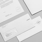
Taiki needed to create a visual identity that matches with the interiors of this office. He applied condense fonts as it is easy to read and recognize, and it also enabled him to use the white-space.
SPECIFICATIONS / TECHNICAL PROPERTIES:
By adopting condense type of identity, Taiki also applied it to the primary font which will suit any other key words or business form the office may encounter in the future. An identity which is more "a minimal and clean, yet functional interior."
TAGS:
Co-sharing office, Co-working space, Branding, Branding tool, Visual identity, Brand identity, Logo, Stationery
RESEARCH ABSTRACT:
The people that wanted to use this office consisted of creators that use print media, so together with an architect, Taiki visited numerous offices and architecture that was graphic designer friendly. One detail they adopted was using a wire to pull a desk rather than using any legs. This also came from our core concept and as a graphic designer we needed a clean space without any unnecessary information. As a result, the brand identity also adopted a simple and clean yet functional design.
CHALLENGE:
The most challenging aspect was, to create and select a space that was most comfortable for creators from various options.
ADDED DATE:
2017-02-27 09:34:25
TEAM MEMBERS (1) :
IMAGE CREDITS:
Image #1: Photographer Taiki Kato, Laundry, 2016
Image #2: Photographer Taiki Kato, Laundry, 2016
Image #3: Photographer Taiki Kato, Laundry, 2016
Image #4: Photographer Taiki Kato, Laundry, 2016
Image #5: Photographer Taiki Kato, Laundry, 2016
|


