Mtrl Kyoto Visual Identity by Hiromi Maeo - enhanced Inc. |
Home > Winners > #55406 |
 |
|
||||
| DESIGN DETAILS | |||||
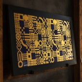
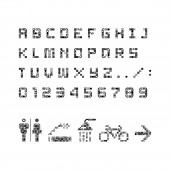
| DESIGN NAME: Mtrl Kyoto PRIMARY FUNCTION: Visual Identity INSPIRATION: We were inspired by the following items. Japanese traditional motif (Ichimatsumon, Ishidatamimon, Ohgimon, Seikaiha, Senmenmon, Kanokoshibori etc.) New technology motif (Printed circuit board, Sensor board components etc.) The concept of "bits to atoms" in the maker movement Minimum shape forming a substance UNIQUE PROPERTIES / PROJECT DESCRIPTION: Materials of mtrl are not just physical. They are physical materials (traditional and new), human materials (creators and academics), corporate materials (providing new technologies and traditional materials), and general materials (founder of mtrl). The identity symbolizes such diversity to gather, affect each other, produce synergy, and keep transforming. Transforming combinations icons the dynamics stimulating people’s creativity, and the innovations and businesses co-created. OPERATION / FLOW / INTERACTION: Individual material symbols represent people gathering in mtrl. Therefore, users can freely combine material symbols and use them as logos. Also, a combination of material symbols can be used as a typeface, as an icon, and its usage is free. It is a space where various people gather and connect, so we set a certain degree of freedom for the combination. PROJECT DURATION AND LOCATION: The project started in June 2015 in Kyoto and finished in January 2016 in Kyoto and Tokyo. FITS BEST INTO CATEGORY: Graphics, Illustration and Visual Communication Design |
PRODUCTION / REALIZATION TECHNOLOGY: We created the logo by combining 4 fundamental material symbols. Material symbols are based on a 10 x 10 grid. The grid came about partly to achieve pixel perfection, but mostly to symbolize the fundamental "bits to atoms" essence of the maker movement. Each square of the material symbols is a bit (the smallest unit of digital information). The individual bits themselves are as well, material. SPECIFICATIONS / TECHNICAL PROPERTIES: We adopted mainly square grid to facilitate combination of material symbols composed of square grid. This is because anyone can easily combine material symbols. Of course, the typeface of the logo was newly created for that purpose. TAGS: material, mtrl, geometric, dynamic, kyoto, japan RESEARCH ABSTRACT: Collaboration methods are by no means one form. Mtrl is a collaborative workspace, a space to promote collaboration. Therefore, Mtrl incorporates dynamic elements into symbols. Symbols change according to conditions, and elements that make up symbols also change to signs and letters. CHALLENGE: Mtrl's identity has a certain degree of freedom. That is that Mtrl officials are free to use symbols and their components. That is why it was the most difficult part to which degree of freedom should be given. ADDED DATE: 2017-02-27 07:34:40 TEAM MEMBERS (8) : Producer & Photo: Akira Moriuchi - Loftwork Inc., Creative Director & Photo: Tatsuya Iwasaki, Art Director & Designer: Hiromi Maeo - enhanced Inc., Web Designer: Dai Yoshinaga - ADRIATIC, Archtect: Fumihiko Sano - studio PHENOMENON, Photo: Nobutada Omote - Omote Nobutada Photography, Photo: Mayumi Ishikawa - Loftwork Inc. and Photo: Takashi Maki - Loftwork Inc. IMAGE CREDITS: Image #1: Designer Hiromi Maeo, Design, 2015 Image #2: Designer Hiromi Maeo, Design, 2015 Image #3: Photographer Nobutada Omote, Photo, 2016 Image #4: Designer Hiromi Maeo, Design, 2015 Image #5: Photographer Nobutada Omote, Photo, 2016 |
||||
| Visit the following page to learn more: http://goo.gl/ywnwvi | |||||
| AWARD DETAILS | |
 |
Mtrl Kyoto Visual Identity by Hiromi Maeo-Enhanced Inc is Winner in Graphics, Illustration and Visual Communication Design Category, 2016 - 2017.· Read the interview with designer Hiromi Maeo - enhanced Inc. for design Mtrl Kyoto here.· Press Members: Login or Register to request an exclusive interview with Hiromi Maeo - enhanced Inc.. · Click here to register inorder to view the profile and other works by Hiromi Maeo - enhanced Inc.. |
| SOCIAL |
| + Add to Likes / Favorites | Send to My Email | Comment | Testimonials | View Press-Release | Press Kit |
Did you like Hiromi Maeo-Enhanced Inc's Graphic Design?
You will most likely enjoy other award winning graphic design as well.
Click here to view more Award Winning Graphic Design.


