DESIGN NAME:
Innovator
PRIMARY FUNCTION:
Branding Tool
INSPIRATION:
The most important aspect of this project was to communicate the prominence of the craftsmen and their fine crafts. The inspiration came from the fruitful climate of Japan and the ancient form of Japanese Kanji characters.
UNIQUE PROPERTIES / PROJECT DESCRIPTION:
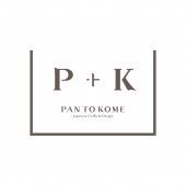
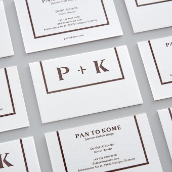
This brand (Pan To Kome) was created to connect Europe and Japan by promoting Japanese crafts and craftsmen to people of Europe. Taiki incorporated the brand concept "to connect" using the symbol "plus" in a graphical way, binding "Pan" (Europe, meaning bread) and "Kome" (Japan, meaning rice). Instead of making the users read the letters, he came up with a motif that simply portrays the message. The outside frame describes a dish, which also expresses the concept; a platform that connects people.
OPERATION / FLOW / INTERACTION:
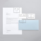
Pan To Kome has two missions: to inform Japanese crafts to Europe, and to spread Japanese techniques from Japan to Europe. This logo also brings a different brand experience (UX) for both parties. For Europeans, they will perceive a sense of Japan from the logo, and for the Japanese, they will feel a sense of affinity from the certain aspects of the Japanese character found in the logo. This logo will be used for an online shop, and in the near future for a retail shops.
PROJECT DURATION AND LOCATION:
The project started in March 2016 and completed in July 2016, in Tokyo.
FITS BEST INTO CATEGORY:
Graphics, Illustration and Visual Communication Design
|
PRODUCTION / REALIZATION TECHNOLOGY:
All the letters involved in the design was originally written with every tool such as pencil, brush, and flat brush (used for Japanese paintings) and sought for anything in common with the alphabet and the Japanese character.
SPECIFICATIONS / TECHNICAL PROPERTIES:
Taiki studied what vibrant characteristics from the Japanese character such as Tome, Hane, and Harai can be applied and fused with the alphabet and created a design/typography that worked. A design/typography that unites both characteristics of the two languages.
TAGS:
Branding, Branding Tool, Visual Identity, Brand Identity, Logo, Stationery, Ceramics
RESEARCH ABSTRACT:
Taiki researched and studied all kinds of history of Japanese characters, as well as the strength and form of ancient characters. His research also extended to interviewing actual craftsmen about how to create exquisite crafts. As a result I avoided using simple and obvious expressions of Japan and was able to include both the craftsmens technology and spirits into the logo and to base the branding upon the climate and history of Japan.
CHALLENGE:
The hardest part of the research was uniting the modern and traditional aspect of Japan and finding a good balance. Another challenge was setting a primary color. The initial color included black, but it was perceived a certain image in a European country that we did not expect.
ADDED DATE:
2017-02-27 07:03:03
TEAM MEMBERS (2) :
Creative Producer: Masaki Hoshiyama and Bilingual Manager: Sayaka Ito
IMAGE CREDITS:
Image #1: Photographer Taiki Kato, Innovator, 2016
Image #2: Photographer Taiki Kato, Innovator, 2016
Image #3: Photographer Taiki Kato, Innovator, 2016
Image #4: Photographer Taiki Kato, Innovator, 2016
Image #5: Photographer Taiki Kato, Innovator, 2016
|


